
Automagic Things
Reducing complexity
Business design principles for reducing complexity in AI-enabled systems
Strategic thinking to move business from the generative to the agentic, assistive, anticipatory, and agentive.
Last update: Jan 24, 2026
Aynne Valencia
Tools and tactics can change weekly, but the underlying patterns of human behavior and a sound business strategy are a solid foundation to build things that last.
In this post, I’m sharing high-level principles I’ve learned from designing for AI-enabled, user-facing products. To be clear, I am not talking about building back-end automation or analytics. I am talking about how to think about systems powered by LLMs, machine learning, and generative models that directly shape what people see, decide, and do. These are the kind of products where users must understand, calibrate, and interact with the medium of AI to get meaningful outcomes.
These systems raise new questions about trust, governance, and strategy, and how to center humans in a ever changing machine powered information world.

Anything is possible…
An immutable principle of, well, doing anything is to always askwhy you are doing it, and does the thing you think needs doing need to be done at all?
How this translates to building products is to ask: Why am I making this product/feature/service? What does it really need to do? Why would my customers choose my product over others to do it? These are the fundamental, existential questions worth asking and must be the focus.
What ways of working does your end user have, what tools already exist to do it, and what does your product need to co-exist with, other tools, systems, services? Who is the real user, and who is the decision-maker that will evaluate and ultimately buy what you've built? What features need to be present to attract the customers you want, and how do you ensure those features work well enough that people will actually keep using them?
The answers depend heavily on context. An early-stage startup finding its footing in a consumer market operates very differently from a growth-stage company handling complex, dynamic data, or from a security-sensitive, highly regulated industry like financial services or healthcare. The patterns matter: how information flows, what gets displayed and when, who can permission information to be shared, edited, or removed. All of this shifts depending on what you're building and for whom.
AI can build on existing written knowledge or has been documented by a photo, and translate it into data and identify patterns. It can, over time, also learn, predict, and infer repeatable patterns, bring in multiple data points and apply them to other data, and it’s very good and very fast at that. And in this way, it can seem very easy to imagine you don’t need a human in the works, gumming up the system, but that is only a part of the picture.
To create products humans will use and find useful, knowing the context and what someone cares about at the moment your product, service, or system can and cannot do is what matters.

TIP: I’ll talk about this later, but context matters. Take healthcare as an example. A doctor might find genuine value in an AI assistant surfacing a diagnosis, but that AI wasn't in the room. It cannot observe the patient's appearance, movement, or speech. It can't catch the nuances; the hesitation in a person’s voice or the way they hold themselves. The system can serve as a co-pilot, an additive, informative, and useful, but the meaning, the context, and the decision about what to do next remain firmly with the human.
Data is the Product

Your product is your content, and what you can do with it, with AI, that is mostly data
The computing adage: garbage in, garbage out, applies more than ever. Data works from input to get output. The more meaningful, unbiased, factual data, the better the output.
Data works from input to processing, analysis, inference, and recommendation. This requires a solid foundation built on facts and context, and the job of great software is to make meaning.
Expecting to show meaningful results? Make sure it’s easy to ingest data that matters, that means if someone needs to upload data, map files, import tableau, etc. that the uploading and field mapping tools are optimized to make that process smooth or better yet, use systems that parse the data for them, create a sample set to validate the data has been ported correctly (this also builds trust by showing what happens behind the scenes), and allow users to make the necessary corrections.
Missing data? No problem. First, diagnose the problem:
Is this something users always seem to be missing? Then, make it easy by fetching the data for them, or give them a good experience with the data they do have.
Do your users know how the data should be formatted and what it will be used for?
Can you get the data from another input/source? Do you have a sensor that can be used? Is there a map or open-source data source you can grab to get the information without the user needing to intervene? Start there to make products that people will love.

Rapid, iterative prototyping is a method that works for the medium
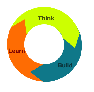
Think>build>learn>repeat
You have to experiment to get the prompts to give back the information that is the most useful to your context.
Experimentation and iteration are processes designers are very used to working in.
Important:
When working with data derived from models, it’s hard to be deterministic; AI generates data probabilistically with light structured output that can be inconsistent, so it can take some trial and error to be certain what data can be reliably and consistently retrieved.
A design is a rough blueprint for what should be there and why - but with designing with and for data, the real design doesn’t start until you can show the data.
One of the biggest benefits of the onslaught of tools coming out is that, rather than removing the need for design, it can allow designers to have much more agency to drive what the real end product will be. Designers can retrieve actual data themselves. This enables designers to validate concepts quickly and know what will work and ship it themselves.
Then comes the real work of reducing what doesn’t need to be there, moving information to deeper levels, or showing data in more than one place to provide more clarity and anticipate when customers will need that information.
So make sure when you are getting into it, that you know the design has just started once the data hooks are in, and then comes the work of knowing what can be reliably retrieved, identifying what is missing, and optimizing for the delta.

Context Matters

AI is context-bound. It knows what it has learned to find through training, probability, repeated pattern and through the history stored. Do your customers a favor and make sure you set them up for success with the prompts that will help them get the information they need.
The scent of information
Help a user out by anticipating what they might want to do next.
Let someone know that information is present and what kind of information it is.
LLMs require scaffolding for customers to understand what information they can ask for.
Do your llm and your users a favor by providing the context, the regulatory rules, and the cultural nuance that matches their industry. And use your copy voice, symbols, and clear information design to show it and say it in a way that is unique and specific to your brand.
* By the way - I have a canvas for making a brand voice for chatbots that helps to set the stage for this.

Make meaning for your customers

Make Meaning and show the big picture
In a world where AI can competently create a screen or a discrete user flow, what AI cannot yet do effectively is understand the gestalt of any given experience.
That’s where the principles of information design and information architecture are critical. When to use progressive disclosure vs. serving up a deterministic result of a decision-tree or linear algorithm is less of a technical skill and more of an art. It will vary from product to product and context to context. And knowing which one to employ at any given time lives within understanding the way the human operator conceives of and will use that information. Getting the balance right is what ultimately makes the difference between products that customers can sit down with and be successful with, vs products that confuse.
Dashboard, heads-up displays, and landing spots serve to orient a user to what is available to them, help make meaning and give context, and, most importantly, surface which features are available.

Tip: Use the progressive disclosure interface design principle to allow users to visualize and make sense of the data, then help them drill down to the details.
Transparency & trust are table-stakes

Just say no to suspect data. Deliver the maximum trustworthy product
Unclear or un-actionable results will not do. Show your work, allow customers to tweak the knobs, and add and remove variables. Give the agency to your users.
Most llms do this by showing the thinking as information is being gathered. In other places, you can use loaders and other devices to show what is happening under the hood.
Ideally, you can also have places in your product where customers can have the opportunity to change certain variables to get results more tailored to them.
And always show confidence levels if you aren’t 100% sure, indicate something is in BETA if it’s not quite there yet. Ask for feedback, talk to customers all the time. Better to be honest than be wrong and lose trust.

Respect the model

Mind the model - not all are created equal
What kind of model are you using? LLM (text)? Image generation/recognition? Sound? A multi-modal combo? How was your data trained? How large or small is the data set? Are you pulling in data from secondary sources? Which ones? What is your company's “secret recipe” and how do you make it ownable?
Knowing this information will help shape what experiences you can deliver with a high degree of confidence and avoid the possibility of data hallucination. The better the data, the better the output.
A picture is worth a thousand words

Visual Design is a powerful language that gives critical information design, so don’t skimp
A symbol can tell a thousand lines of text. A color can be used at cue to pay attention or to scan on by. Use visual design to inform and guide users to things they should pay attention to. Polish indicates someone is paying attention to details. Careful consideration of what shows up on any given screen and what doesn’t makes information scannable and digestible. This is not in the service of being pretty or extra; it is the method of conveying information to your customers and making your product necessary to them.
You can use the size of text and placement to make something more important than others. Typeface is not just for style its for legibility, do your zeros like “o”s? Is a one confused with a lowercase letter “l” (like this)? Thats is type not doing its job - particularly when you are using data with mixed case and numerals.


Mind the gap

We are not our users.
This one is hard; no one gets up in the morning and says, “I want to frustrate, alientate and confuse other people, and make them feel small”. I believe we all want to be good people. BUT.. it is human to be biased towards what we know.
For example, if you stare at terminal command-based interfaces all day, then of course, that’s easy for you to use.
Are you a person who learns best with written words? Then reading a wall of text is fine and dandy.
Are you like me and are visual-spatial - then you lean towards information with diagrams.
But consider this:

The average type size for data tables is roughly the equivalent of 12 point size. Does information get lost in the shuffle? What about someone who doesn’t have 20/20 vision or has tired eyes from staring at a screen? What about someone who needs data on the go- on a tiny smart device?
We must always remember that the person buying the product has different experiences, hardware, physical and cognitive constraints, priorities, aesthetics, comfort level with technology, and areas of expertise than the people making or designing products. Contextual, human-centered design matters more than ever in an AI world.
Don’t be the person who unintentionally leaves someone else behind.
Optimize for the majority, innovate on the edge
Optimize for the 80%
What do 80% of your customers need to know? AI systems thrive on repeatable workflows, common questions, and repeated patterns. When data can be returned with a high degree of confidence, you will be the hero to your customers. It’s okay to start small, make sure you do that, and do it well, and build from a strong foundation. Improves perceived quality, reduces friction, and makes the system feel smarter and more trustworthy.
But… make sure you leave room for feedback on the edge cases. These are the potential opportunity areas.

People and planet first, last and always

The core principles of good design are good for business. When you start from a place of caring about people and the planet, you get better products.
Consider creating default prompts that are most likely to get the job for the desired outcome to prevent user frustration and unneeded data calls.
Thinking at the scale of the micro and the macro is the practice that will save the space we all share and get us to a cleaner, greener future for ourselves, our children, and generations ahead.
The things that transcend the latest fad and are timeless, necessary, and feel effortless and inevitable.
Let’s begin
To wrap this up
These are only a few things I have learned from the front lines using this medium for the last two years and from working with machine learning on and off for over a decade.
Technologies are evolving at a rapid pace, but what doesn’t change is how people understand information. Design principles are the fundamental foundation for how to approach something - before it gets built.
That said, I am always curious and in learning mode, and love to hear about other things they have learned. And I am always willing to talk about these things because they shape the future we all have a stake in.
By building on a solid foundation, you are enabled to not reinvent the wheel and instead concentrate on intent, focus, and feasibility, which are the ingredients that are specific to your business and your customers.


Who wrote this
Aynne Valencia
Is a full Professor in the Interaction Design Program at California College of the Arts, co-authored O'Reilly's Designing Interfaces, and her work is featured in the MIT Press book "Through the Side Door: Fifty Years of Women in Interaction Design History." She has a career that has spanned experiential advertising, natural user interfaces, product design, service design, civic design, and fun experiments with new technologies.
She is available for consulting and freelance projects.
Drop me a line or connect on LinkedIn.