


At Home
Near future smart home
Near future concept
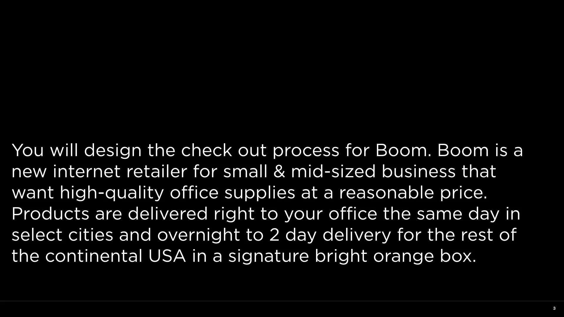
I led a course in the Interaction Design BFA program at CCA where we explored what a near future smart home might be like for GenZ (people born from 1995-the early 2000s). Students participated in a three month design research engagement looking at market behavior, socio-economic trends and attitudes of their age cohort and in partnership with our sponsored created new and/or evolved existing product and service concepts.

The Interaction Design BFA program at CCA explored what a near future smart home might be like for Gen Z (people born between 1995-the early 2000s).
Related Projects

Student work from CCA
Work by my students at CCA

I have spent the last five years teaching classes and in leadership as Chair and Associate Chair at CCA in the BFA Program as Program Chair and the Masters of Design program as well.
I have some of the work by my students here:
Tula, 2021 by Ryan Koble
Advisor: Aynne Valencia
Project Team: Mariana Martinez , Colin Swenson, Isamu Taguchi
Professors: Aynne Valencia and Alexander Baumgardt
Project Team IxD BFA Students Danielle Forward, Daniel Klein, Jack Gale
Professors: Aynne Valencia and Alexander Baumgardt
Ebb is a smart energy & water management system for apartment buildings that uses illustration to visualize data feedback
EM by IxD BFA Students
Christopher Piniati and Essie Kim
Experience Design 2016
Professors: Aynne Valencia and Alexander Baumgardt
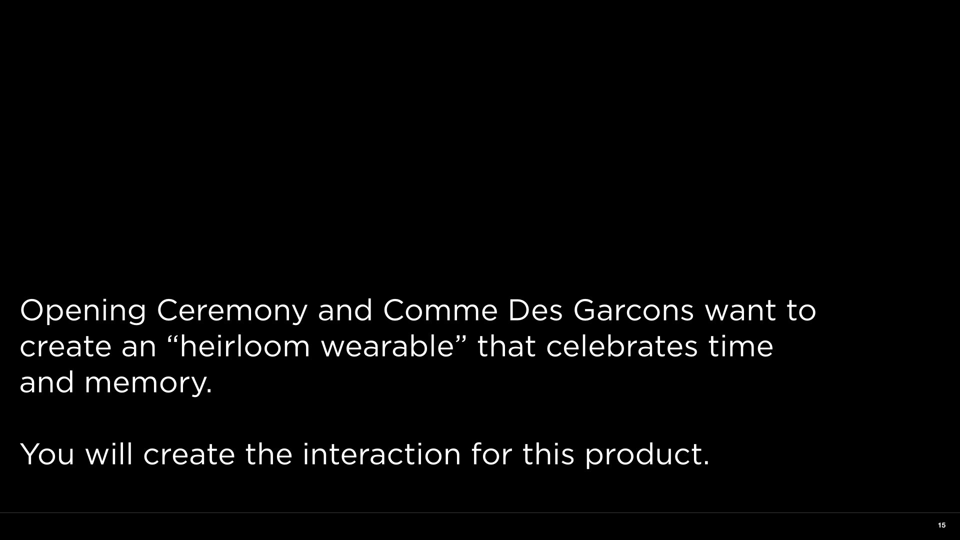
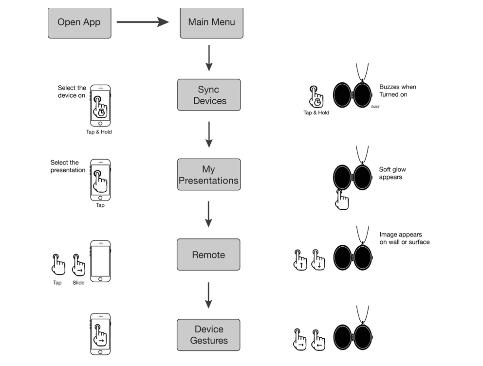
Em is a wearable journaling device that listens to your thoughts and enables you to connect with someone going through a similar experience when prompted. Em helps you build a narrative around the thoughts, feelings, and experiences that you catalog.
The heirlooms are the stories, advice, and empathy shared between two people.
Oracle Design for Trust Studio, 2019
Course Leader: Apurva Shah
Program Chair: Aynne Valencia
Visa and CCA IxD.
Course Leader: Alexander Baumgardt
Program Chair: Aynne Valencia

Data U, an exploration of quantified self by Johannes Seeman, Graham Plumb, Bibiana Bauer, Aosheng Ran, and Tara Lin
Related Projects

Summer Studio
Summer of 2021 I led an interdisciplinary studio where students from CCA worked with clients for hybrid projects.

Summer of 2021 I led an interdisciplinary studio where students from CCA’s undergraduate Interaction Design and Graphic Design programs worked with clients for hybrid projects.
This summer the Interaction design program is offering a unique opportunity to have undergraduate students work on real-life projects under the guidance of a faculty design director. This unique class will operate like a design studio allowing students to get work experience.
Partners in technology and design who had product experience design or design research projects partnered with us to create self-contained projects that lasted no more than six weeks. Students crafted a creative brief and established a schedule, milestones, and deliverables that work for their client organization.
I really love working with multidisciplinary teams. It’s so great to have visual designers, graphic designers, industrial designers working together. I would love to run a transdisciplinary program or start a lab or a studio with folks from wider STEM disciplines and designers working on wicked problems because the future requires looking at problems with a hard science AND design lens.
Ecopoesis


Students Jeiko Da Silveira, Michael Edgar, Corey Rossi, Yu Liang, Marian Guerra and Tian Jiang worked with the @ecopoesis Ecopoesis Team of Leslie Carol Roberts and Chris Falliers to create a brand identity and social media strategy.
San Francisco Veterans Administration


The VA Marketing project was for the rollout of the High-Reliability Organization Campaign for the San Francisco Veterans Administration Hospital. The Summer Studio team worked on a strategy and communication plan as well as design for staff and patient awareness. This campaign is composed of a survey that will provide baseline KPIs for visitor and patient satisfaction and staff and health provider job satisfaction. The second piece is the continued rollout of the training program and continued measurement of program efficacy. Students Phillip Joo, Ryan Kilmer, Gisselle Torres, Elena Wang, Jie-I Chen, and Danqi Huang produced this work in collaboration with Alfred Lee from the VA San Francisco Team.
Meet the Moment

The brief was to create a series of posters and materials that responded to topical or current events. This project was called Meet the Moment and lasted two weeks. Students: Min Ji Kim (IxD) Mary Vainstein (GD) Hongyu Zhao (GD) Weidi "Vick" Qi (IxD)


Related Projects

Experience Design Class
Intro to my Experience Design class
An intro to my Experience Design class.


Visual Design Class
A preview of my visual design for UI/UX class
This is the course intro to my Visual Design for UI/UX class

Future of Work Studio - SwissNex + CCA
A sponsored studio I led at CCA

Related Projects

Design for Trust Studio

This is a video with information about the Design for Trust studio at CCA I created in partnership with Oracle Design.
Related Projects


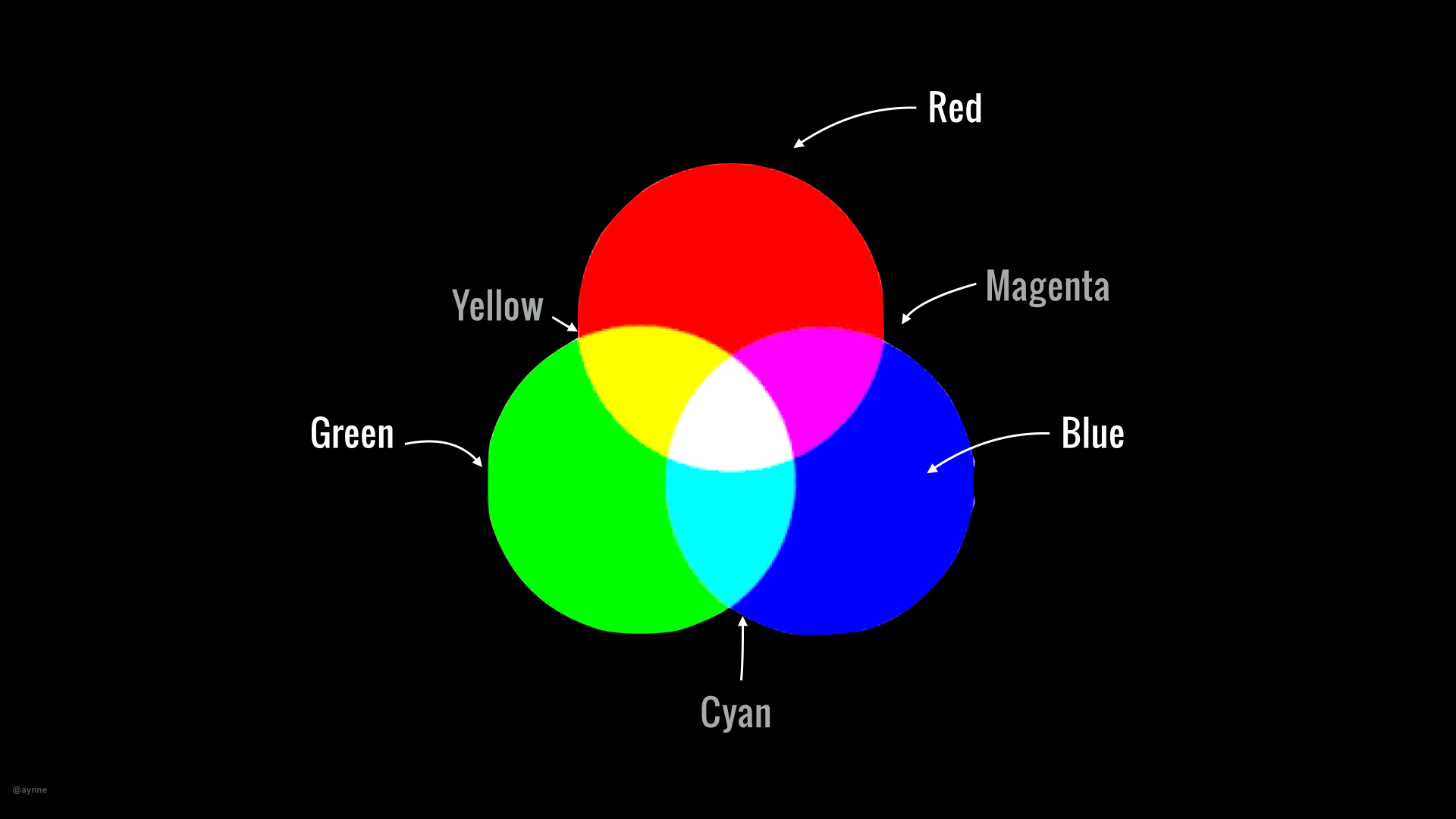
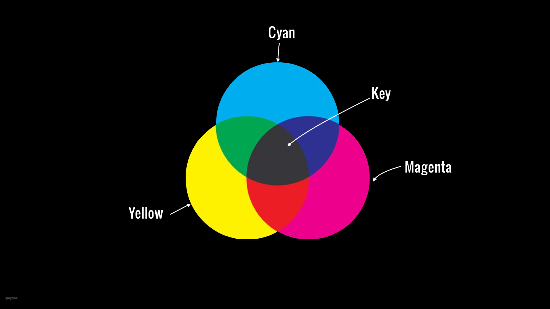
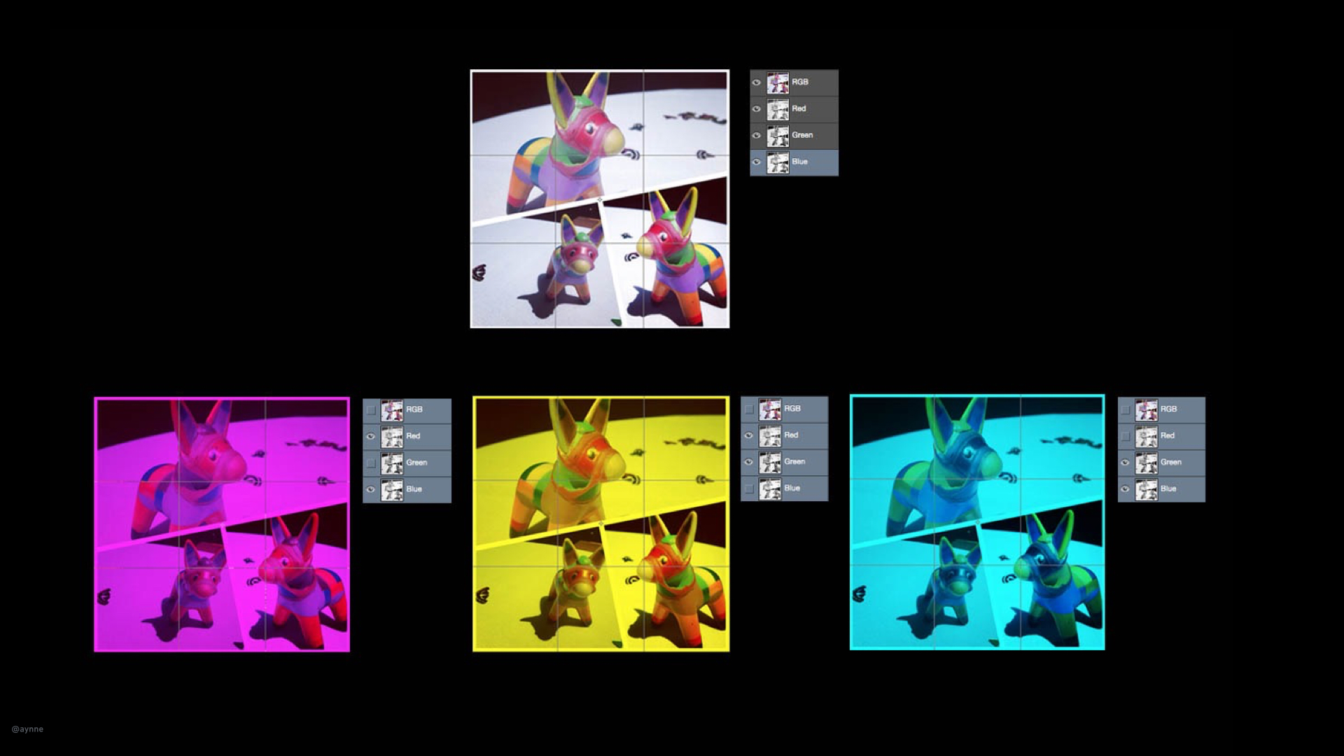
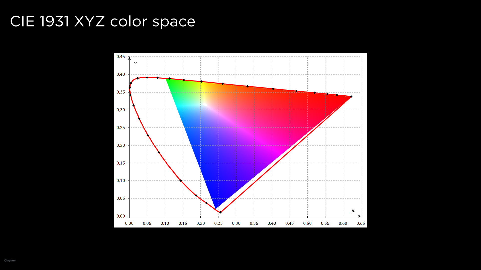

Visual Design
Notes from my visual design lectures at CCA
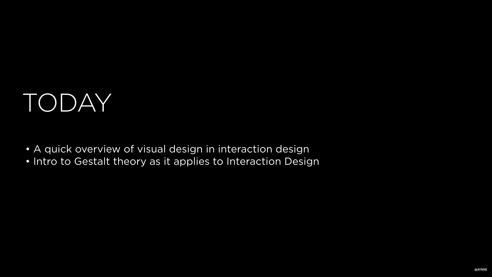
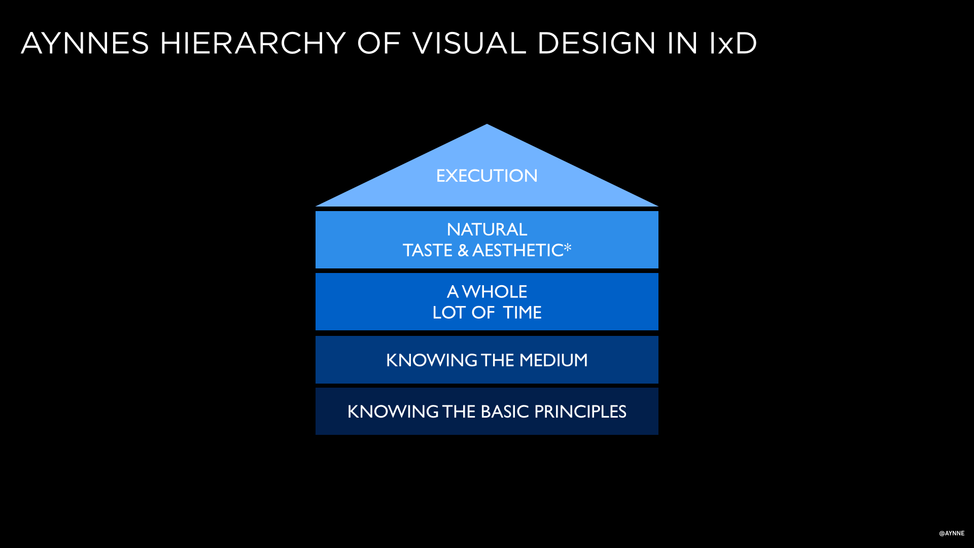
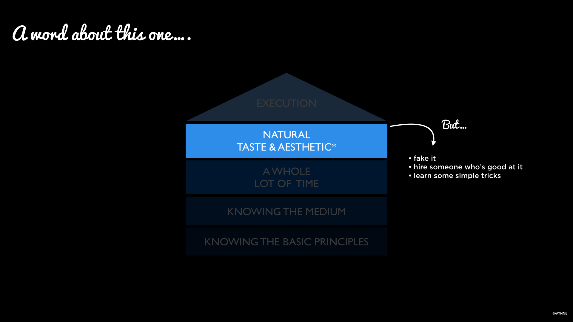
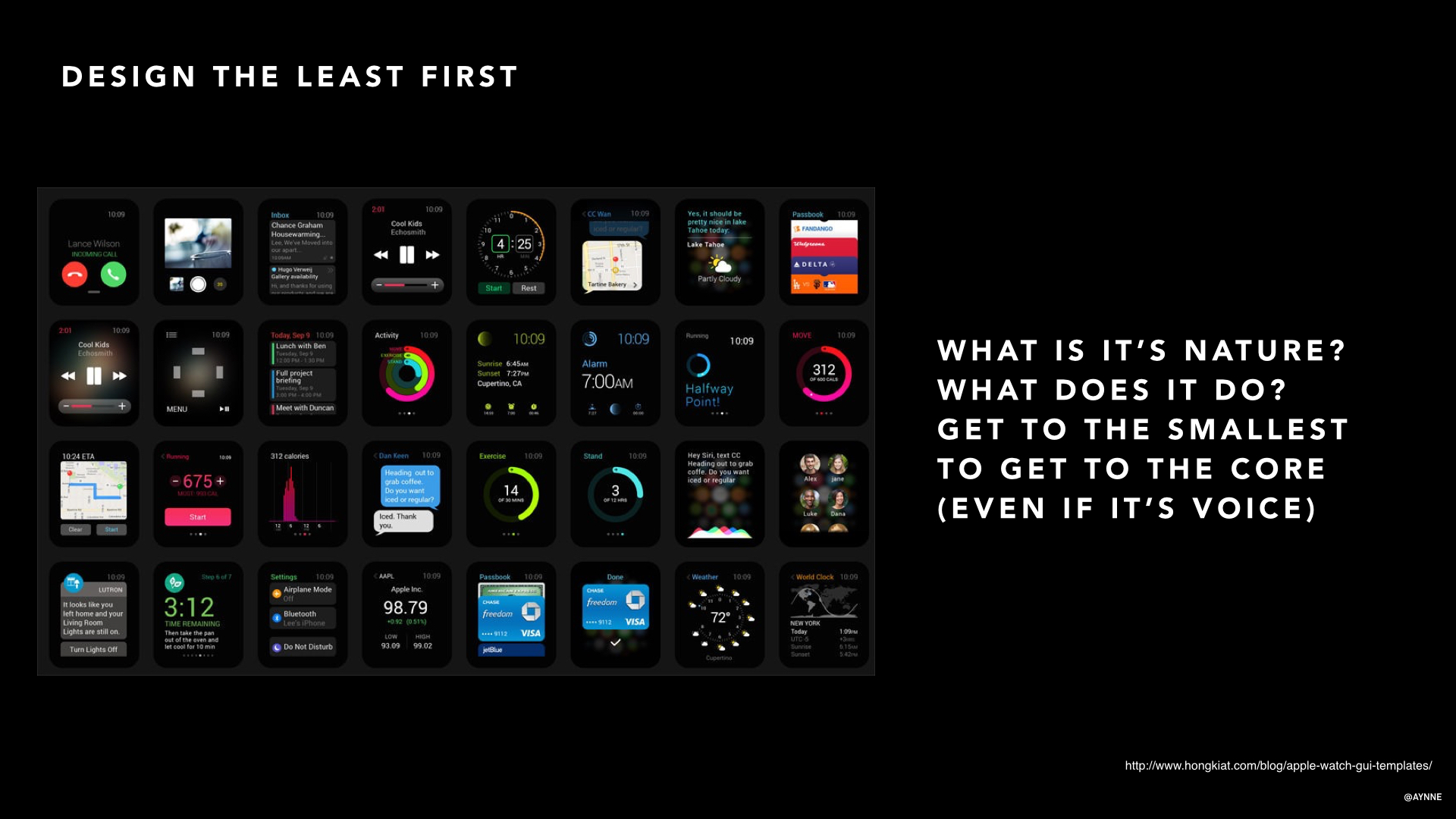
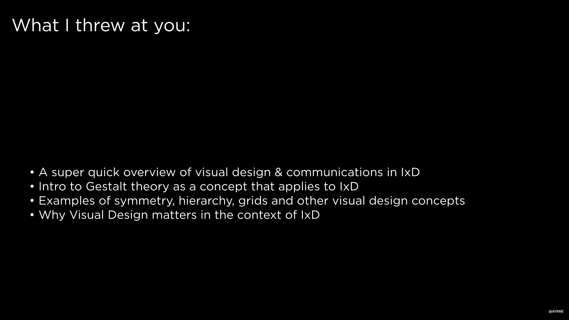
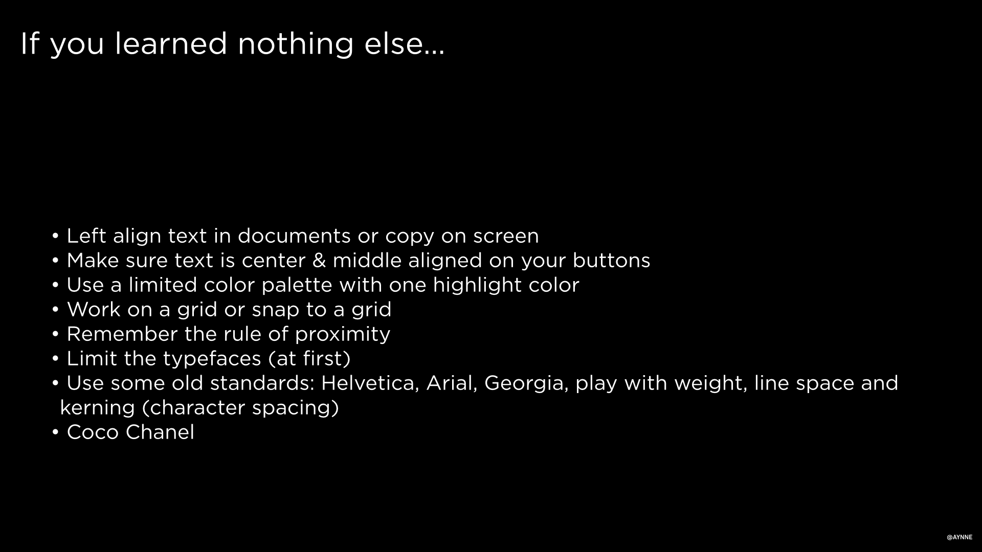
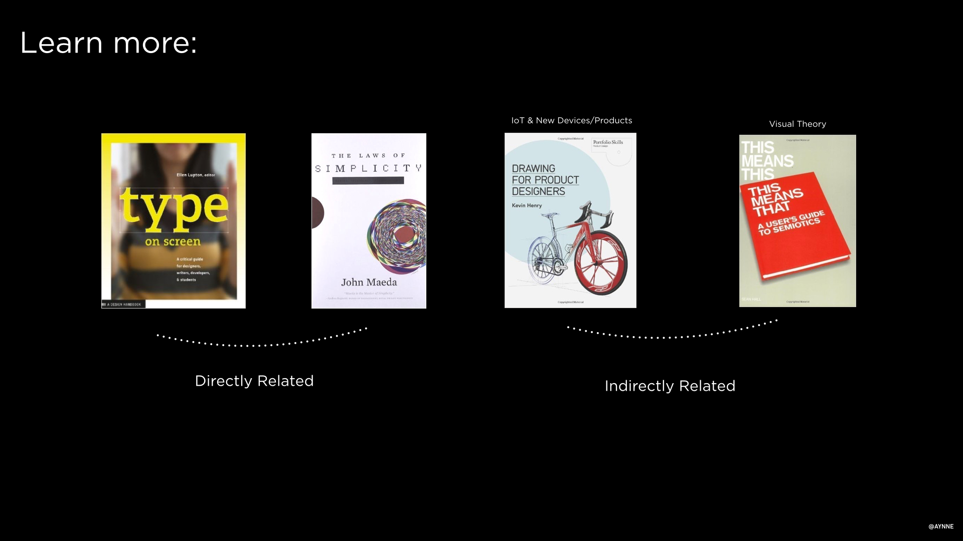
I teach Visual Design in the Interaction Design Program at California College of Art.
I will be posting some of the slide decks from my lectures here. I have collected resources and answers to student questions as well.
QUESTIONS STUDENTS ASKED:
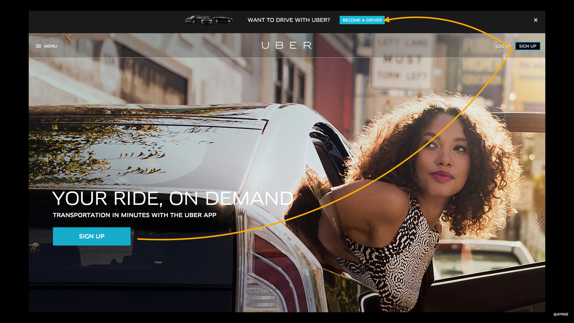
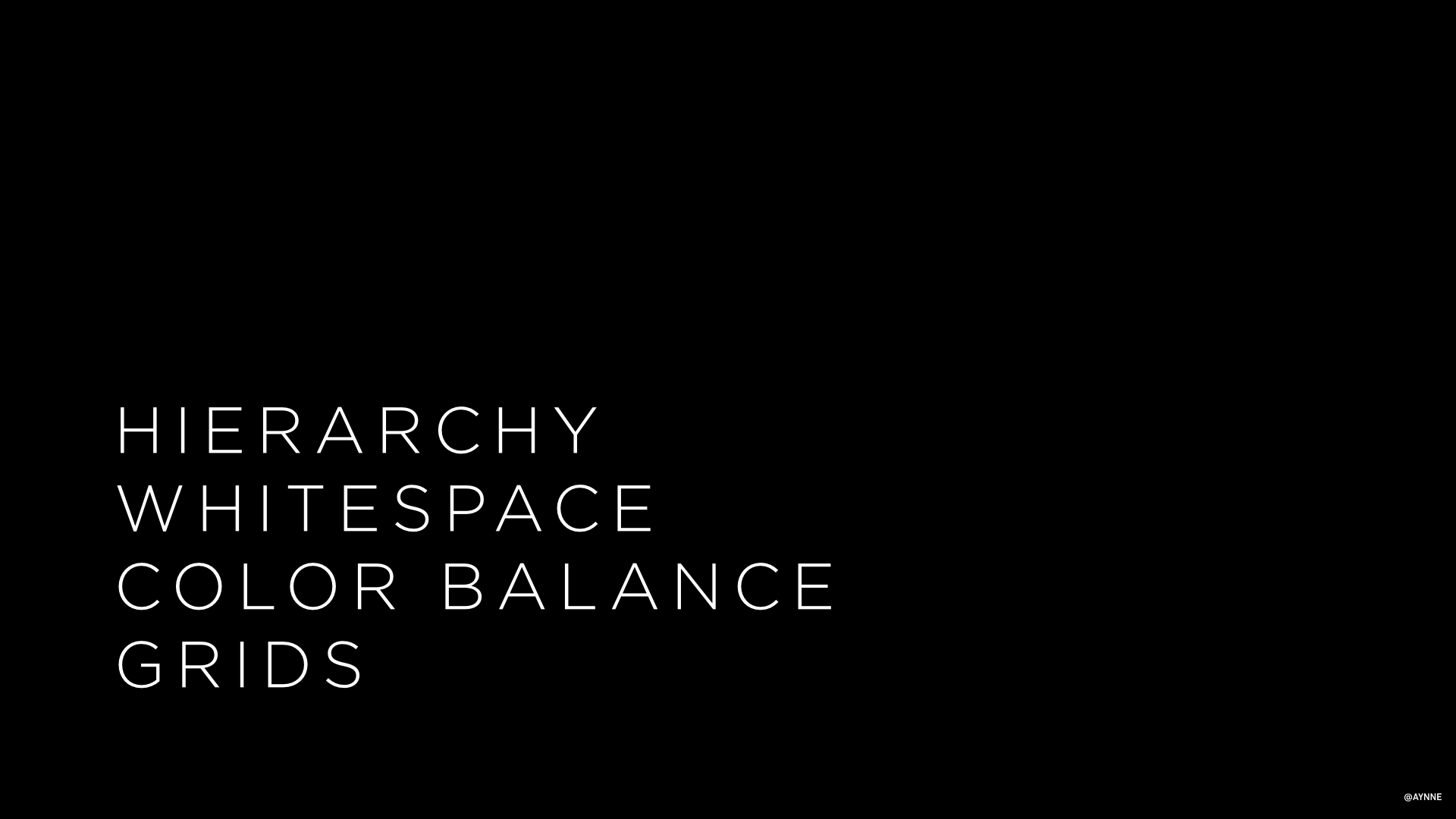
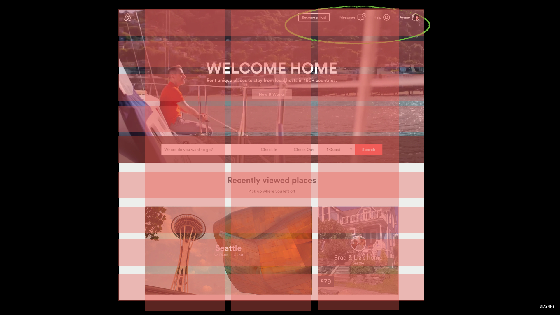
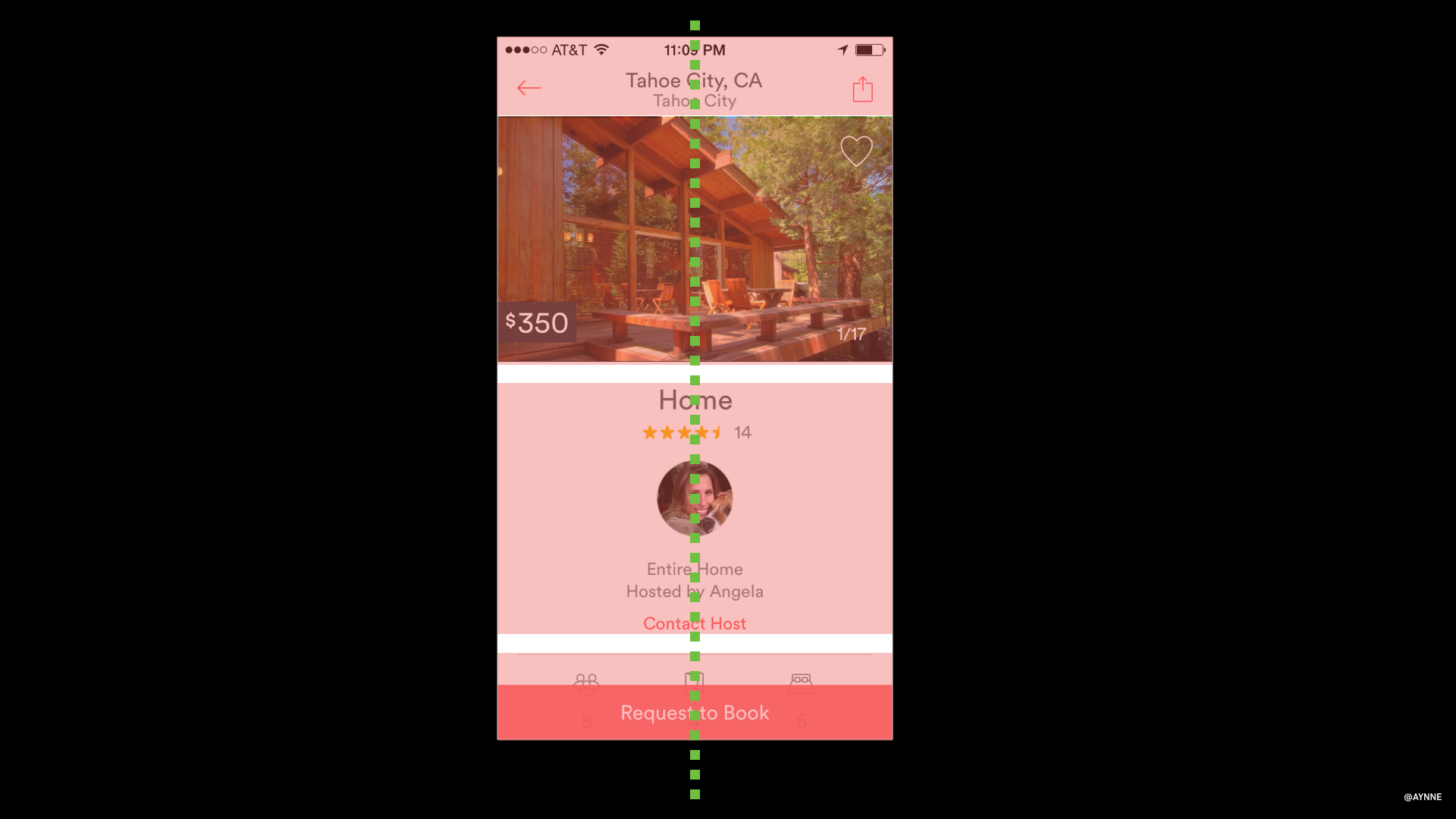
1). Where can I learn more about grids?
I have a lecture on grid and responsive web sites stay tuned I will post that soon.
http://www.sitepoint.com/grid-based-layouts-101/
Info on hierarchy here:
http://webdesign.tutsplus.com/articles/understanding-visual-hierarchy-in-web-design--webdesign-84
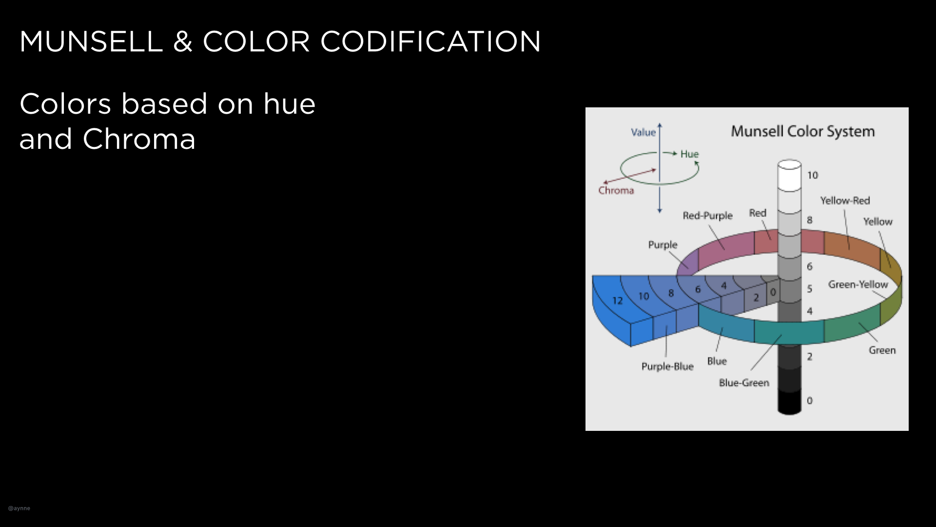
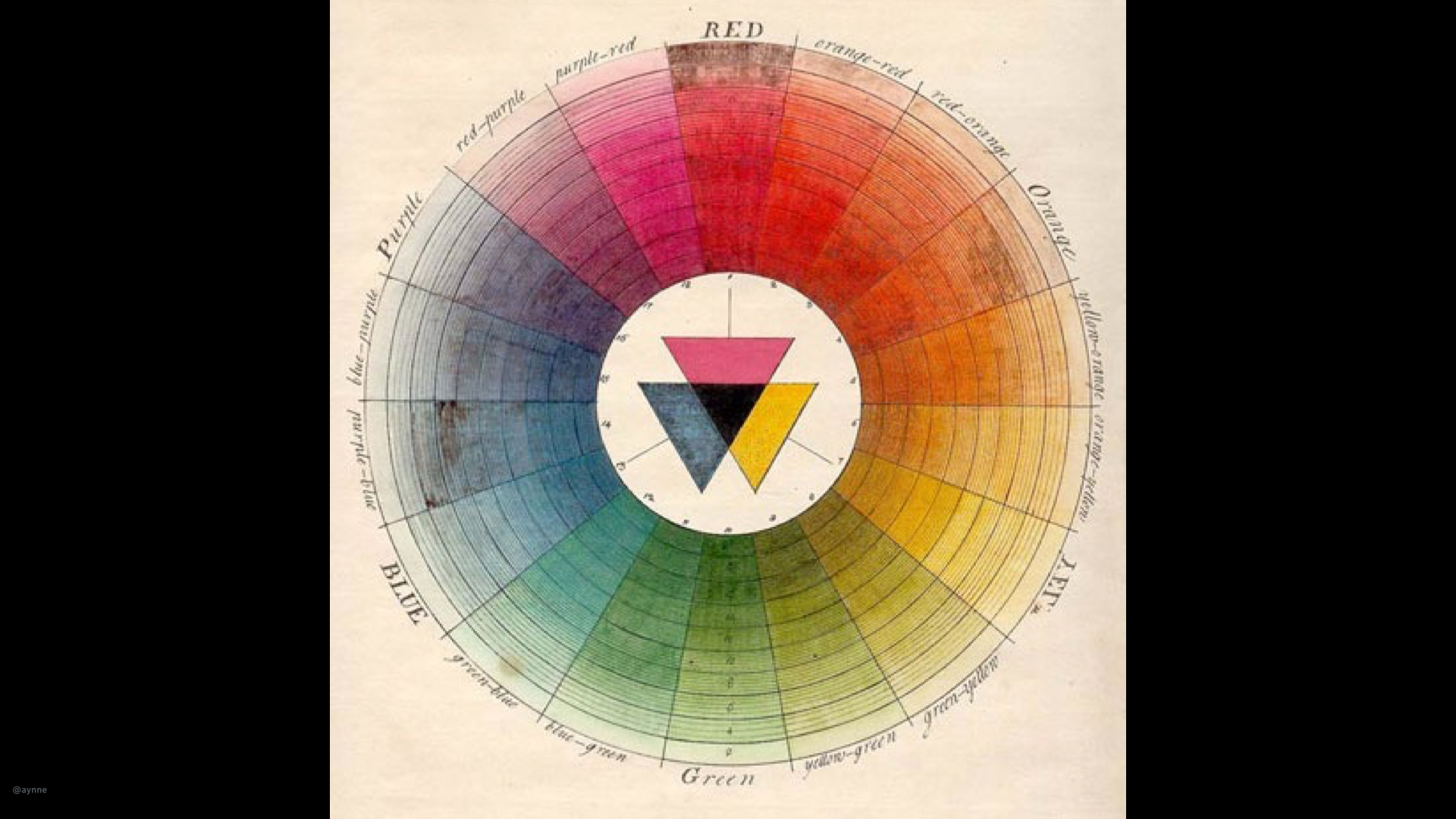
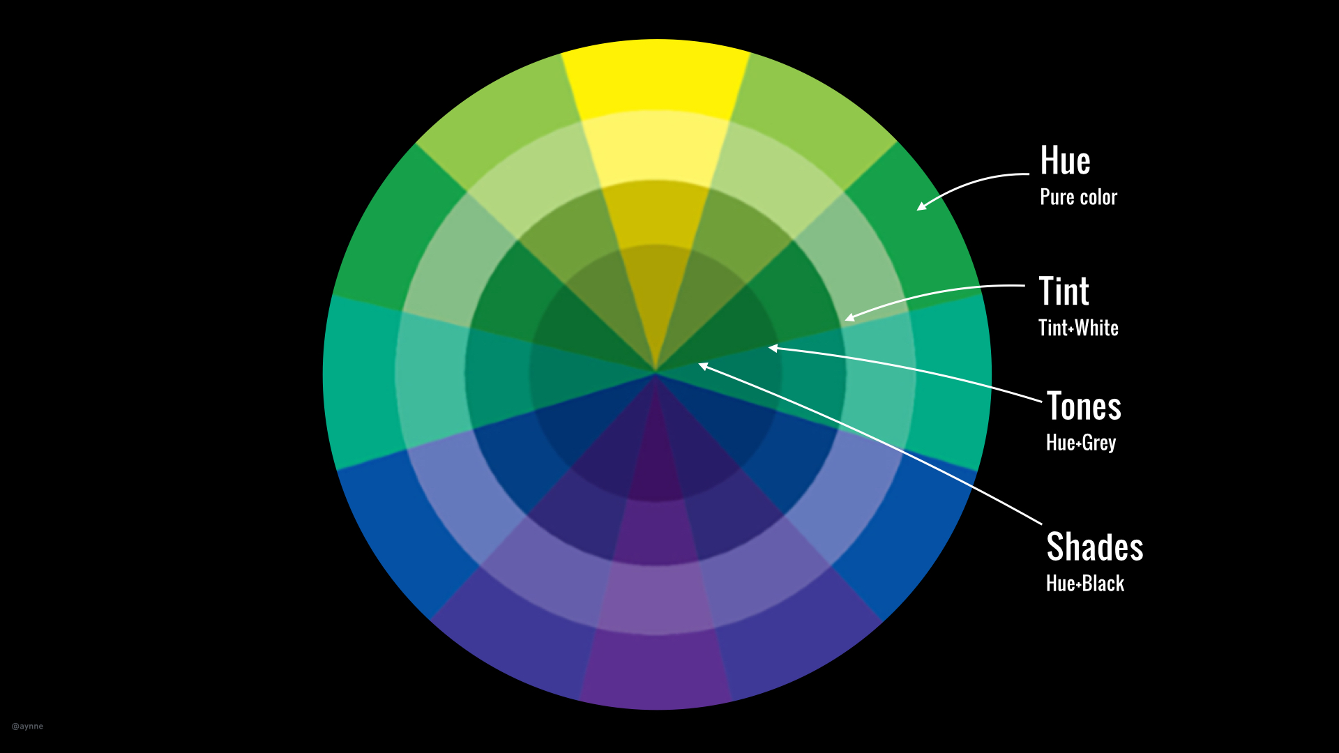
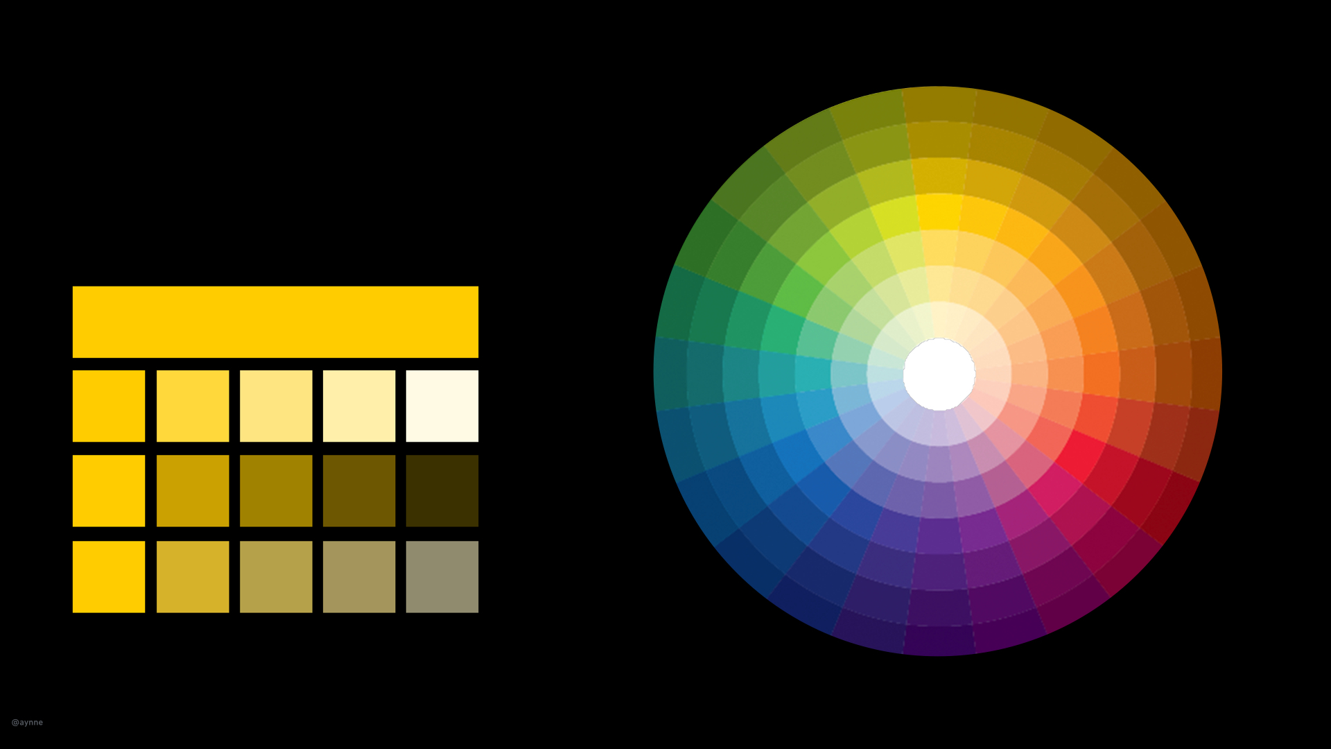
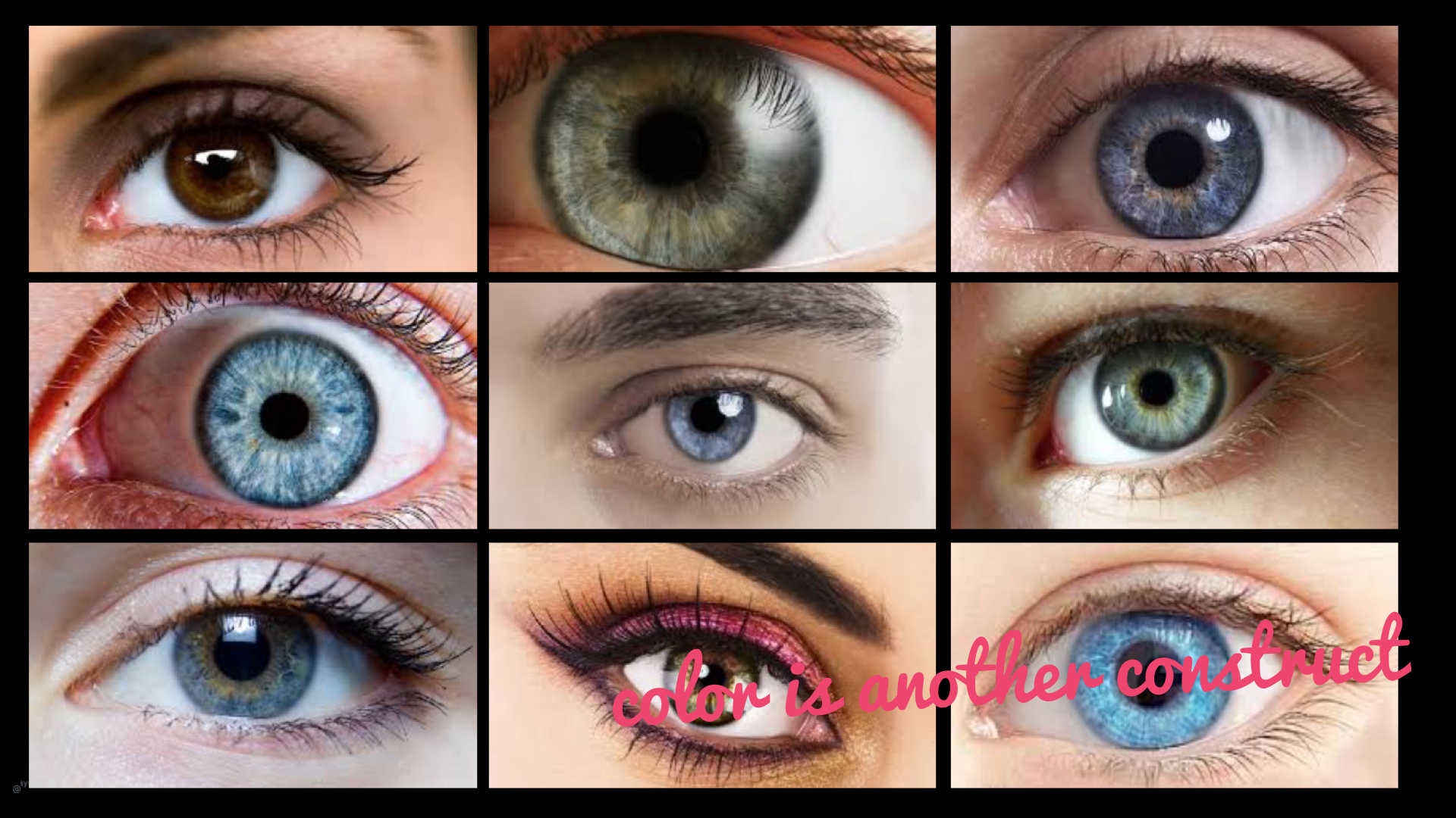
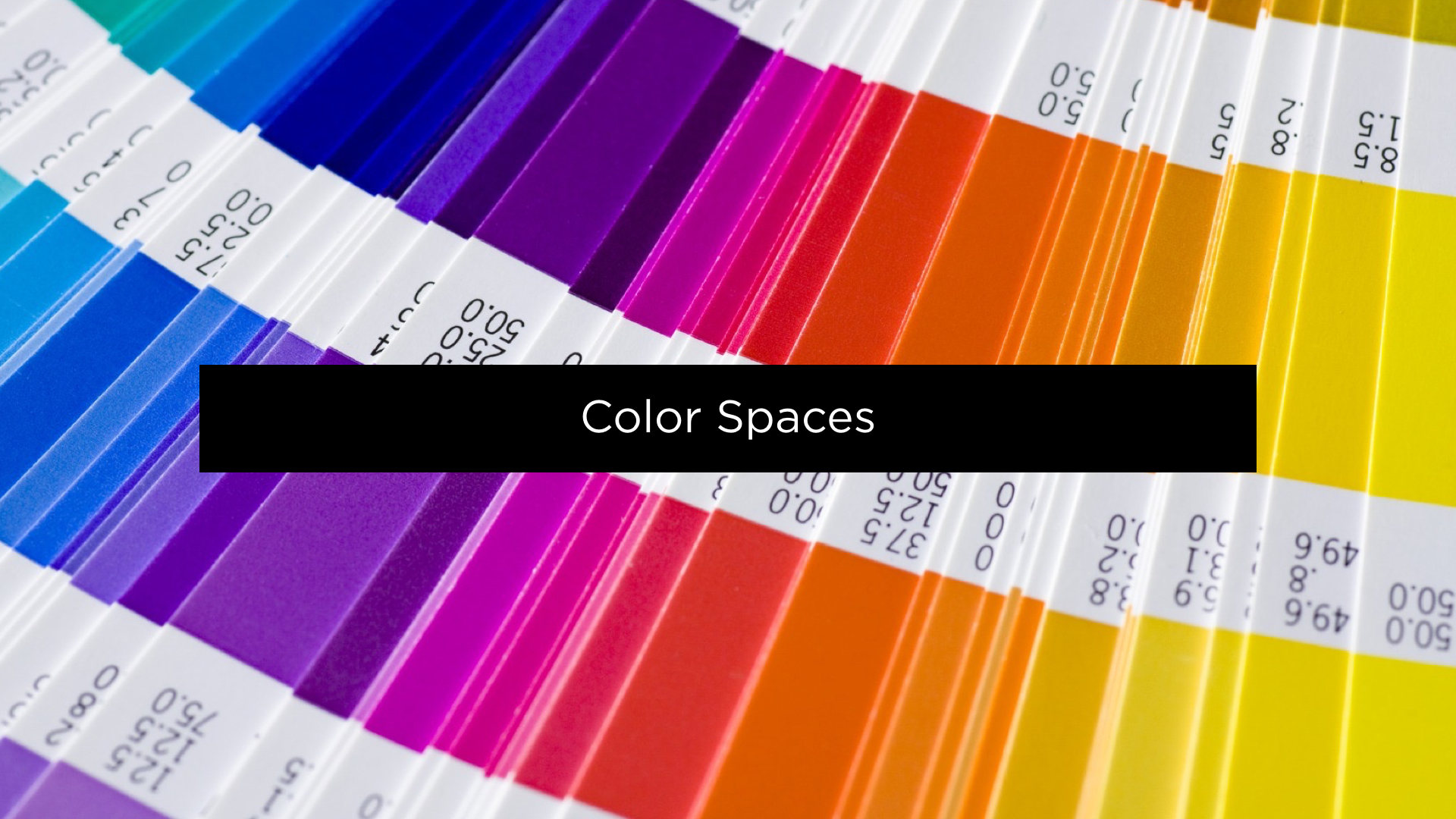
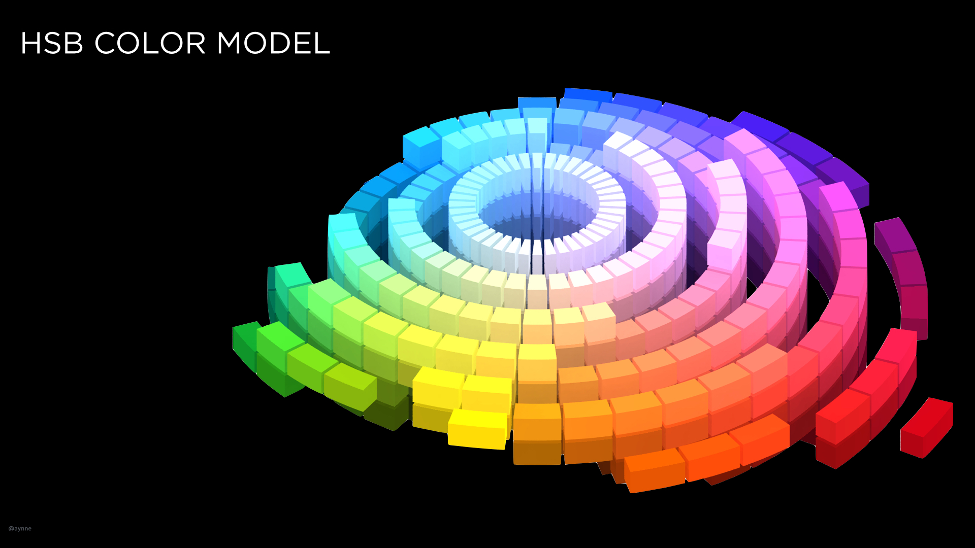
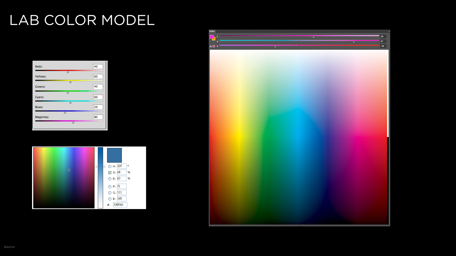
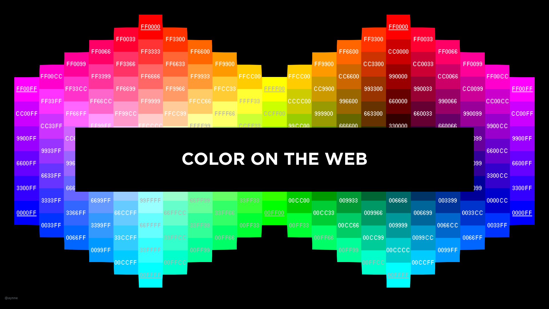
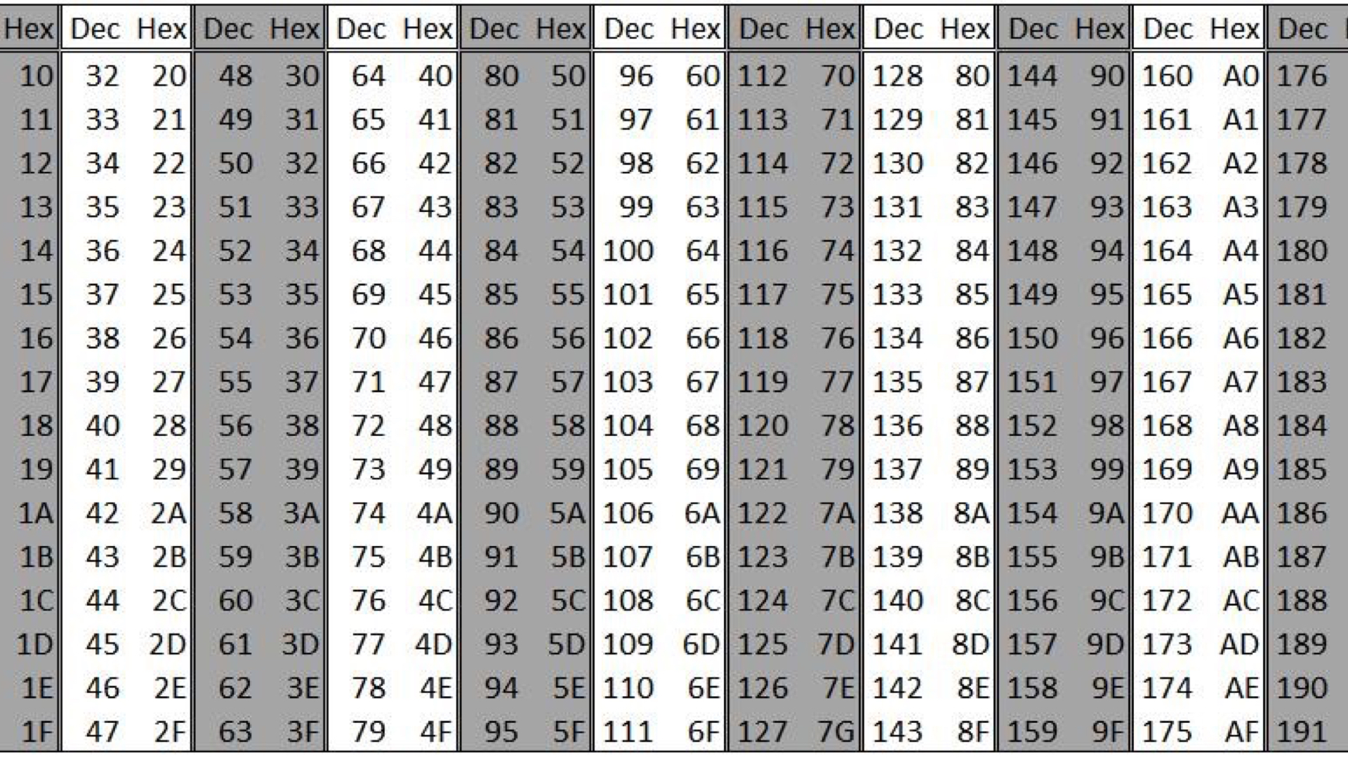
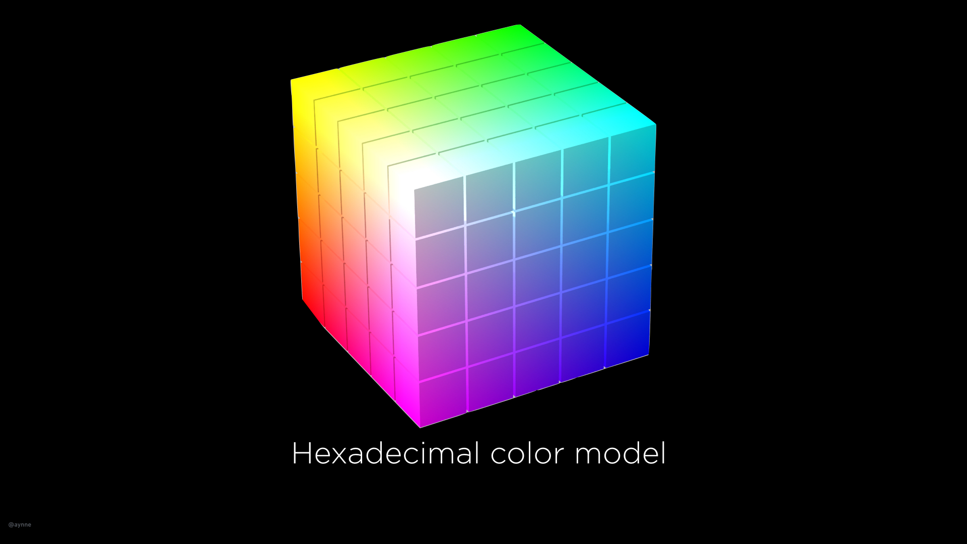
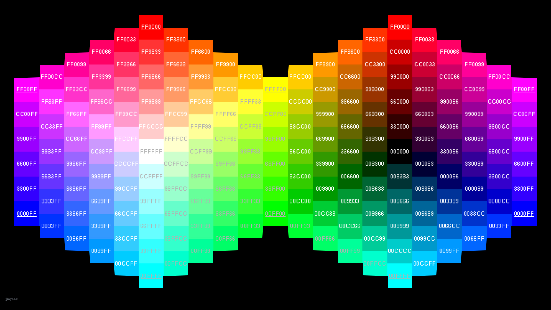
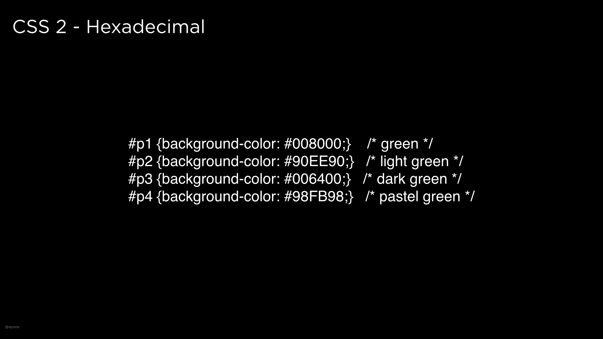
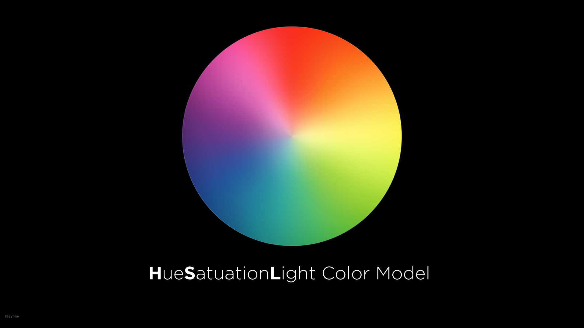
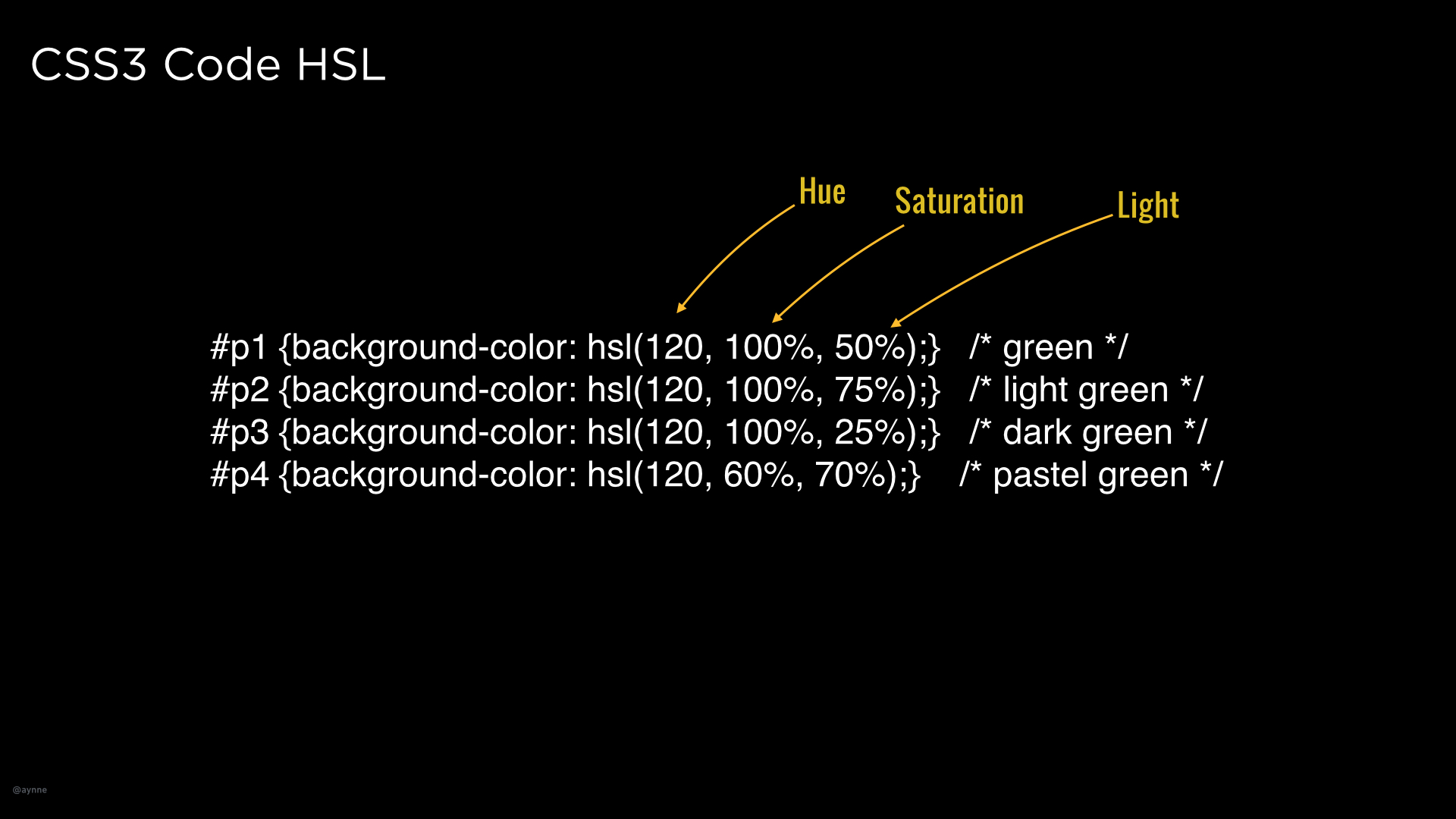
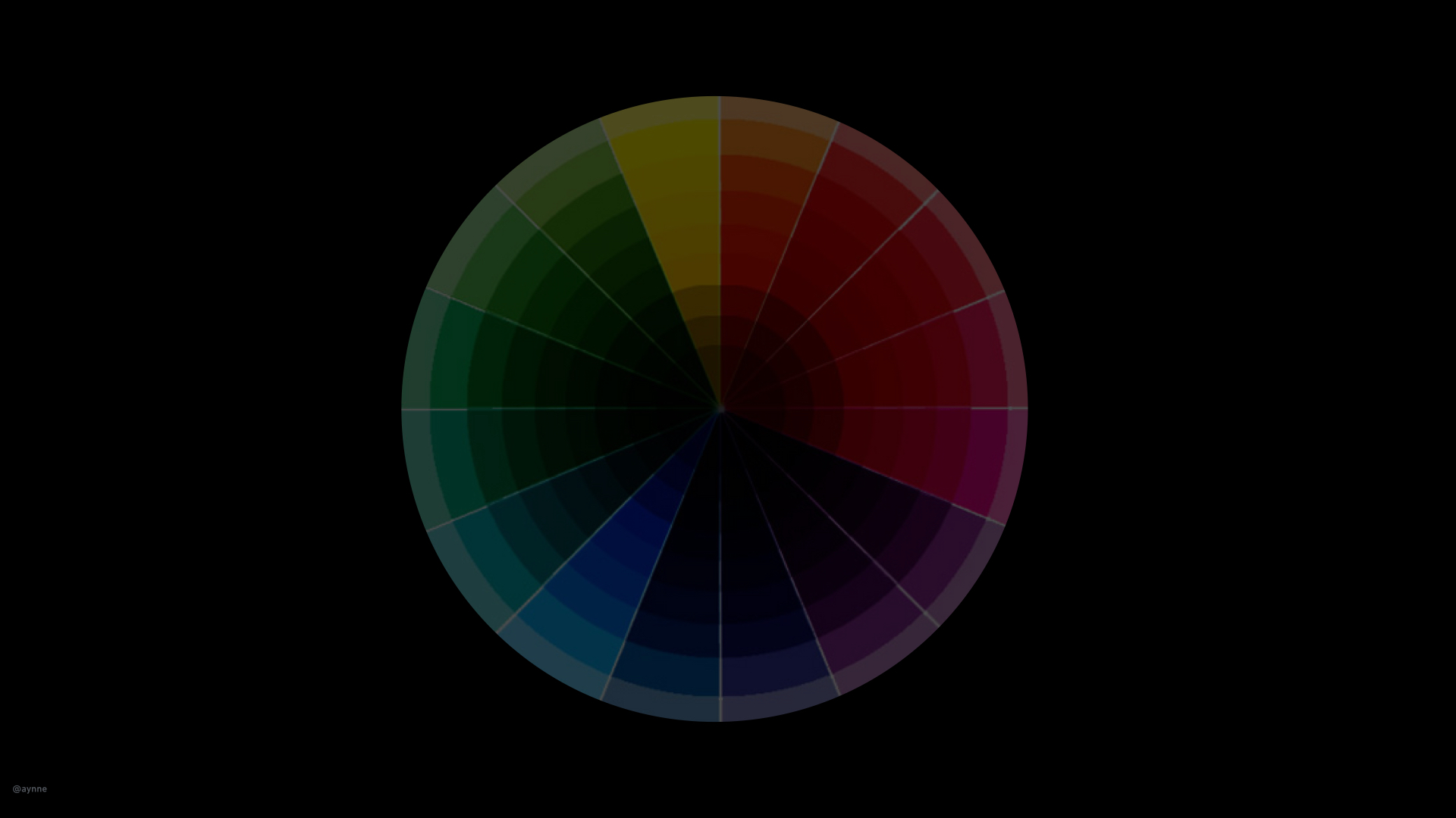
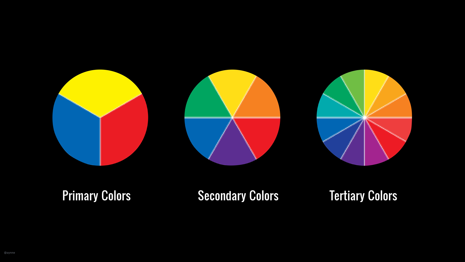
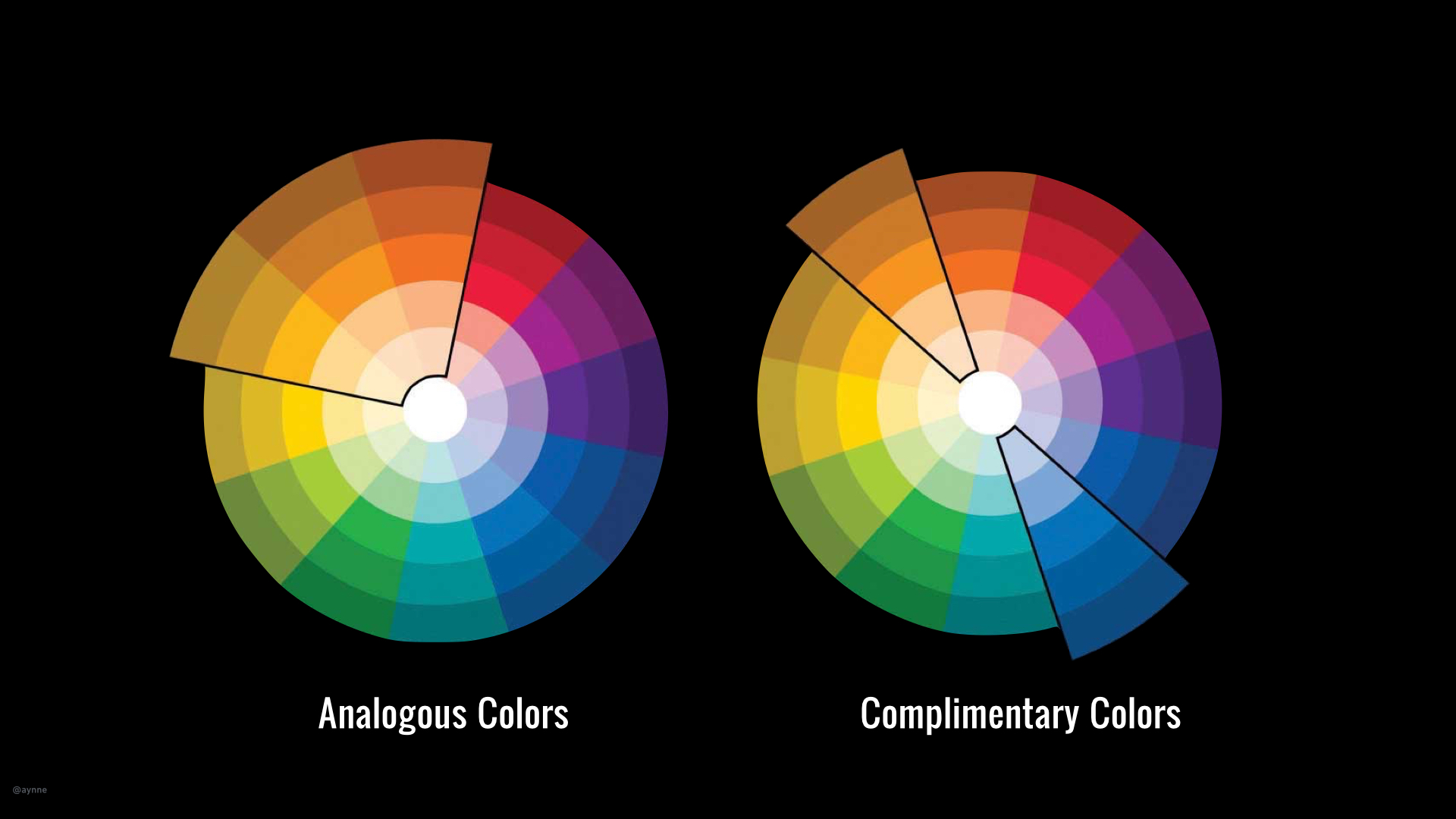
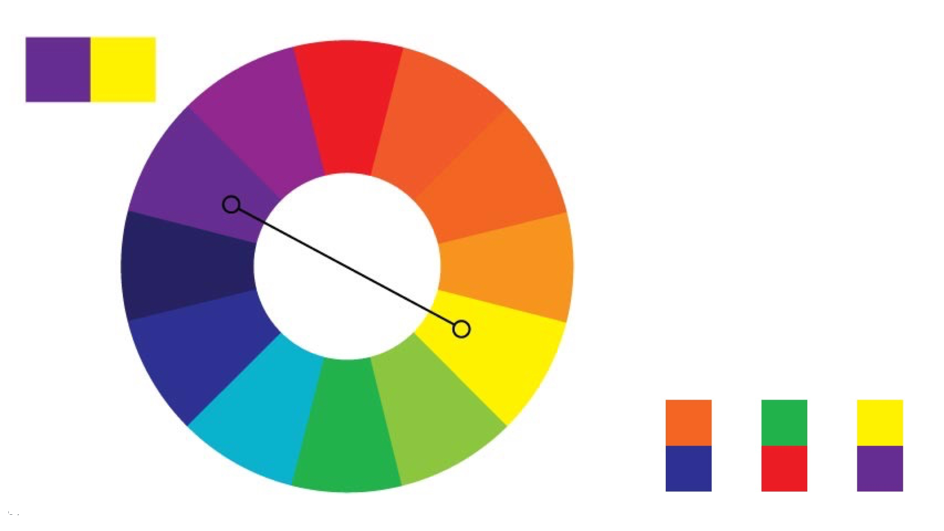
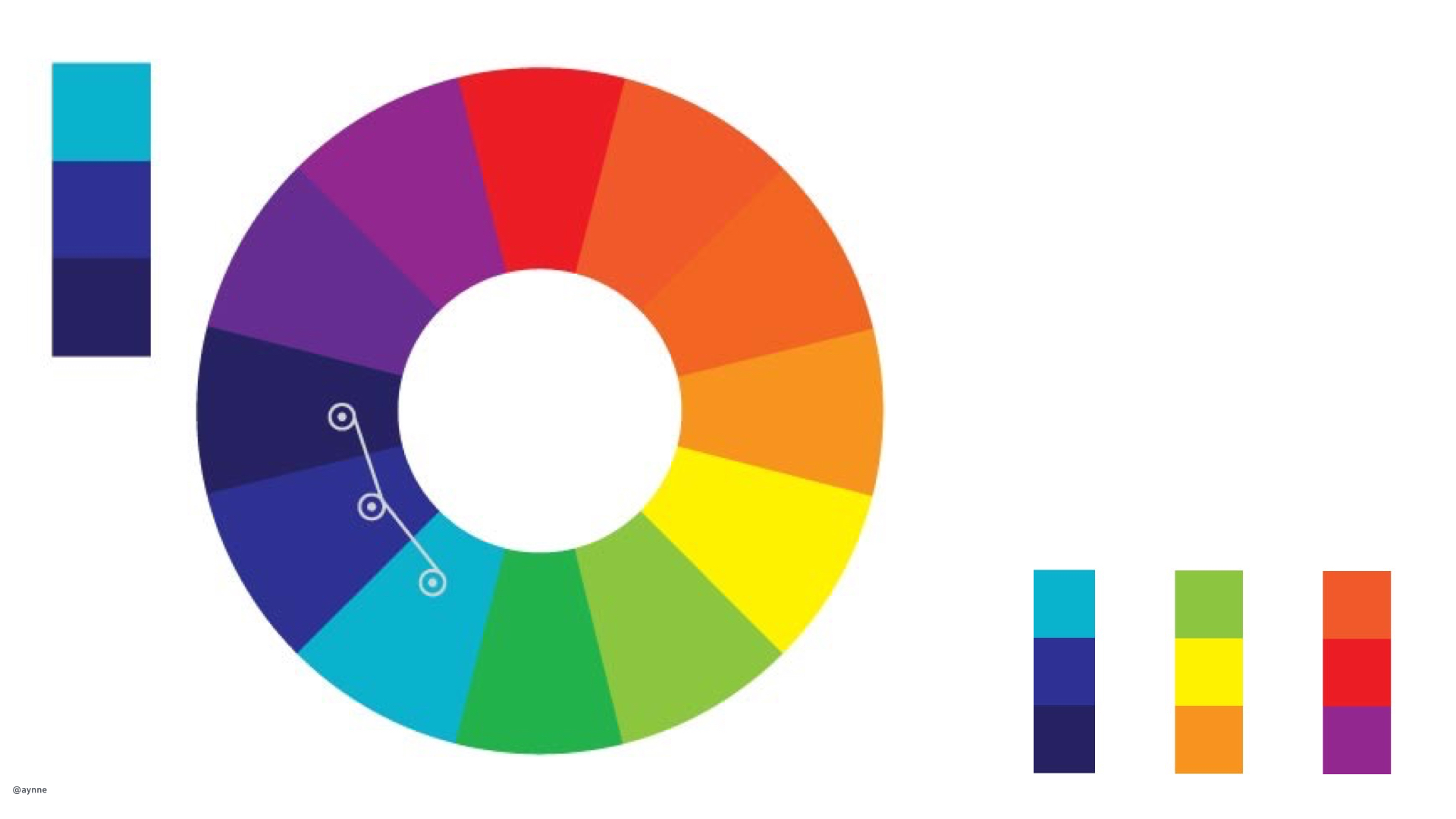
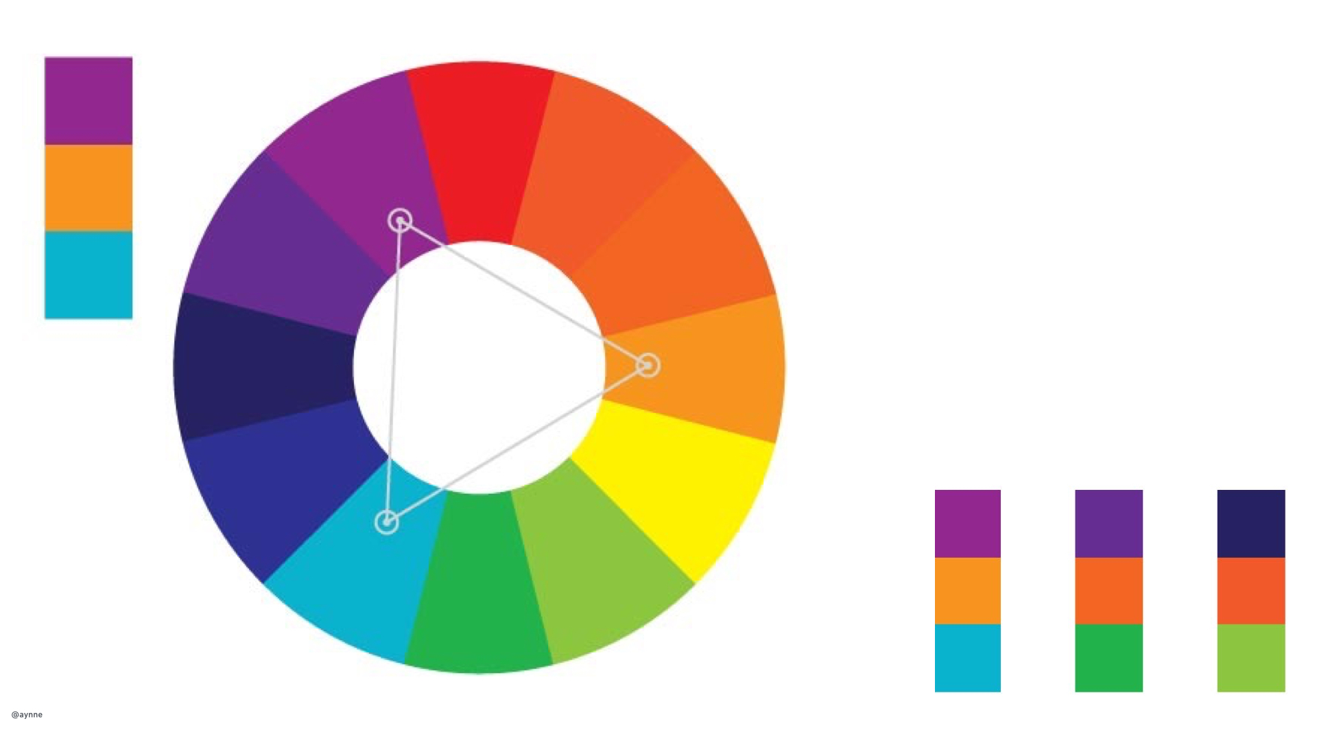
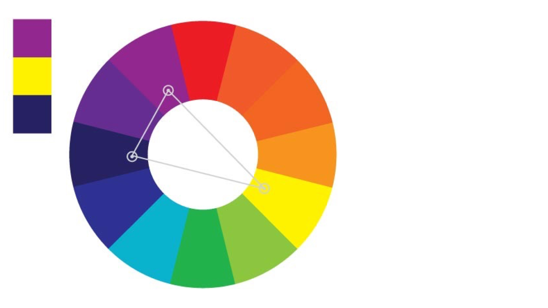
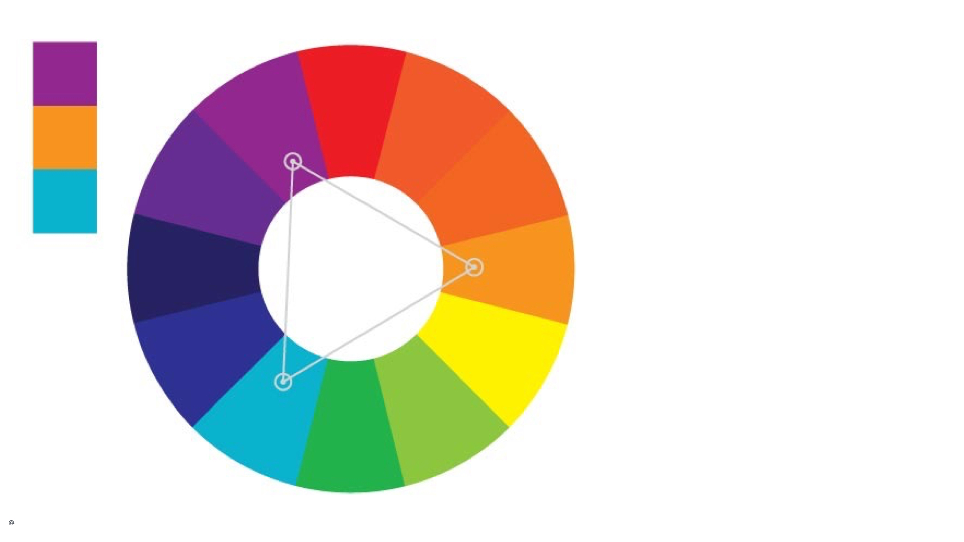
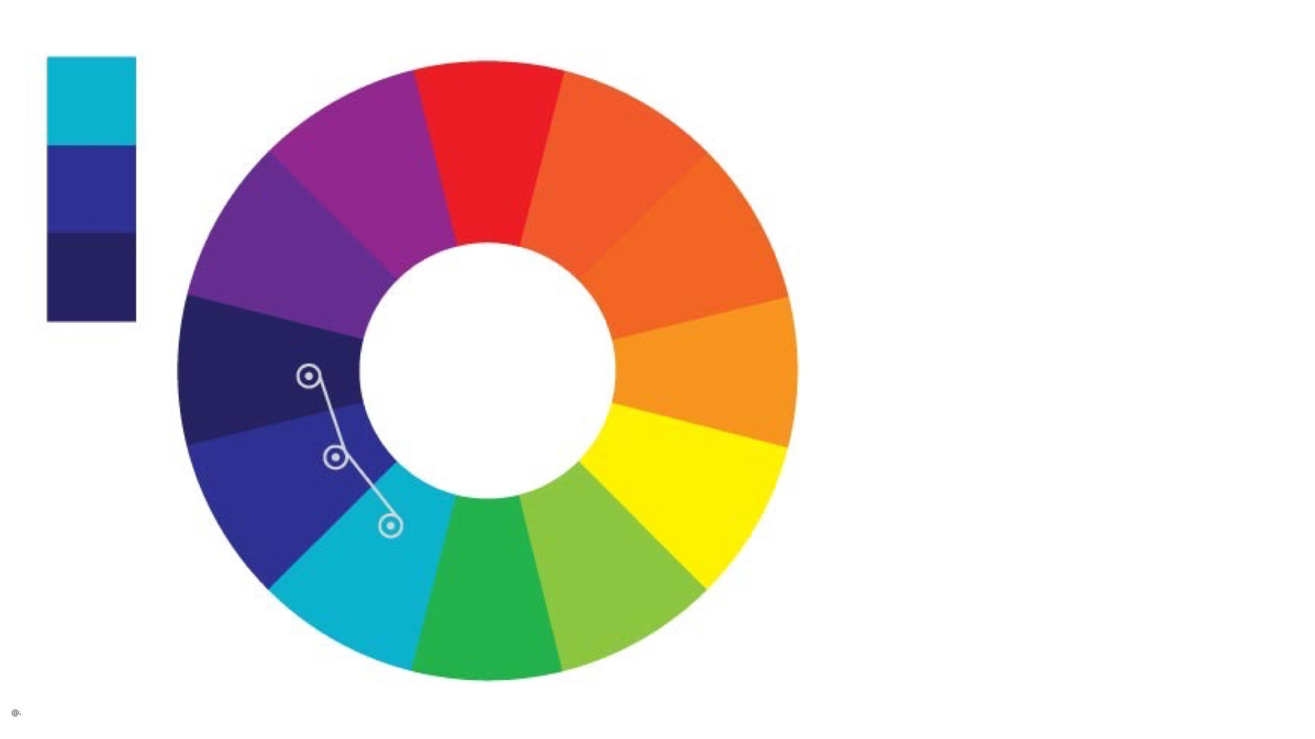
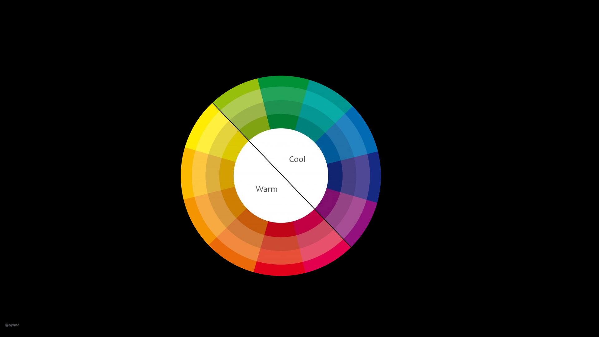
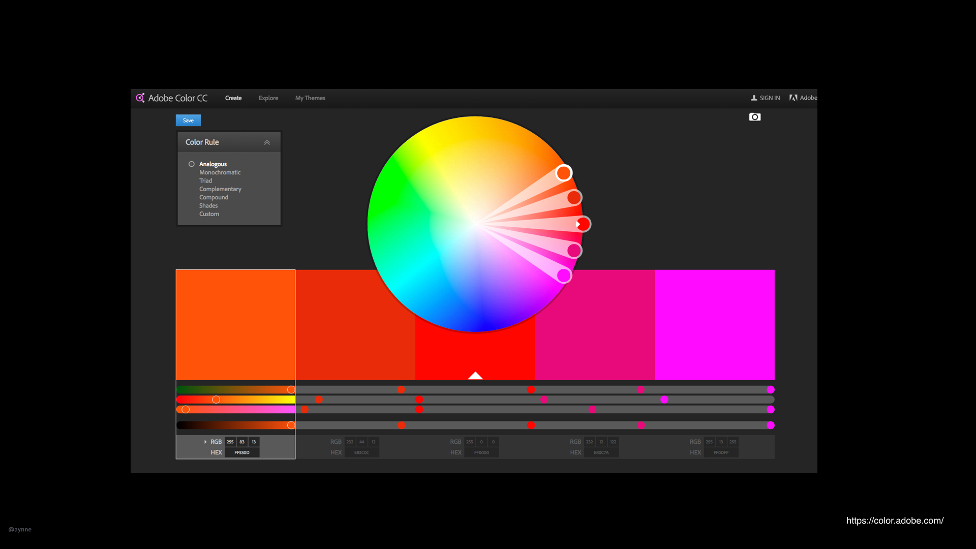
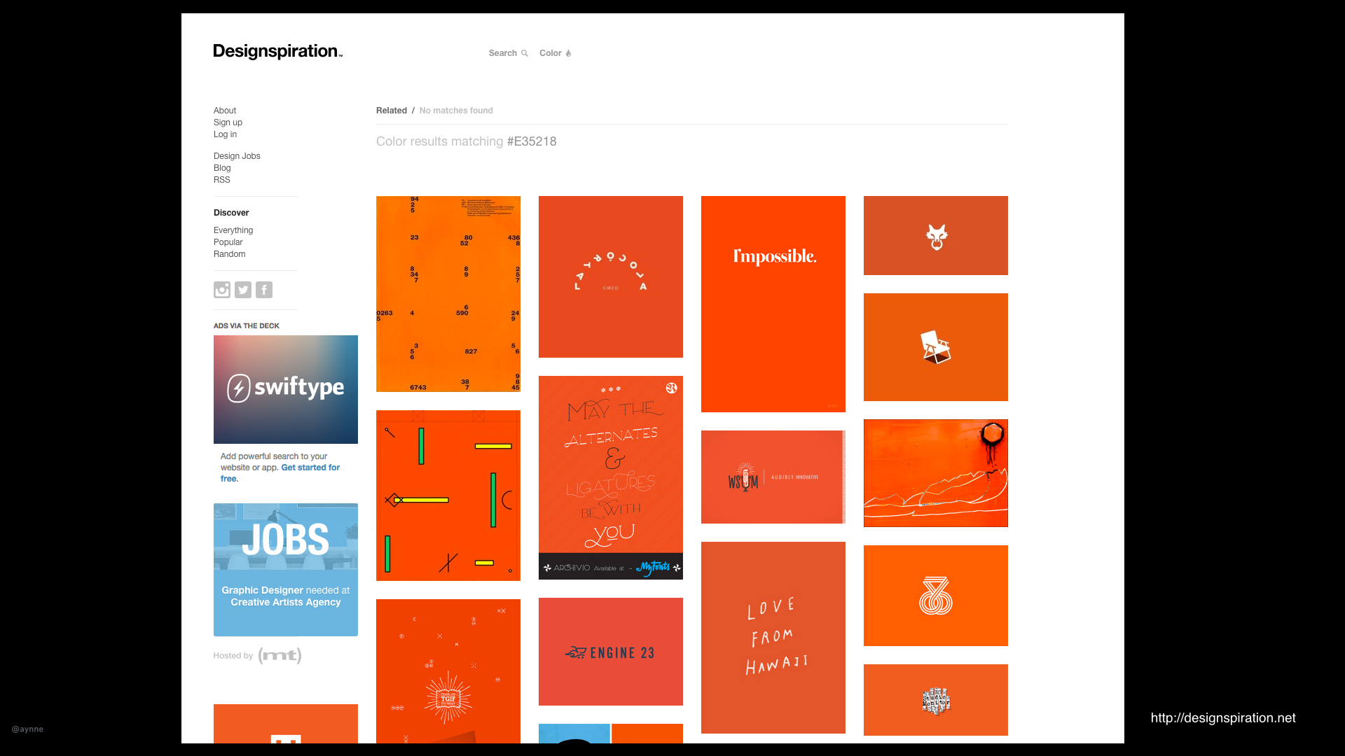
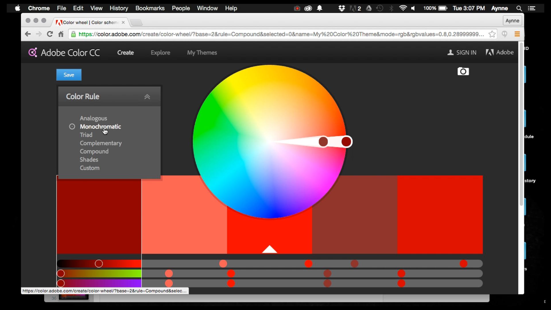
2). How do I choose color?
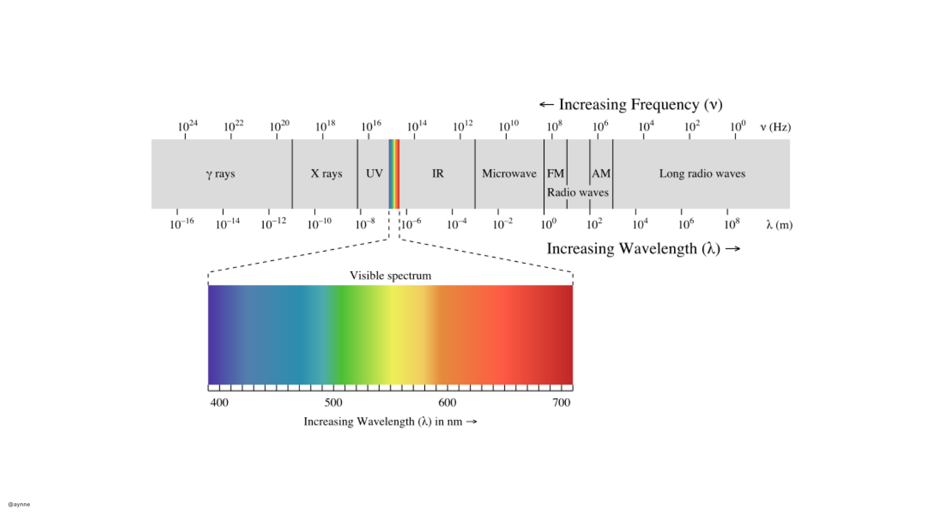
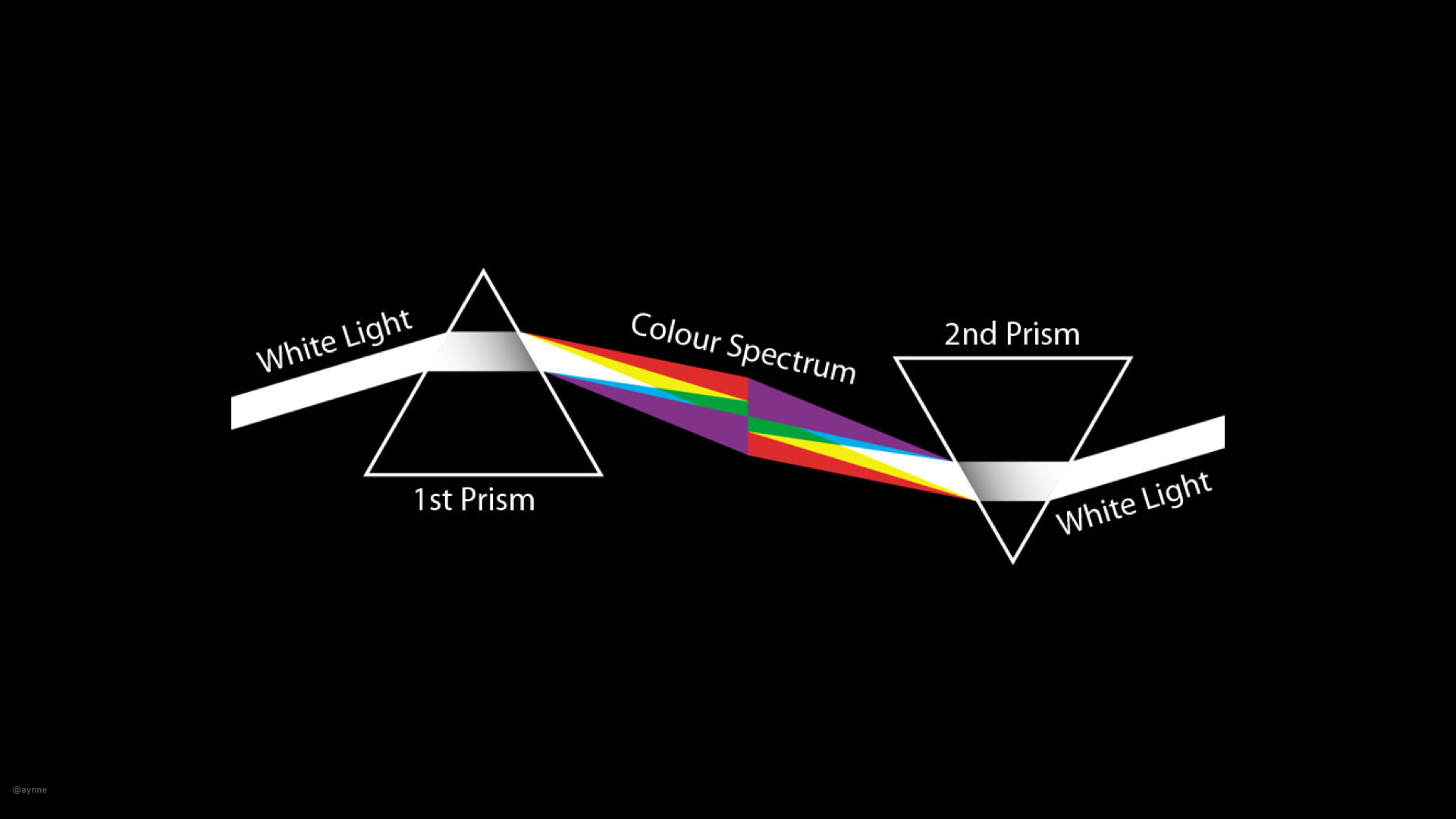
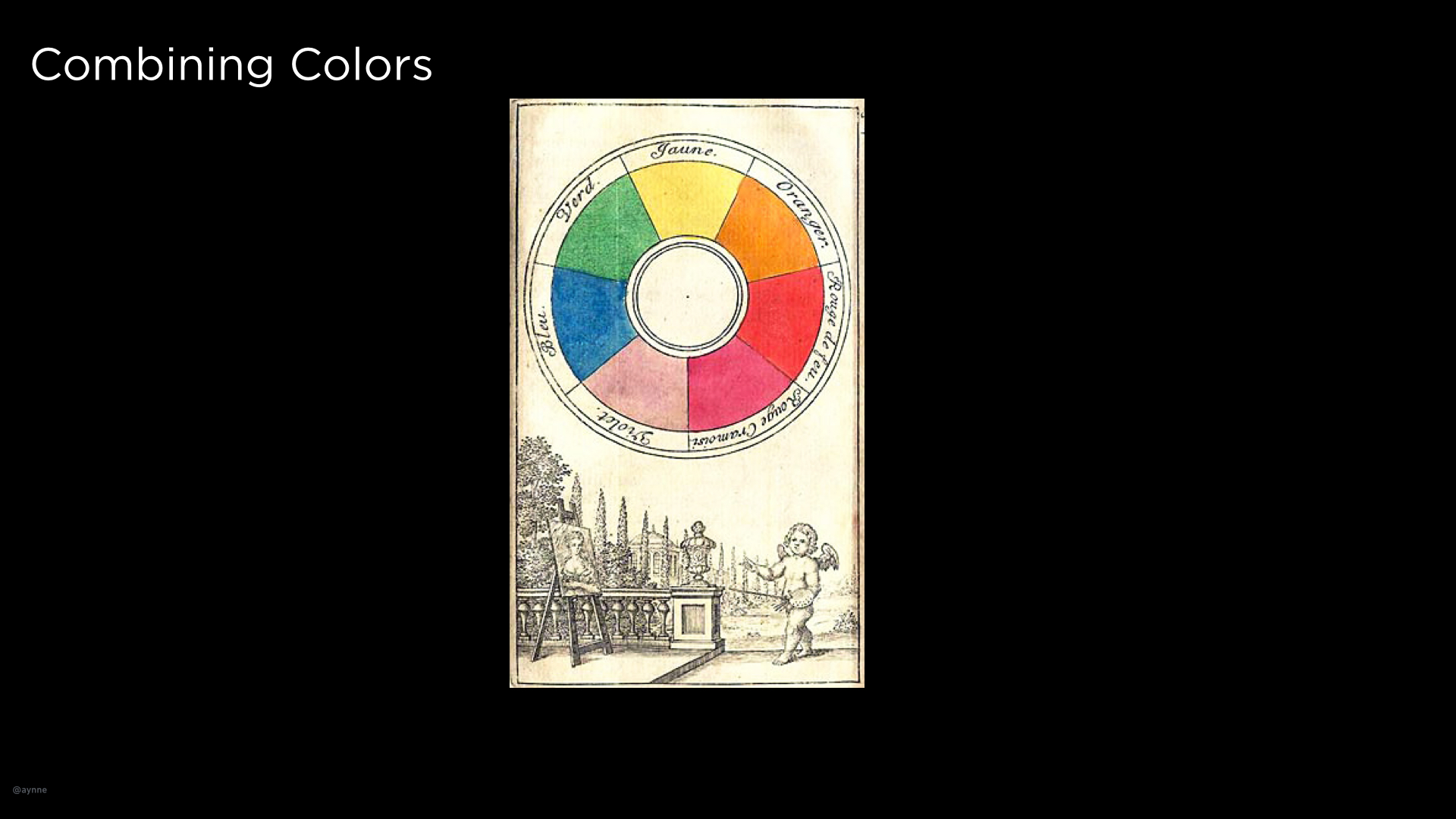
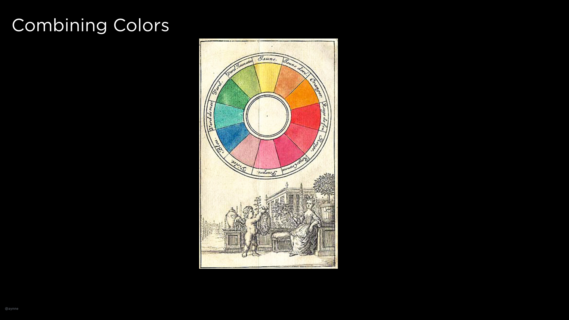
I'll be discussing color in an upcoming talk called The Construct of Color.
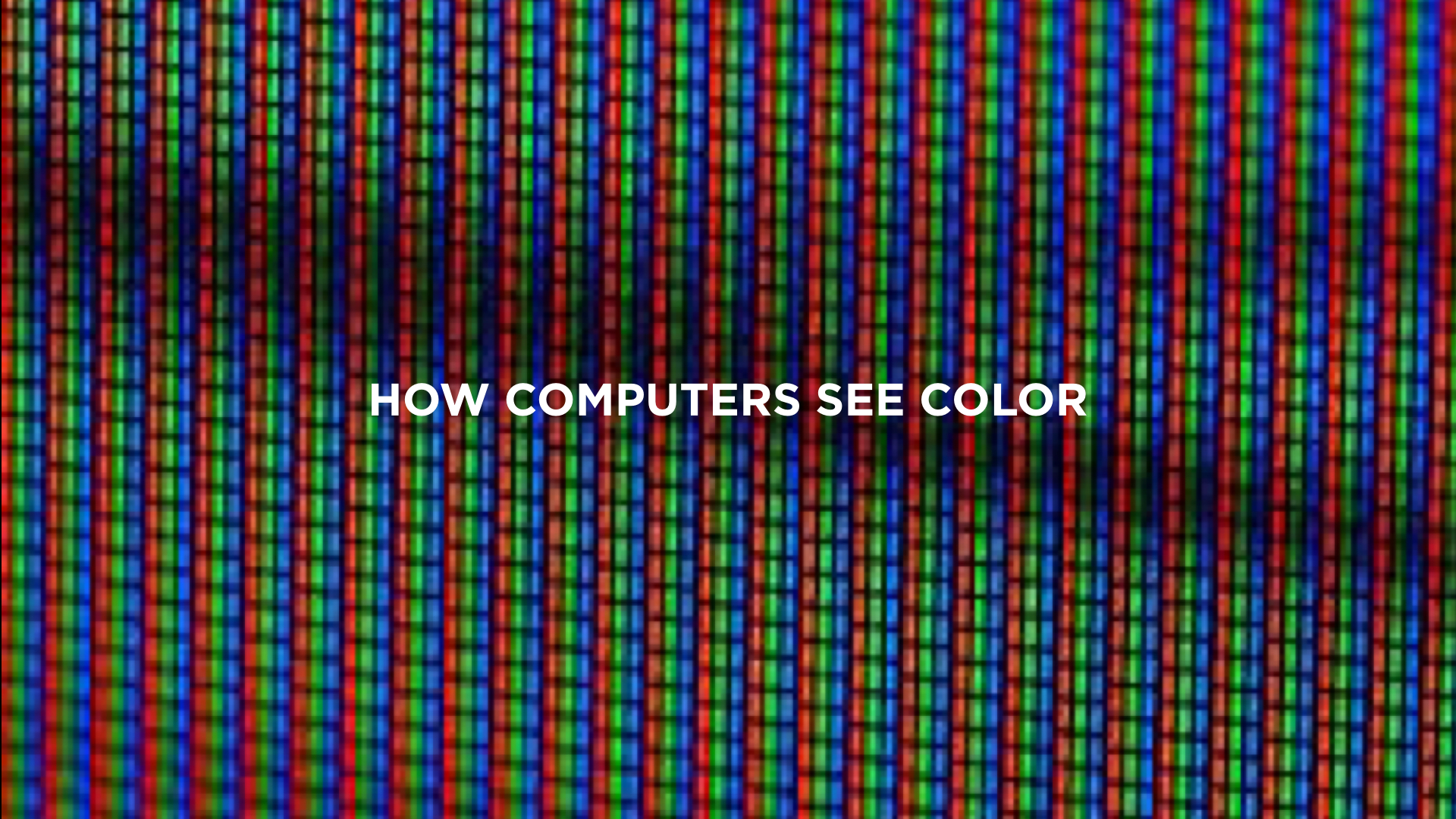
Random note: Keep in mind, when designing for the web you don't need to worry much about color because computers and monitors can handle millions of colors. However, different processors and screens handle color differently. If you are designing for devices (other than your basic smart-phone or tablet) don't assume the device can handle Millions, Thousands, 256 or even *gasp* 15 colors. When designing hardware, always talk to your dev/engineering team first before getting too deep into selecting color. In fact, you should be talking to your dev/engineering team all the time.
http://www.sitepoint.com/color-theory-101-2/
http://www.smashingmagazine.com/2010/01/color-theory-for-designers-part-1-the-meaning-of-color/
3). What tools should I use?
I'll be talking about great tools for prototyping in my The World of Prototyping lecture.
Bohemian Sketch, Illustrator, Photoshop, Invision and Keynote are the applications I use everyday.
https://backend.bohemiancoding.com/store/edu/
http://www.invisionapp.com/redeem/s/17166
4). What's the difference between a Typeface and a Font?
A typeface is a family of fonts, a font is a specific weight and size of a typeface. In web and application design you will mostly hear people refer to typeface as "fonts". I am not sure why but, this is probably because in many software applications type selectors are labeled font and CSS uses "font" to refer to type.
And also some synonyms frequently used: Logo/mark, stroke/border because code.
5). When do you prioritize aesthetics with usability?
They go hand in hand. Color, size, placement, hierarchy, layout should enhance not compete with usability.
Obviously, designing something for a consumer is very different than designing for task optimization.
For example, you would not design forms fields in a wizard for a frequent task on the UI of a customer service rich internet application used by a customer service representative (unless you are cruel and hateful).
You might break up a form in smaller chunks, however when you are designing input fields that have validation that requires a server call and you want to make error correction and control easy for a new consumer. Example: creating a user-name and password for a new account. This involves checking to see if this username or email is already in the database depending on what is being used as an unique I.D and you would want to have the user chose a new id or recover their old one before moving on to the next field. There are some simple tricks that look great and enhance usability so the user need never know of the complexity or that there even was an error depending on how elegantly the ui is designed.
Ah, forms. This is a topic for another time.
7). When/Why would you use different typefaces?
It depends on many factors:
Brand:
First determine if there is a current brand digital style-guide. Most brands have already thought about how their brand extends to the digital medium and to devices and other medium (and if they haven't, I can help them do that ;-) ). If not, carefully consider the current style and ask:
What overall look are we trying to convey?
Sophisticated? Urban? Conventional? Hip? These lend themselves to a very different style for key typographic elements like Headlines, and Headers. One should never go crazy on the type to to the work of driving the visual style. Body type should be legible first and only.
I will be talking about this extensively in the upcoming Creating the Digital Brand lecture.
Some inspiration: http://mediaqueri.es/
More on Typography here: http://www.sitepoint.com/typography-101/
What screen size are you designing for? What is your medium and what is the context?
What looks good on the web might not look so great on mobile. What works on a tablet might not work on a watch. Car touch screens require much larger and legible size. If you are designing for something tiny and under 7 pt aliased fonts actually work better. There are lots of variables to consider.
The most compatible fonts across all platforms are: Georgia, Palatino Linotype, Times New Roman, Arial, Trebuchet MS, Verdana, Courier New.
Generally, UI, form labels and help text should use a highly screen-legible san serif font like Arial, Verdana, Trebuchet or Tahoma. Tahoma and Verdana is slightly wider, Trebuchet is slightly more condensed. For experiences optimized for reading, do your readers eyes a favor and stick with well crafted serifs Times New Roman, Georgia, Baskerville are easy on the eyes for dense copy. There are LOTS of choices out there. https://www.google.com/fonts
And please, for love of humanity, never, ever, ever use Comic Sans.

Student projects
Some selections from the students of my SFSU six night Interaction Design course.


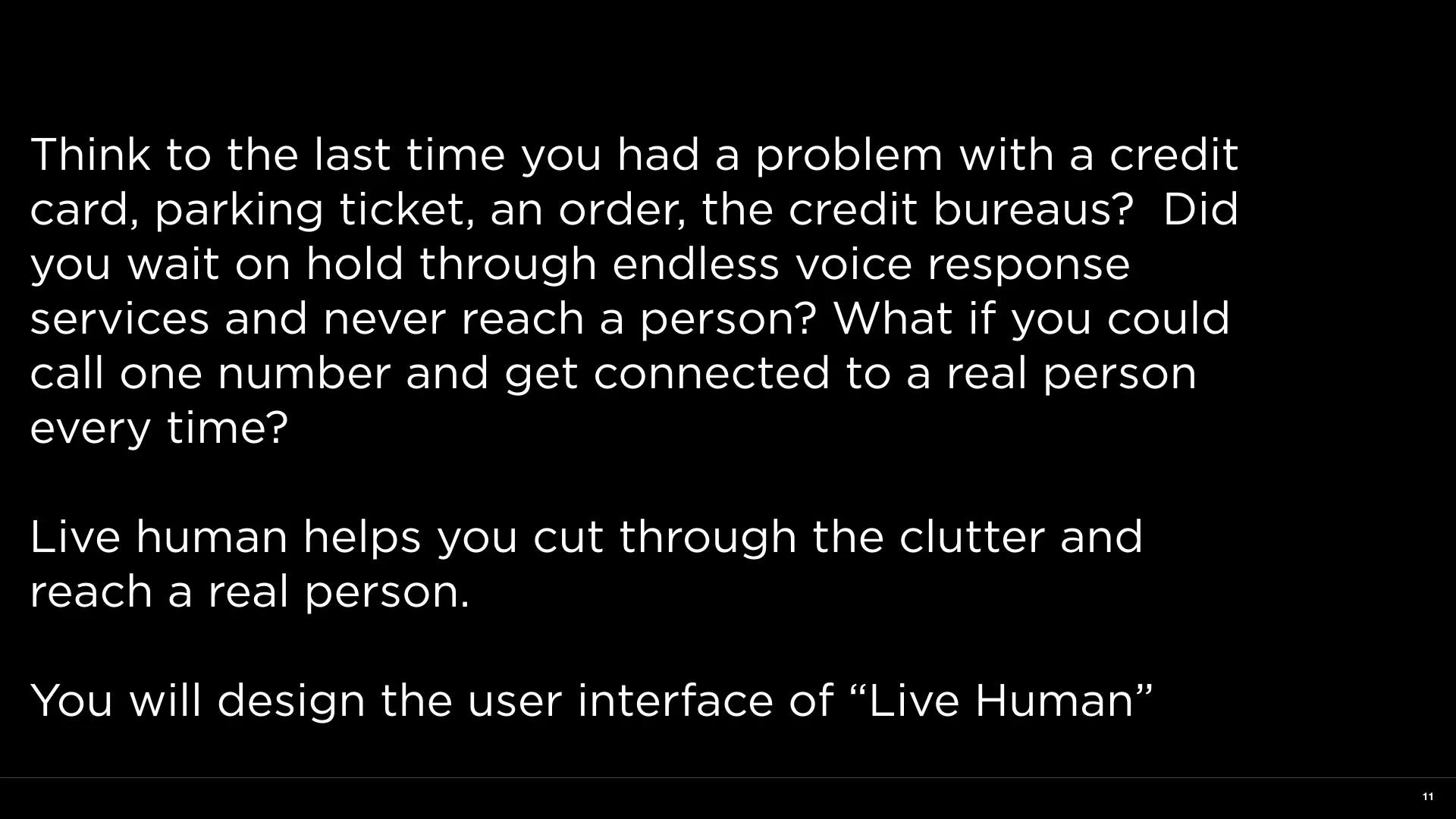
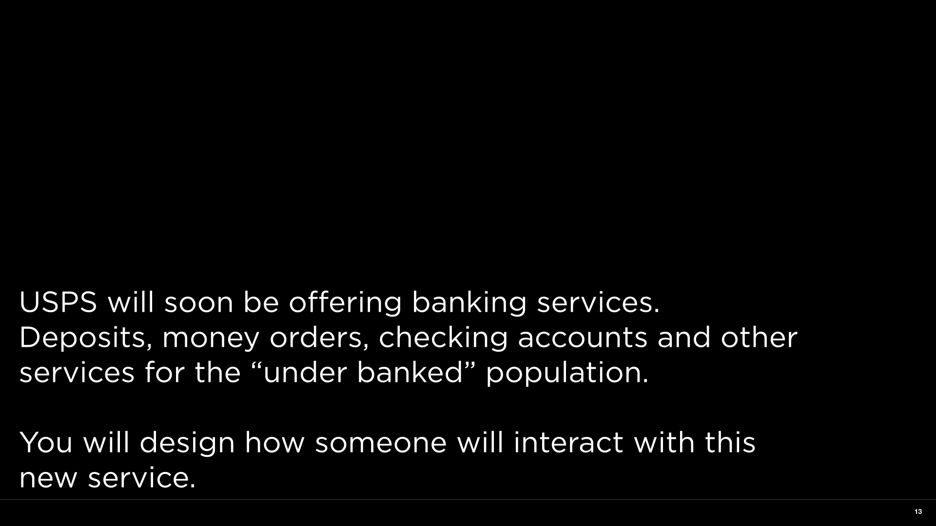
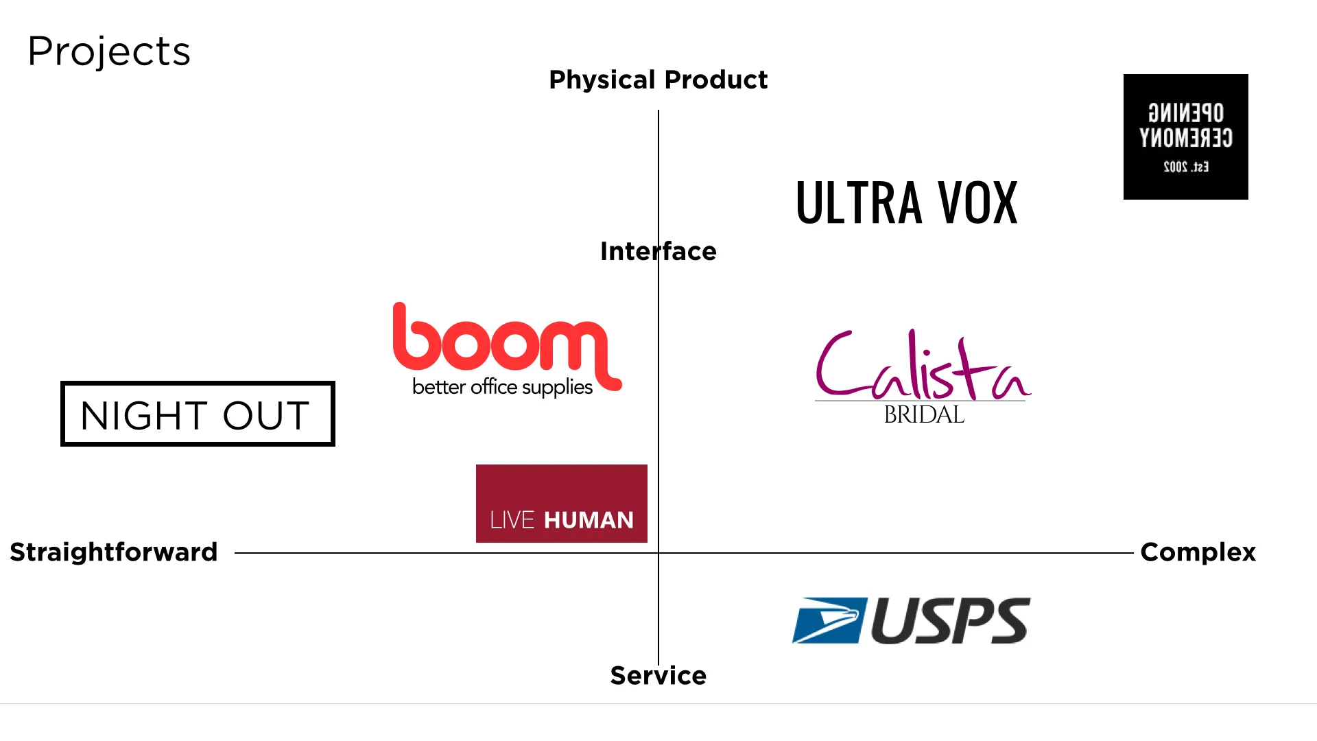
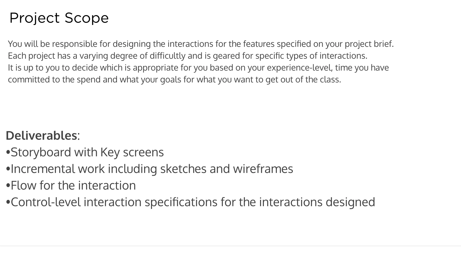
The project briefs I gave the students.
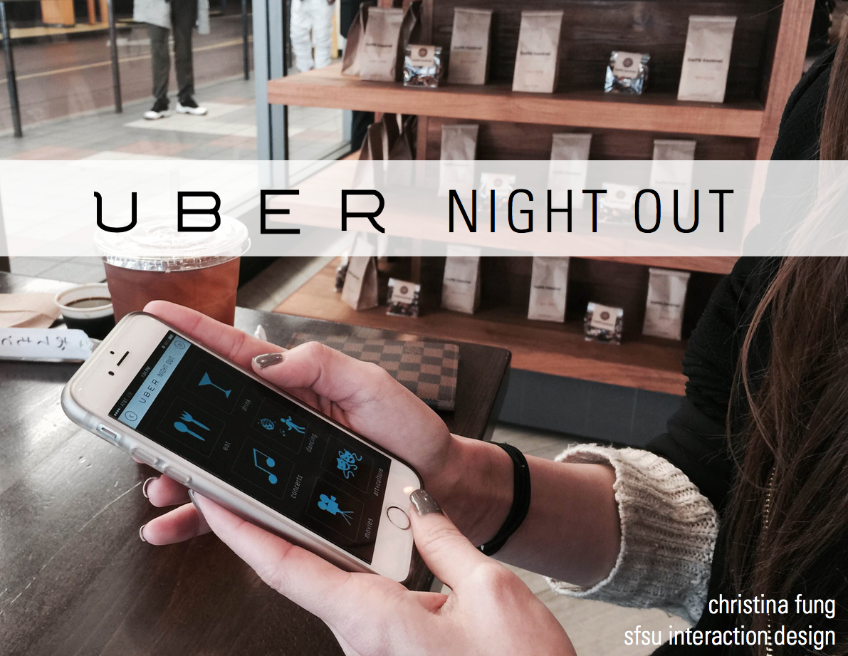
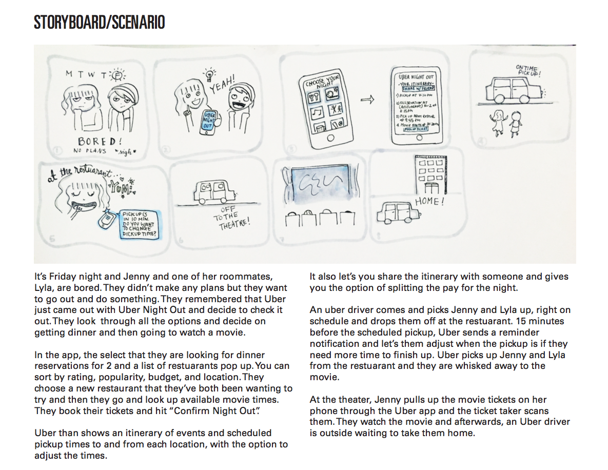
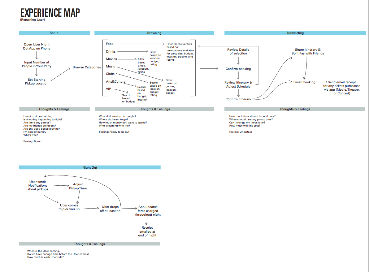
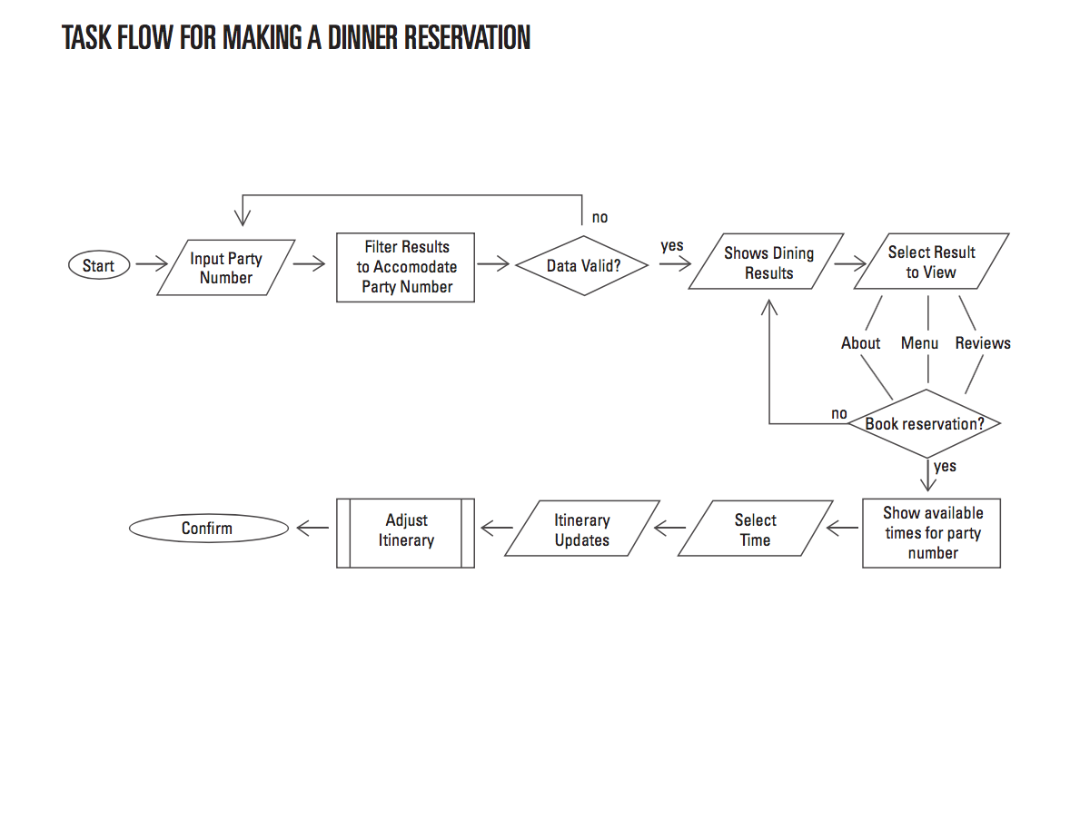
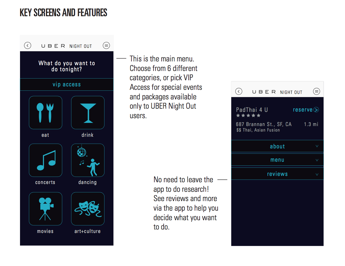
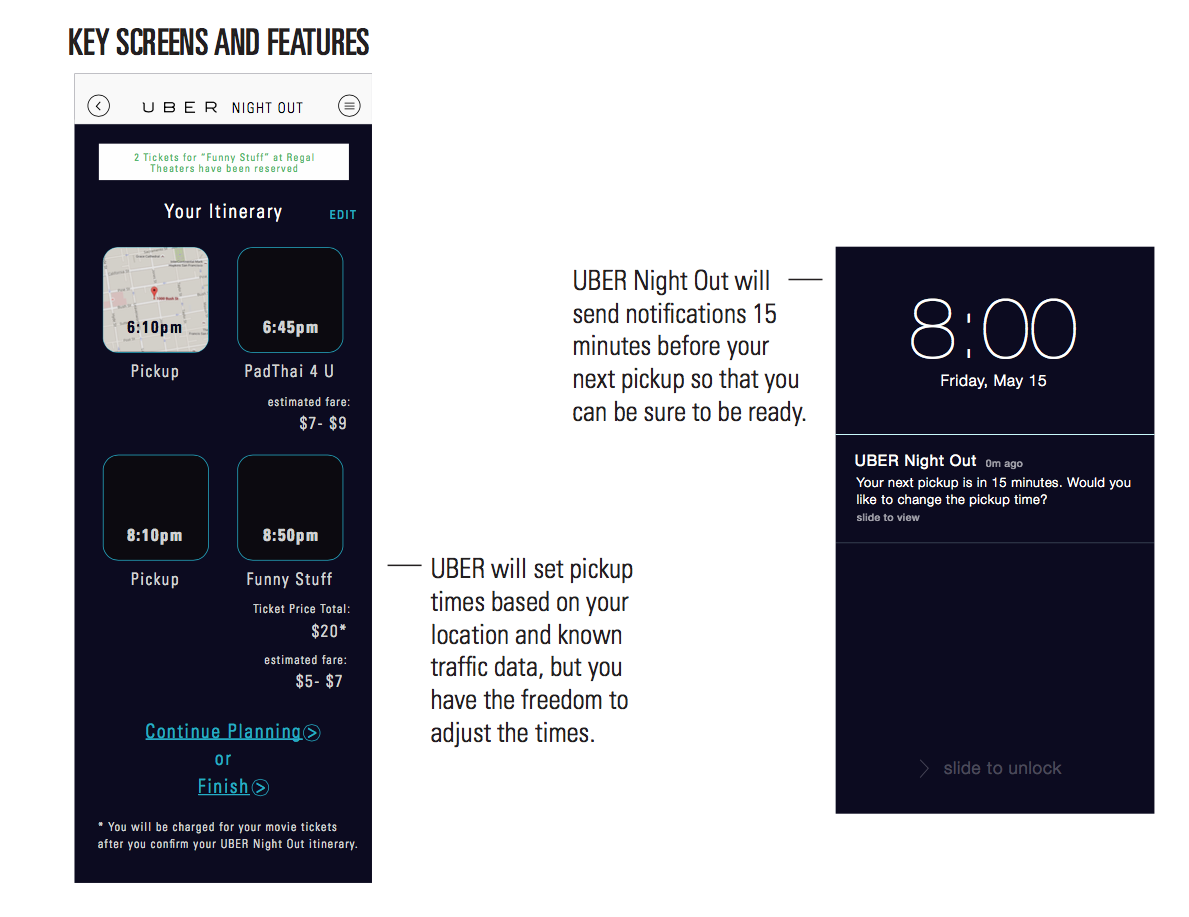
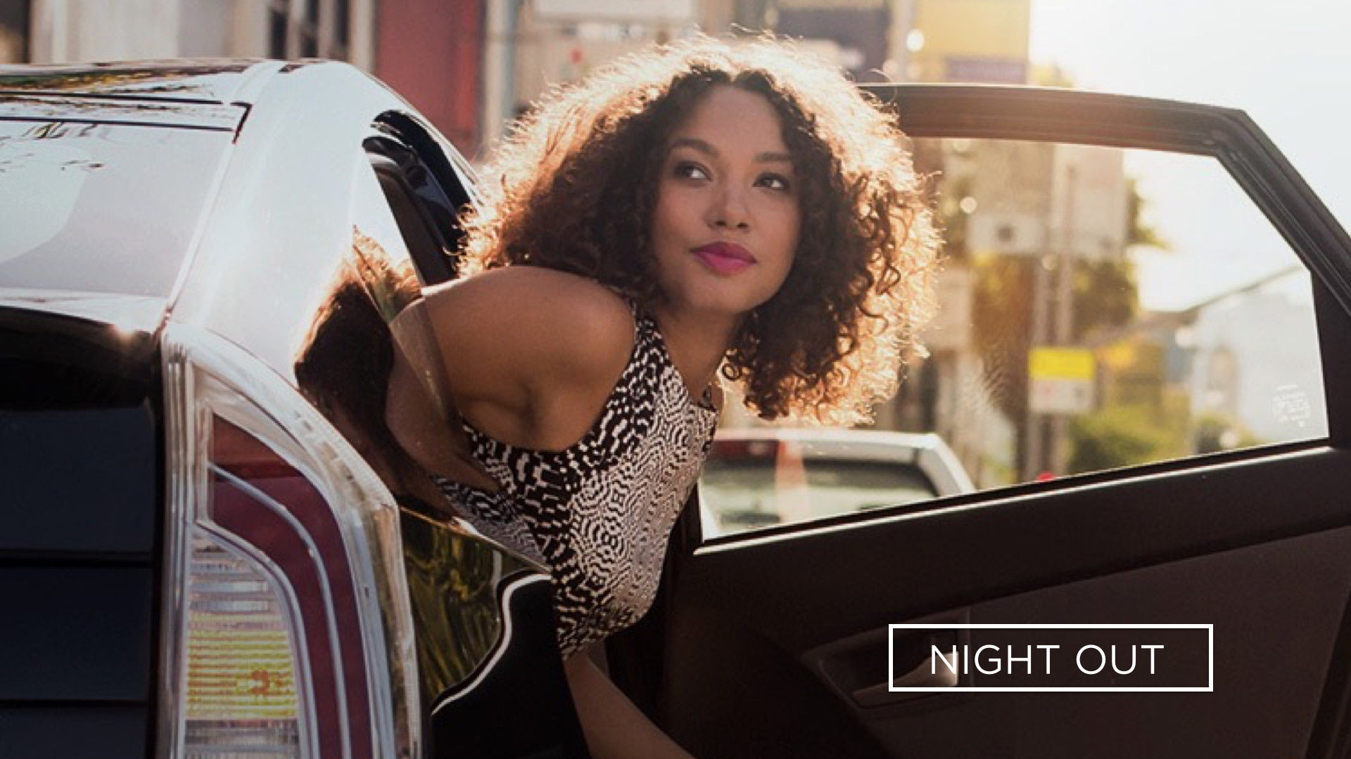
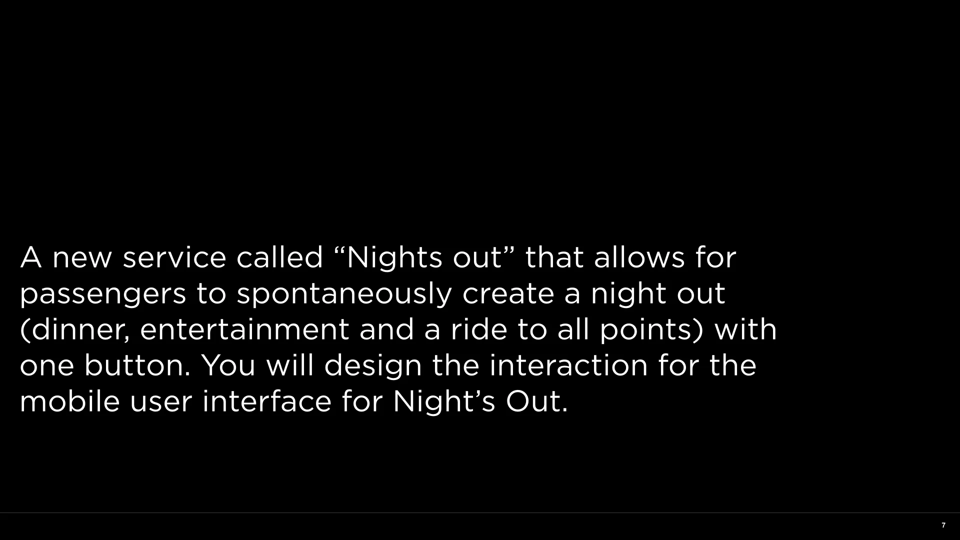
Christina Fung, Night Out
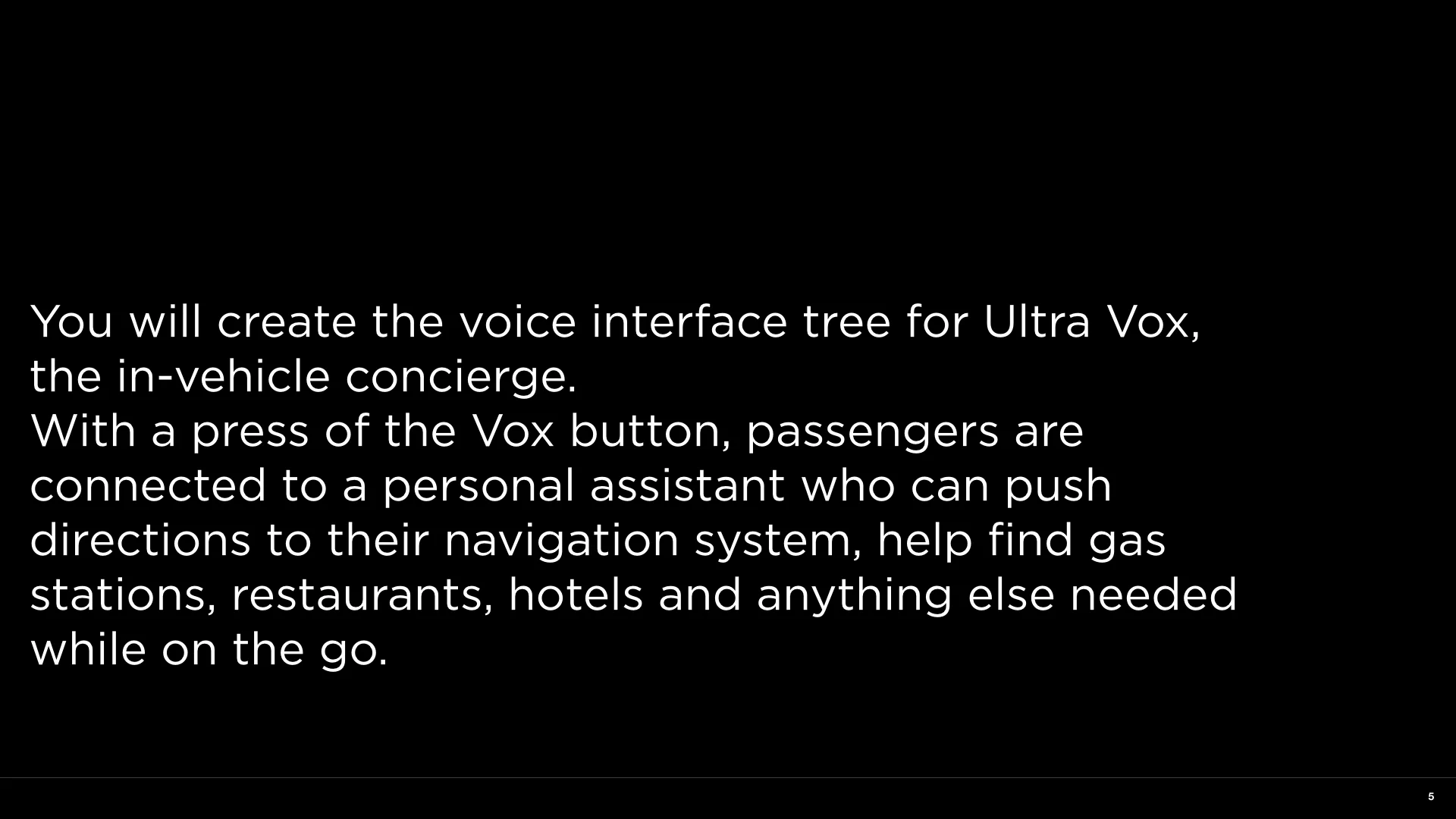
Phillip Casiano, Ultravox

Chloe Li, NightsOut
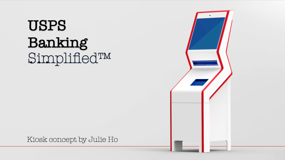
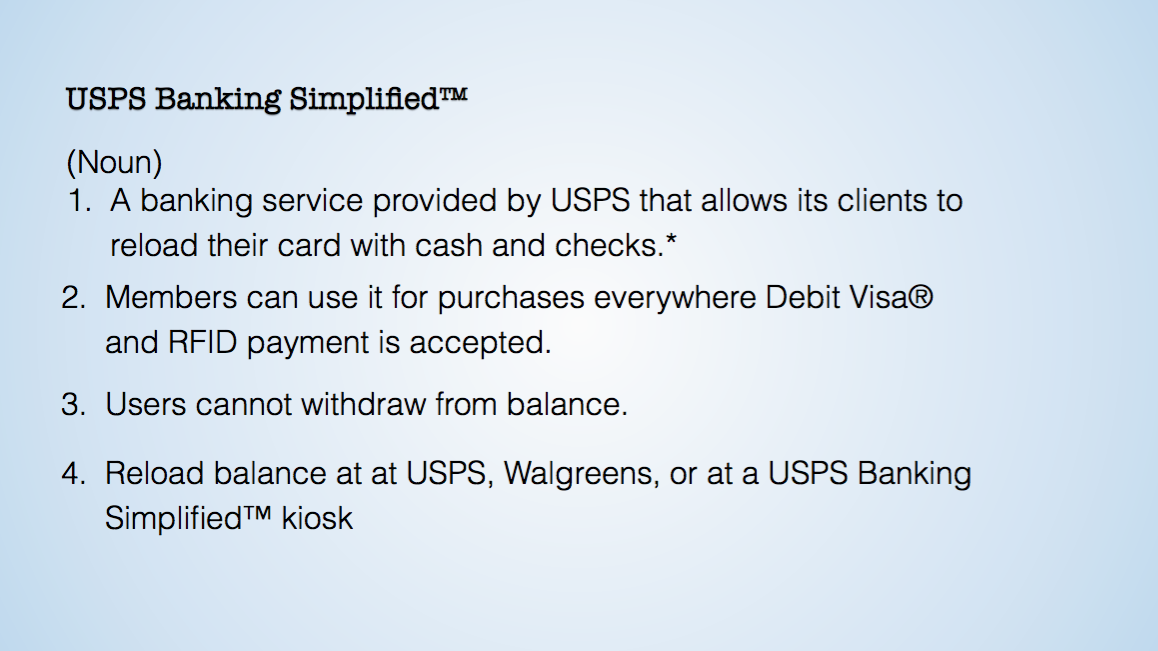
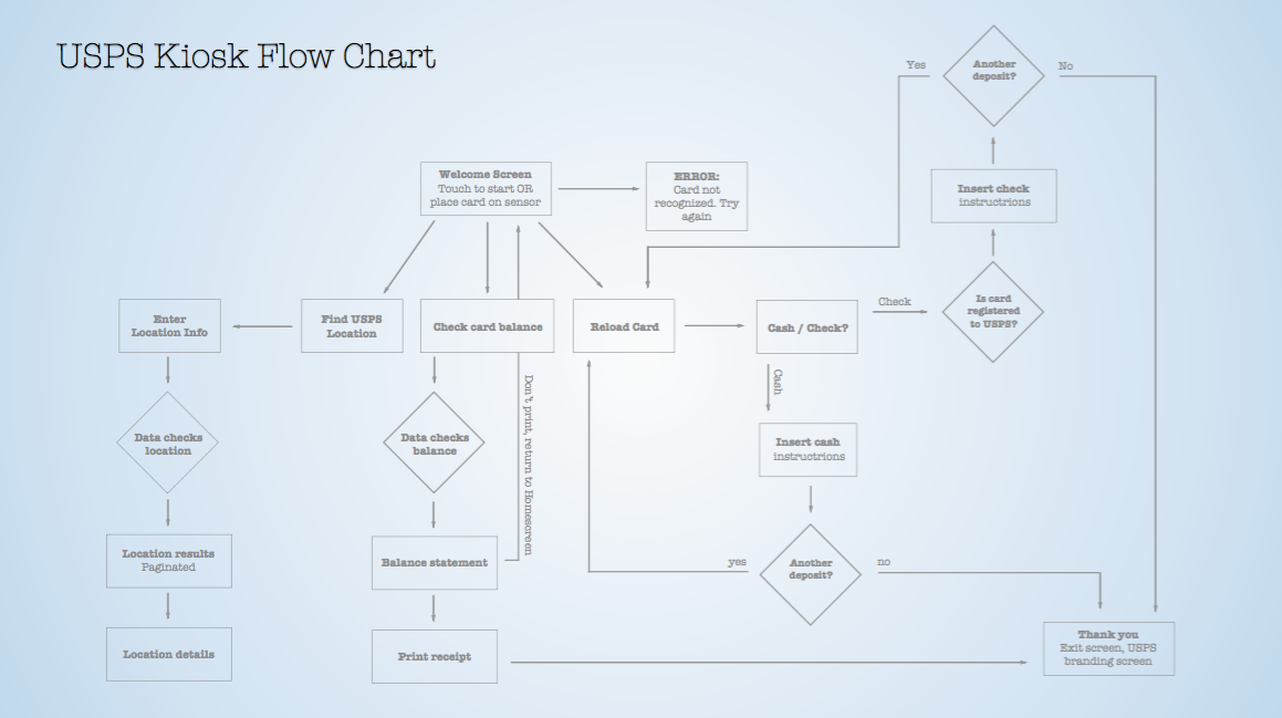
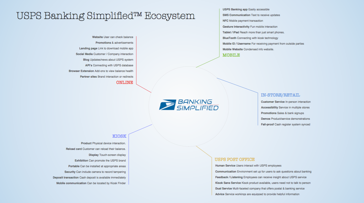
Julie Ho, USPS Banking Simplified Banking for underbanked citizens.
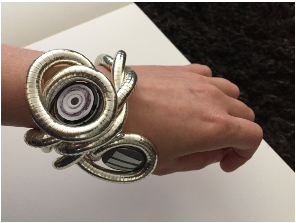
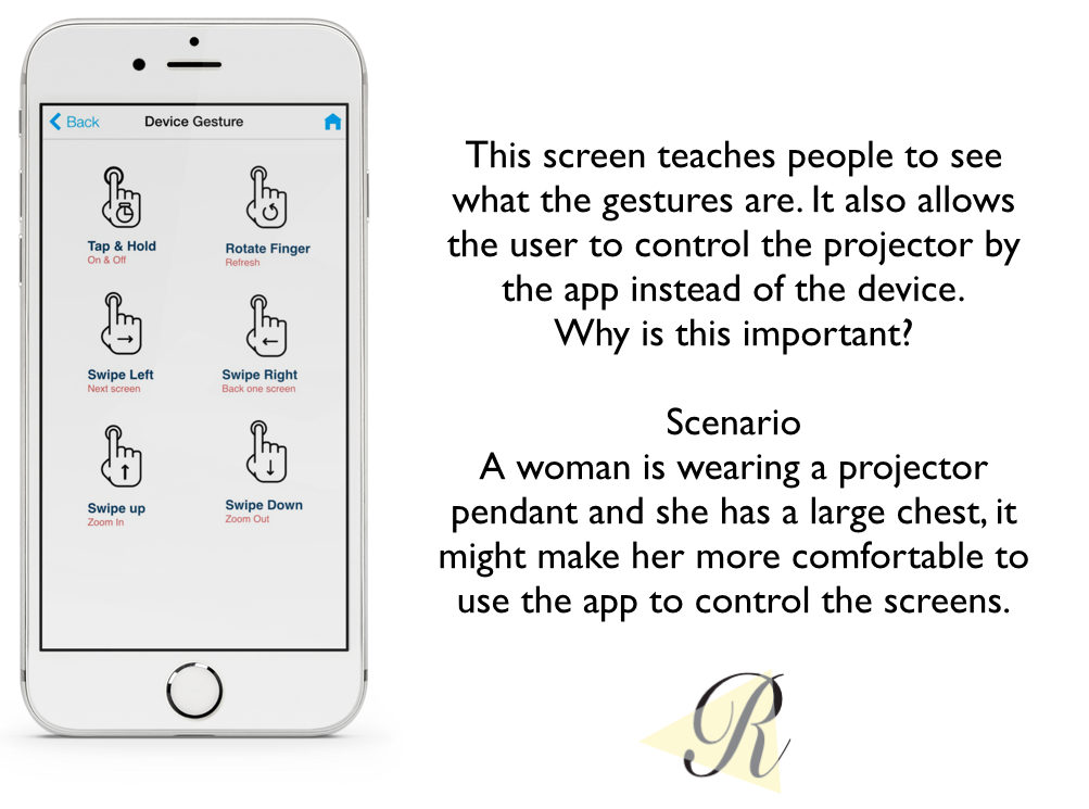
Cindy Clarke, Reverie Memory Projection Watch