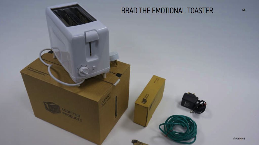
Glam Studio
Design Strategy for a cosmetics retailer. Glam Studio was the output of a digital strategy pitch for Sephora.
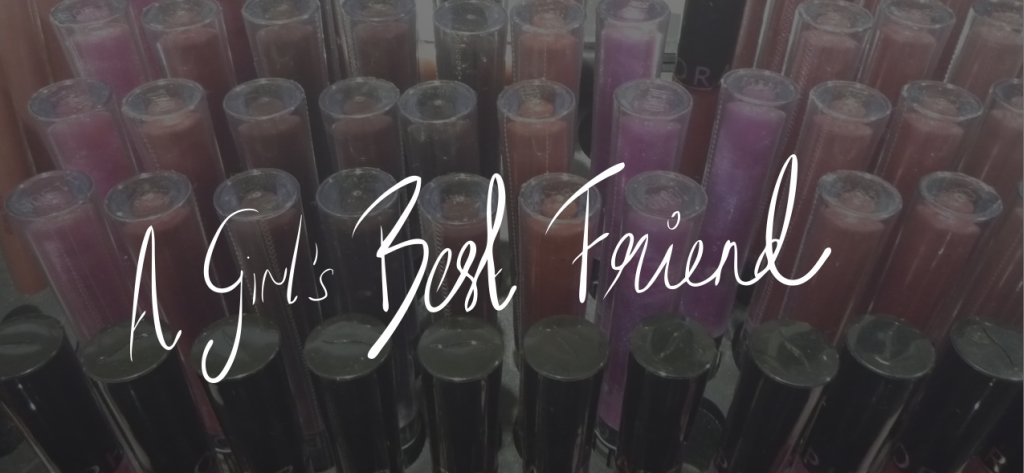


GLAM STUDIO
Glam Studio was the output of a digital strategy pitch for Sephora.
The Brief
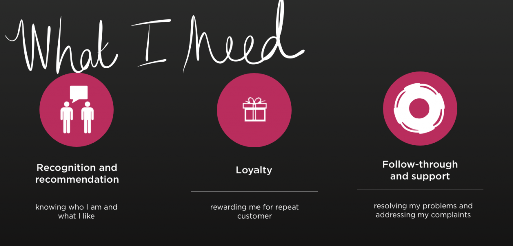
Sephora wanted to explore how to use the iPad as a potential eCommerce Platform.
My Role
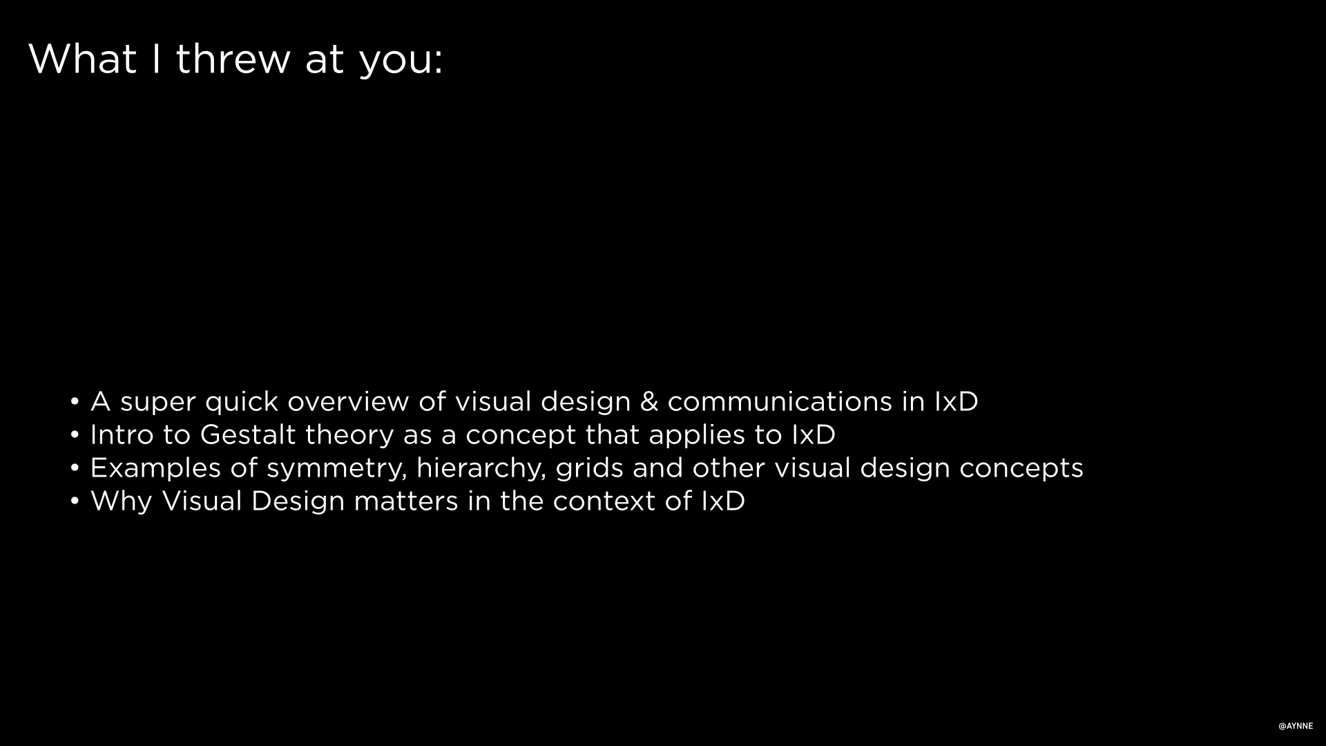
Design Strategy
Approach
Conducted design research
Spoke to 35 female Sephora customers in the target age group. I asked a series of questions centered on what brands they enjoyed using, what devices they frequently used, that apps they used most and what activities they tended to use their iPad for.
Competitive Analysis
Looked at a range of other cosmetic retailers, department stores and makeup related games. I did an analysis of what the range of offerings were, what was getting the most downloads and usage and what the nature of the features on these applications.
Organizational Research
Since this product would ideal go to market within a year, I spoke with the e commerce, point of Sale group and other people in the organization to analyze what a realistic scope for how robust the eCommerce experience could be based on the current or easily repurposed SKU features they already had. I also looked at what capabilities, bandwidth the organization could support in the timeframe allowed.
Metrics of success
Worked with the team to identify what metrics we would use to determine usage and success of the product as well as what the company hoped to get out of the investment in this channel.
Deliverables
A comprehensive presentation of findings, a persona of the specific customer archetype for this product channel and a series of recommendations for product, services and their rollout strategy.
The samples show a small part of the market research, customer personas from segmentation and a few of the concepts that came out of the retail digital product and service strategy.

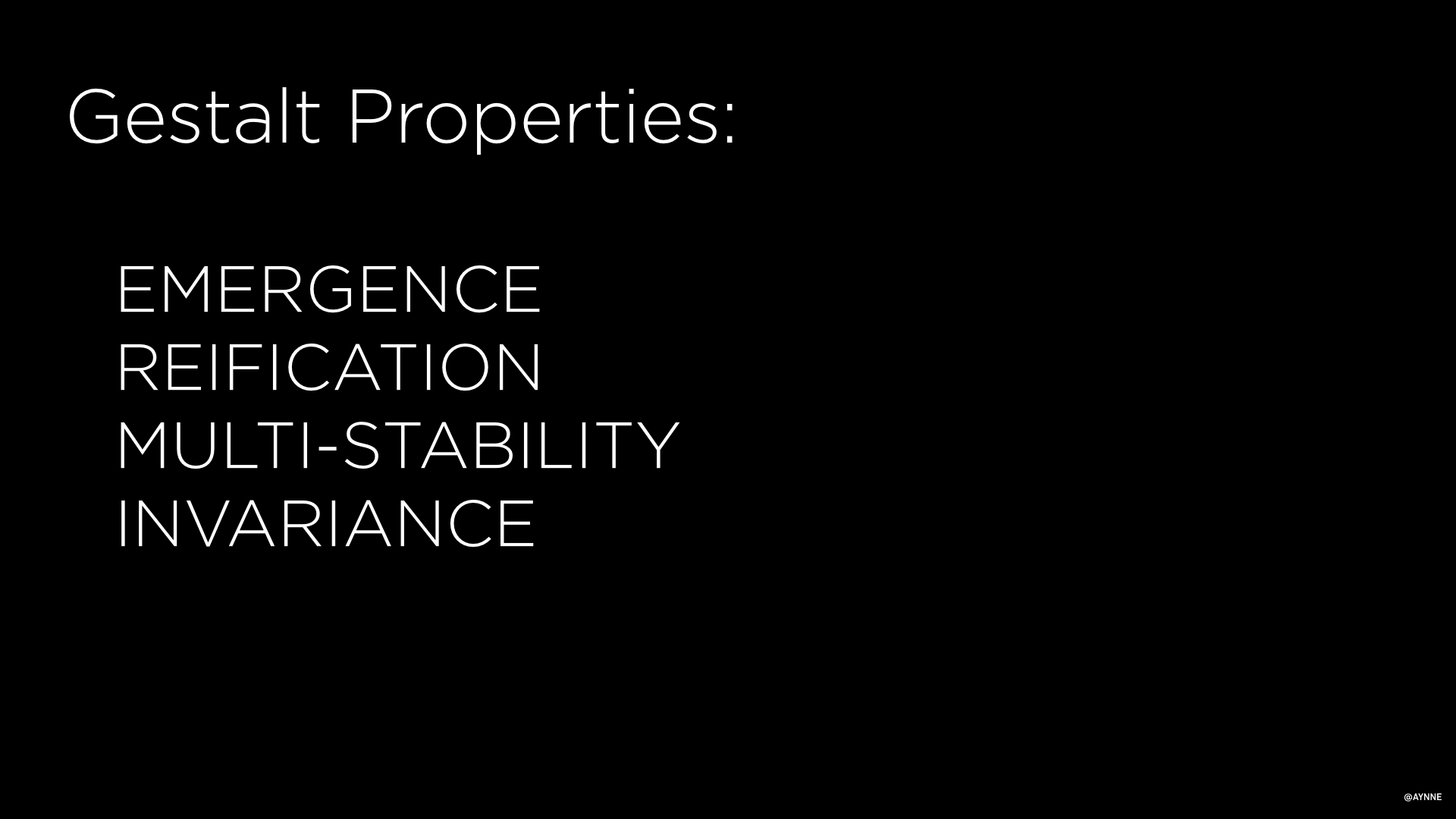
Curiosity
A panel I was on at the Apple Store

Curiosity and the creative mind

Talking about my narrative video and photography work
I spoke on a panel about curiosity at The Apple Store in San Francisco last month.
I decided to dissect my own creative process and the loose and abstract connections I make when I create my design or art work. I thought about how these two activities of creation are different and the ways they are the same.
Curiosity is human - I am a person who spends my days dealing with the world of computing. I love technology but a machine lacks curiosity and making strange unexpected connections is one of the most amazing characteristics of our humanity.
Curiosity is the force that drives creativity - it is the core of creativity and with it ideas, innovation, and new ways of being are possible.
Curiosity begets curiosity. One question leads to another which leads to another. And it is also contagious. Being a person who is curious about the world sparks it in others.

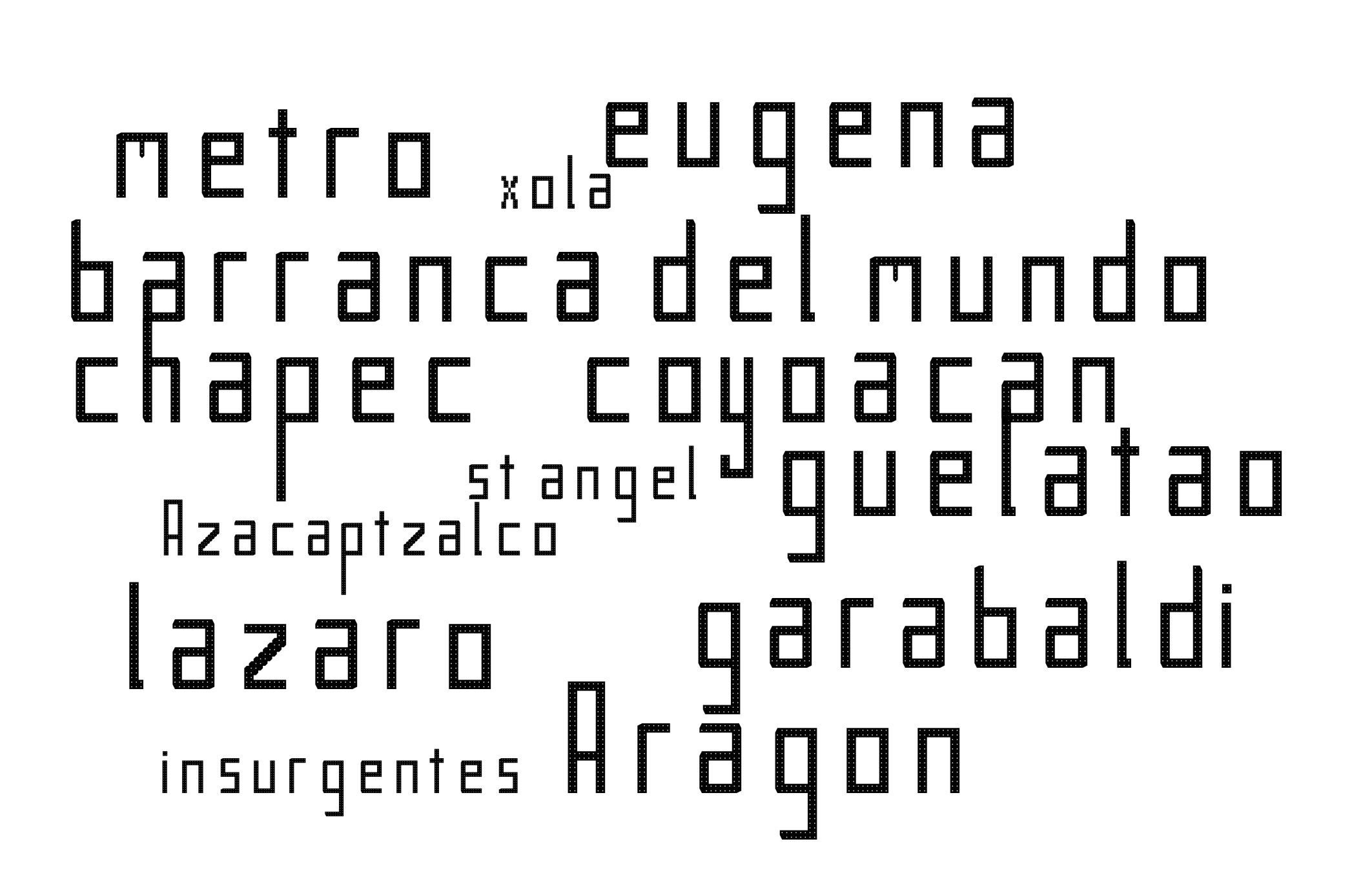
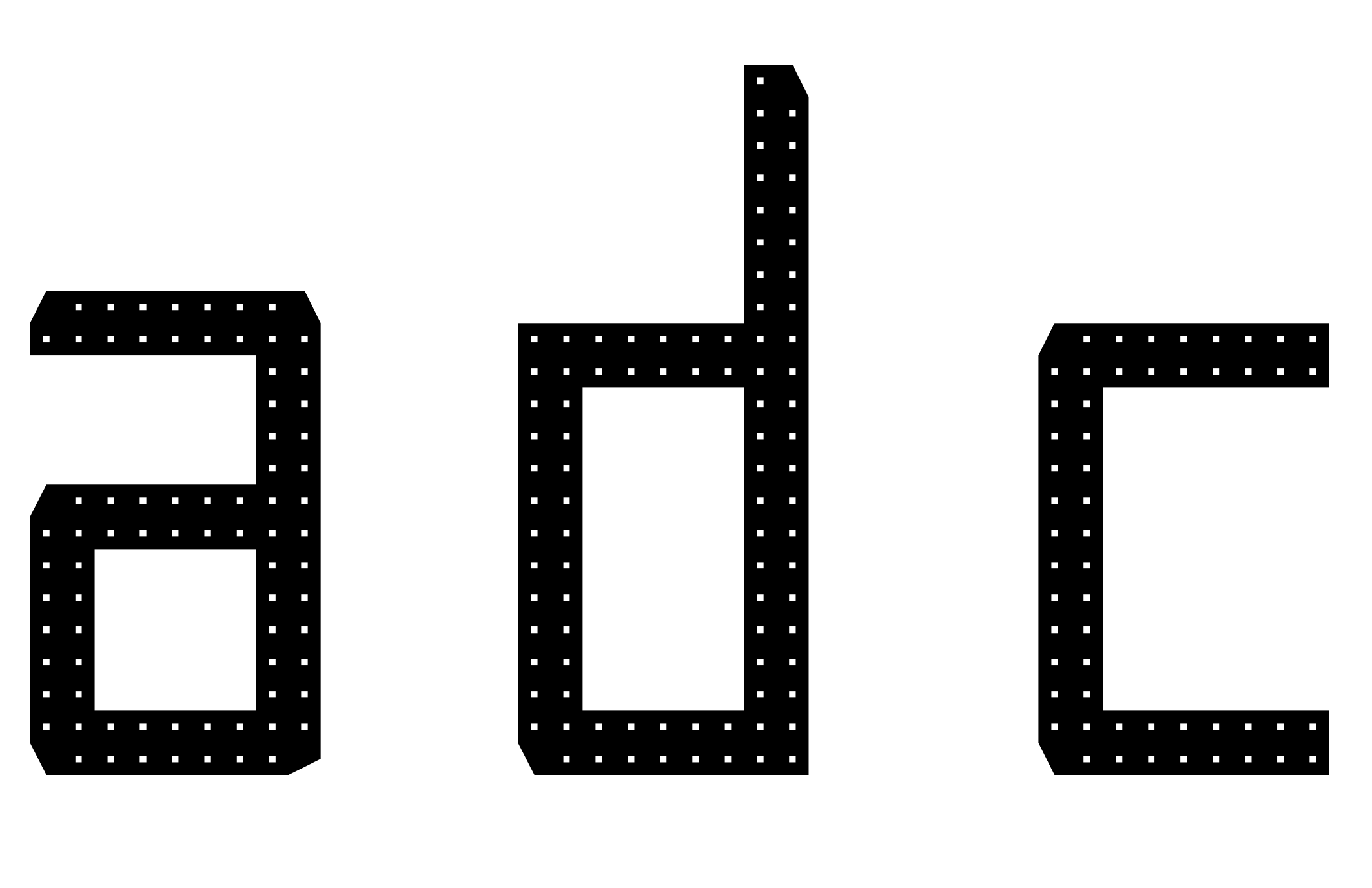
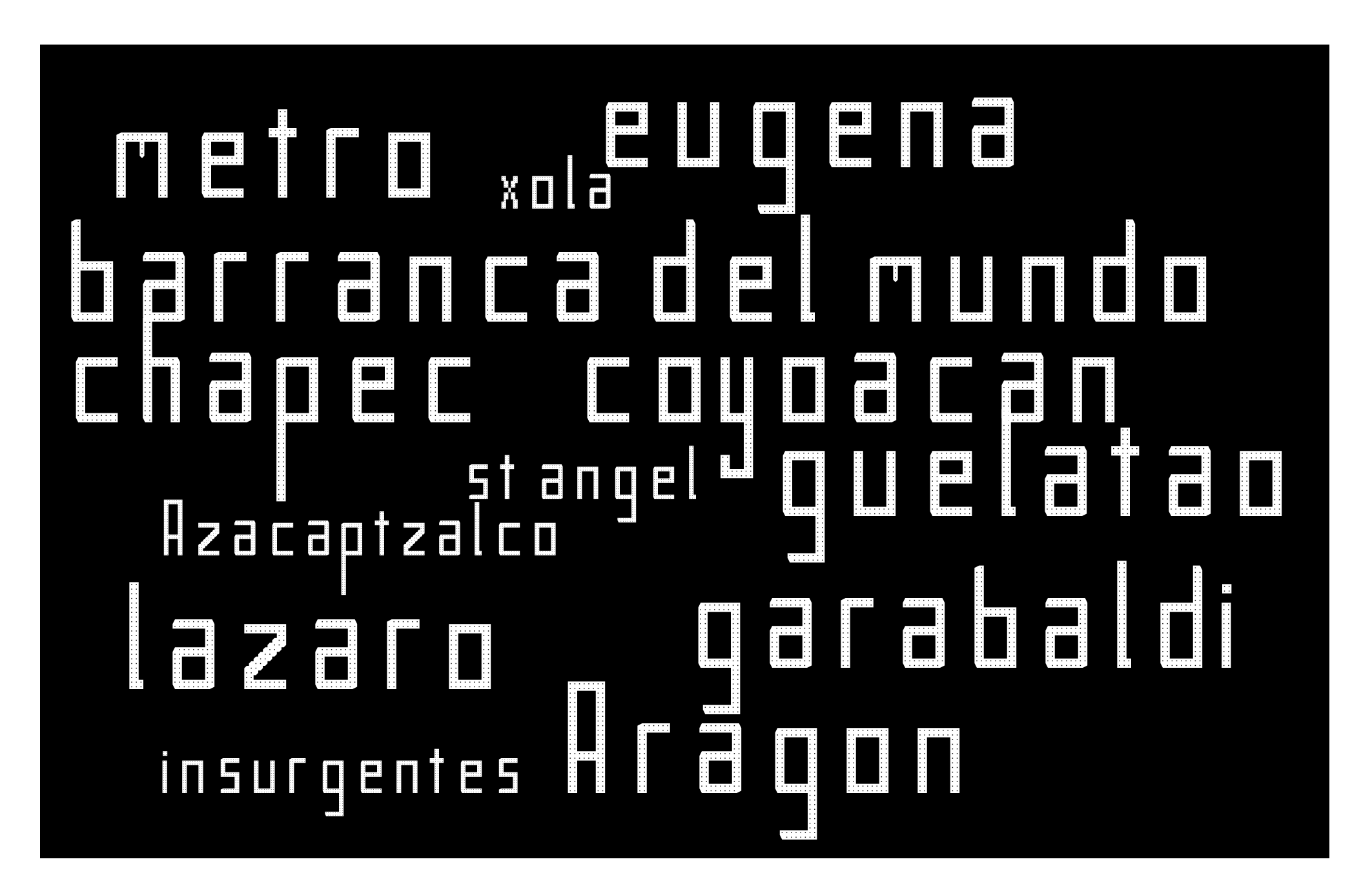
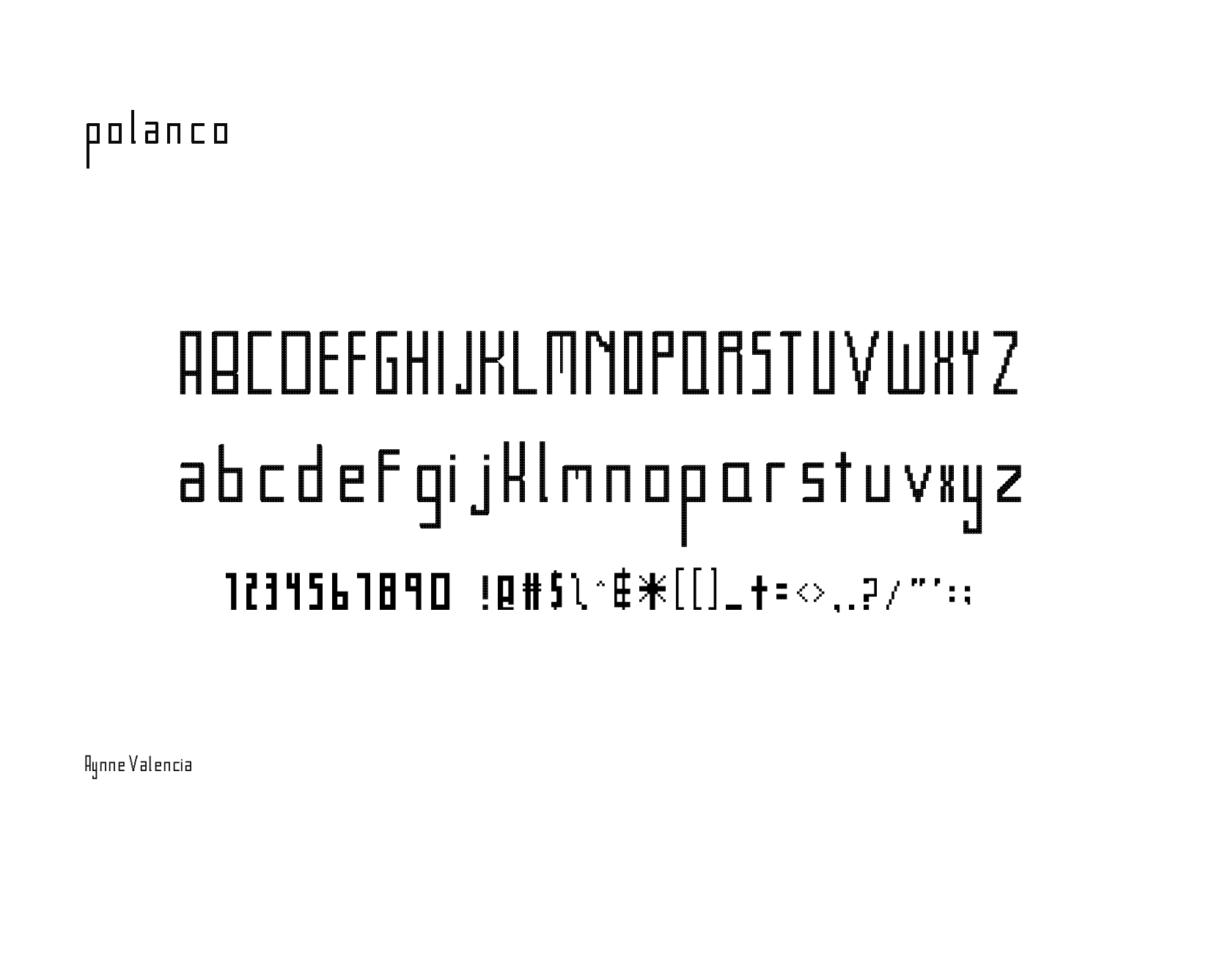
curio maps
Curio is a map that shows the local lore and history of selected San Francisco neighborhoods. Download the mobile application to see stories and documented histories as told by the residents, and merchants in this dynamic and changing city.
“Cities, like dreams, are made of desires and fears, even if the thread of their discourse is secret, their rules are absurd, their perspectives deceitful, and everything conceals something else.”
Italo Calvino

Curio Maps on display
Living in the city means negotiating space with other people and constantly maneuvering our way as we try to get to one destination to another. We strive for convenience, expediency. Serendipity, curiosity and chance is harder to find in a dynamic, transient city.
How might we open the channel to things we would not have ordinarily seen? How can we invite the intangible energy, the spirit, the secrets each block holds that can take us on a journey that transcends us from our daily routine?
What’s curio map?

Open the channel to things you would not have ordinarily seen. See the secrets each block holds and go on a journey through history.
Curio is a map that shows local lore and history of selected San Francisco neighborhoods. Download the mobile application to see stories and documented histories as told by the residents, and merchants in this dynamic and changing city.
Coming soon:
North Beach & The Broadway Corridor 1970s Punk Scene
Curio - Hayes Valley
Little Bohemia along Hayes Creek
The current map covers the territory between Van Ness street to Market Street to Webster to McAllister Street.
History of Hayes Valley
This land was home to the Ohlone Tribe until 1776. Hayes Valley transformed from a sleepy farm community of the 1840s to a bustling commerce area up until the 1910s. Structures in hayes valley survived the fires that followed the 1906 Earthquake and serve as one of San Francisco’s best examples of early Victorian architecture.
The 1920s-1930s were a prosperous time in this neighborhood with single family homes and a thriving African American community.
The construction of the Central Freeway cut through this neighborhood and Urban redevelopment of the late 1940s 1970s decimated the community. The earthquake of 1989 and damage of the freeway offered a chance for renewal.

information about the map

Map center


Awake from a dream of utopia
photo essay

What is a space that endures?
Plovdiv, Bulgaria has retained the same footprint since the Greeks knew it as Philippopolis, if a time-traveller from today traveled back in time to Paris, France in the early 1800s they would still recognize the city’s famous architectural landmarks and city streets, and Varanasi, in Uttar Pradesh India has been inhabited consistently for 3,000 years. While these are extreme examples, spaces that endure have similarities that transcend nation, culture and time.
Park Merced is not a space designed to endure. By 2030 the entire landscape of Park Merced will be completely transformed as it awakes from the dream of the utopia conceived by its makers.

utopia
Park Merced was designed in the early 1940s by Landscape Architect Thomas Dolliver Church and Architect Leonard Schultze of Schultze & Weaver Architects in New York City for Metropolitan Life Insurance Company. These early suburbs were following the tradition that began in the USA with spaces like Llewellyn Park in New York, These spaces were designed as a respite from city life and an contrivance of rural life. A utopia. Schultze & Weaver were known for their hospitality and entertainment related work and the design of Park Merced shows the spirit of that aesthetic. Park Merced was created as inexpensive housing for the post World War 2 generation. These densely built apartments and townhouses were designed to celebrate the nature that surrounded it. And, contributing to it’s future demise, this housing complex was also designed to accommodate a lifestyle centered around automobiles.
Some of the qualities of urban planning that create spaces that endure are 1). Spaces that are human scale (accessible by the street or ground level), 2). Mixed use (Business and residences close enough to access by foot), 3). Their spaces informs the intended use . By design or by modification of use by the inhabitants over time.

Park Merced had all the elements to succeed but fails as a design that endured because the city has grown around it. Tall towers started to replace the human scaled Townhouses and mixed use was not considered so services were clustered into one small area of the neighborhood, making it so that residents had to rely on driving to other neighborhoods or traveling by the muni train that was not well connected to the neighborhood.
The space was designed to have portals to nature in each structure, these open spaces invite the passerby to walk into them, but they are private space so the visual language and the emotional and cultural norms do not flow together.


Nature surrounds the park-like landscape of Park Merced. This commune with nature is reinforced and amplified by the artifacts residents collect and display in their homes.
Visual evidence of creeping dereliction and decline of the neighborhood in anticipation of its demise is at odds with the desire of residents trying to save their homes.
Park Merced awakes from it’s dream of Utopia to a San Francisco that has become a city of skyscrapers, and dense micro apartments. This newer generation that has no use or appreciation for the quiet placid green lawns and graceful trees. The rejection of the well intended contrivance that was the suburbs. One cannot help but wonder if we will live to regret the destruction of this dreamscape?


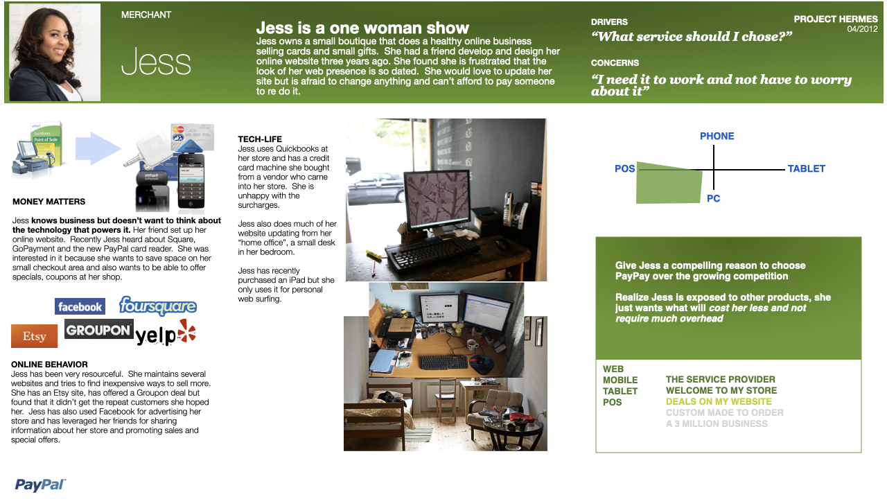
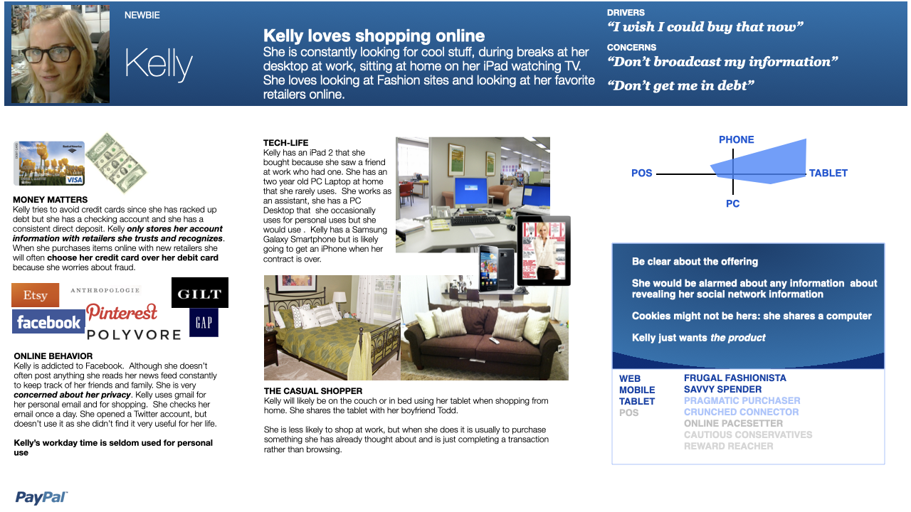
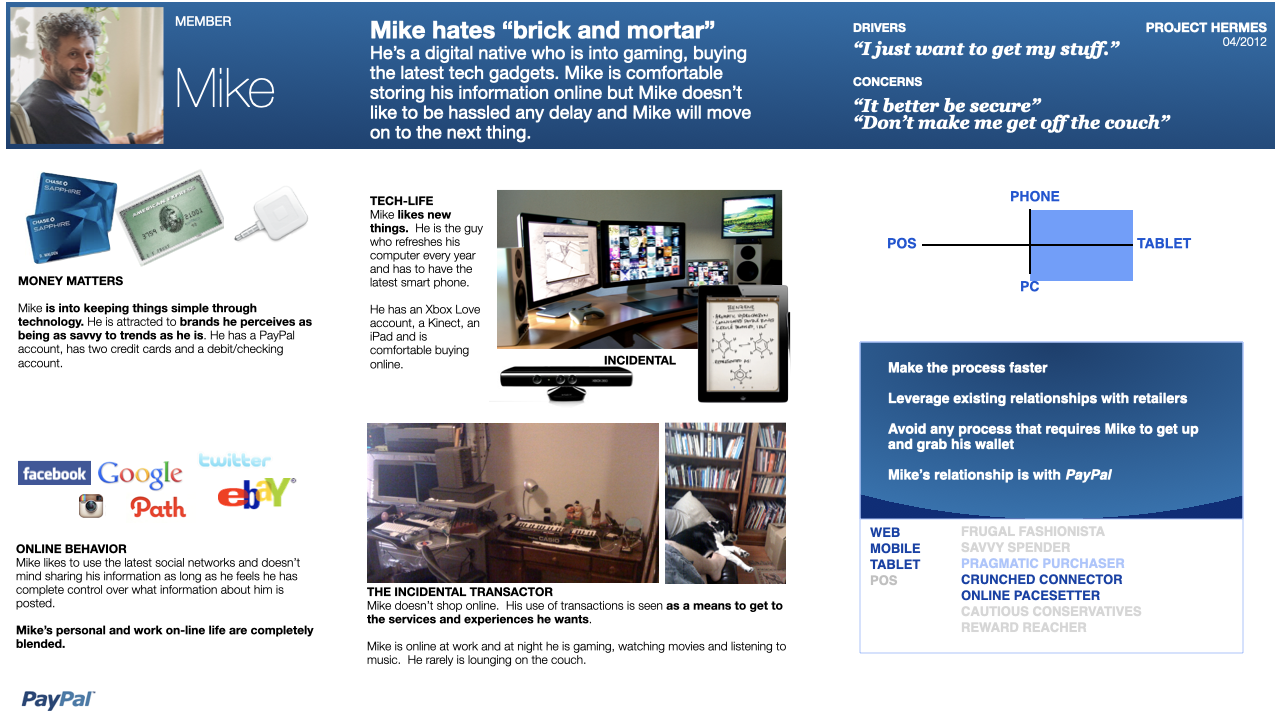
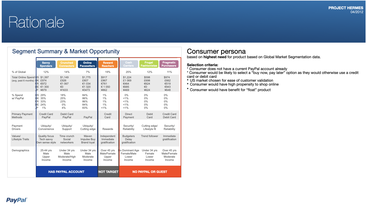
Pay Pal Personas
PayPal user research
About this project:
PayPal was seeking insights into customer shopping behaviors for the release of their pay-later and one-click payment platforms.
My team gathered their existing customer segments, combined those insights with current market research, and conducted surveys, interviews, and site visits for contextual analysis with customers and potential customers who would use this product feature.
Role: Design research
NOTE: Photos of users and any confidential information have been redacted.

MBA in a Box
Platform for students and college professors. This desktop and tablet application powers the online learning and communications component for a large university.


Features

“Classroom” screen
Online education platform tool for Apollo Group
Fjord
Role: Creative Direction, Service Design, Client Lead
The Brief:
Apollo group was seeking a tablet based solution for online learning for student and teachers.
This touchpoint needed to easily port over content from their existing web platform and needed to keep the existing user interface conventions and metaphors and the architecture needed to adapt to the existing system as much as possible.
Process
This project was a year long engagement. My role was leading the concept and design process and transitioning work to the IOS development team. We had 6 weeks for information gathering, user interviews and identifying business rules and workflow, 6 weeks of rapid prototyping and design validation/co design sessions with users. 4 weeks of application architecture and template design, 2 weeks of visual system design and documentation and 3 weeks of design validation. We then went to development and continued to do user validation and QA.


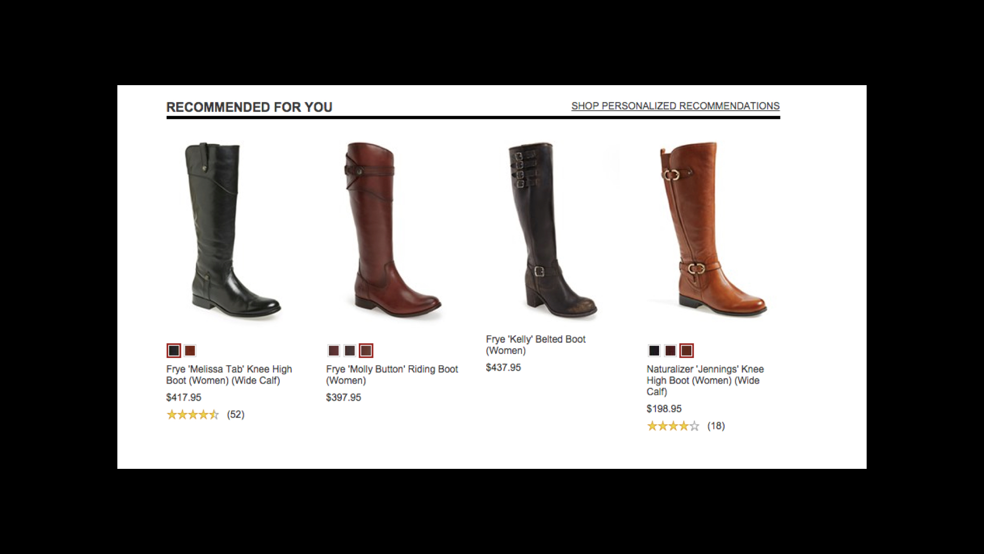
JCP Digital eCommerce Strategy
E.commerce strategy for the proposed rebrand of JCP. JCP wanted to identify a new breed of customer the new brands will attract.

Web experience
JCP
e.commerce platform
R/GA 2013
Role: Design Direction
The Brief:
Develop the e.commerce strategy for the proposed rebrand of JCP.
JCP wanted to identify a new breed of customer the new brands will attract.
Approach:
This engagement included:
Identifying the new JCP customer and creating personas for this new customer
Developing an information architecture that supports the planned launch of 80+ new brands in 2013
Designing a series of experiences designed to increase conversion
The Challenge:
New brands were coming onboard but the site platform cannot handle a significant visual or navigation overhaul.
The site and organization did not support editorial or curated content
Providing strategically placed vehicles for building richer customer profiles

Browse category template

Product detail template


early mock-ups

Visa - Go Campaign Digital Strategy
Visa global marketing - Go Campaign launch digital strategy

Campaign Landing Experience

Bank cards co-branded for Visa Go

Point of Sale Branding
The Brief:
Make Visa the preferred payment method over others at the point of sale.
I was digital product design director on the team that created a series of strategic programs to make Visa the preferred payment method over cash at the point of sale.
This project included looking at how Visa can provide compelling online, point of sale and socially oriented
services and experiences that would make the consumer choose Visa.
The example is below is one of the programs.
Research Insight:
Selecting your payment option at point-of-sale is more habit than conscious choice, making it very difficult to change. in Visa World of Change I considered how we might we turn everyday transactions into socially rewarding actions.
Visa World of Change
With every transaction, cardholders donate one penny to a cause they care about. As people around the world join in, pennies add up to big changes, giving cardholders a real reason to use Visa over cash.
Purchase Funnel: Focus on point of transaction
Channels: Targeted point of sale placements and social networks
MCC’s: Inclusive of all categories •Global: Identify charity with global appeal and tailor executions and communication channels based on countries digital lifestyle
POS Considerations: Core to the idea, advertising will focus on POP placements to drive Visa preference at the final step of the transaction
Details:
1. Visa kicks off World of Change by contributing $1 million (in line with FY09 levels) to five charities it already supports.
2. Initially, Visa partners with it’s the top issuer in each of the five markets.
3. Visa/AKQA promotes the program through PR and recruits cardholders with advertising and direct mail.
4. Cardholders join the program by registering their Visa card with the issuer and choosing a favorite cause.
5. POS signage reminds cardholders to use the card over cash and competitors. Each month the issuer adds a penny per transaction to the cardholder’s bill and forwards the total to the designated charity.
6. Issuers forward contribution data to Visa for display on the World of Change site.
7. Cardholders recruit friends through social networks and track progress online.
8. As the program grows, Visa partners with other issuers.


Visual Design
Notes from my visual design lectures at CCA
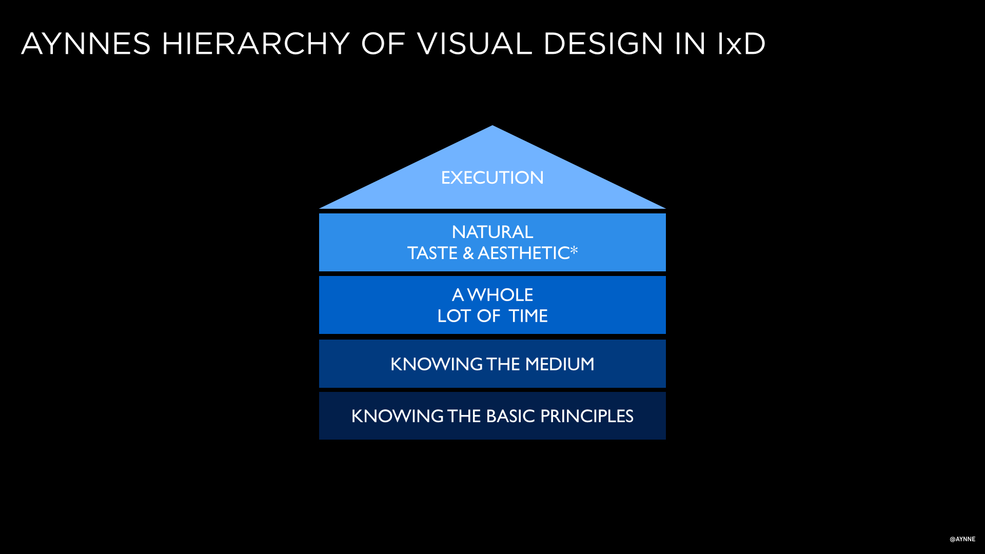
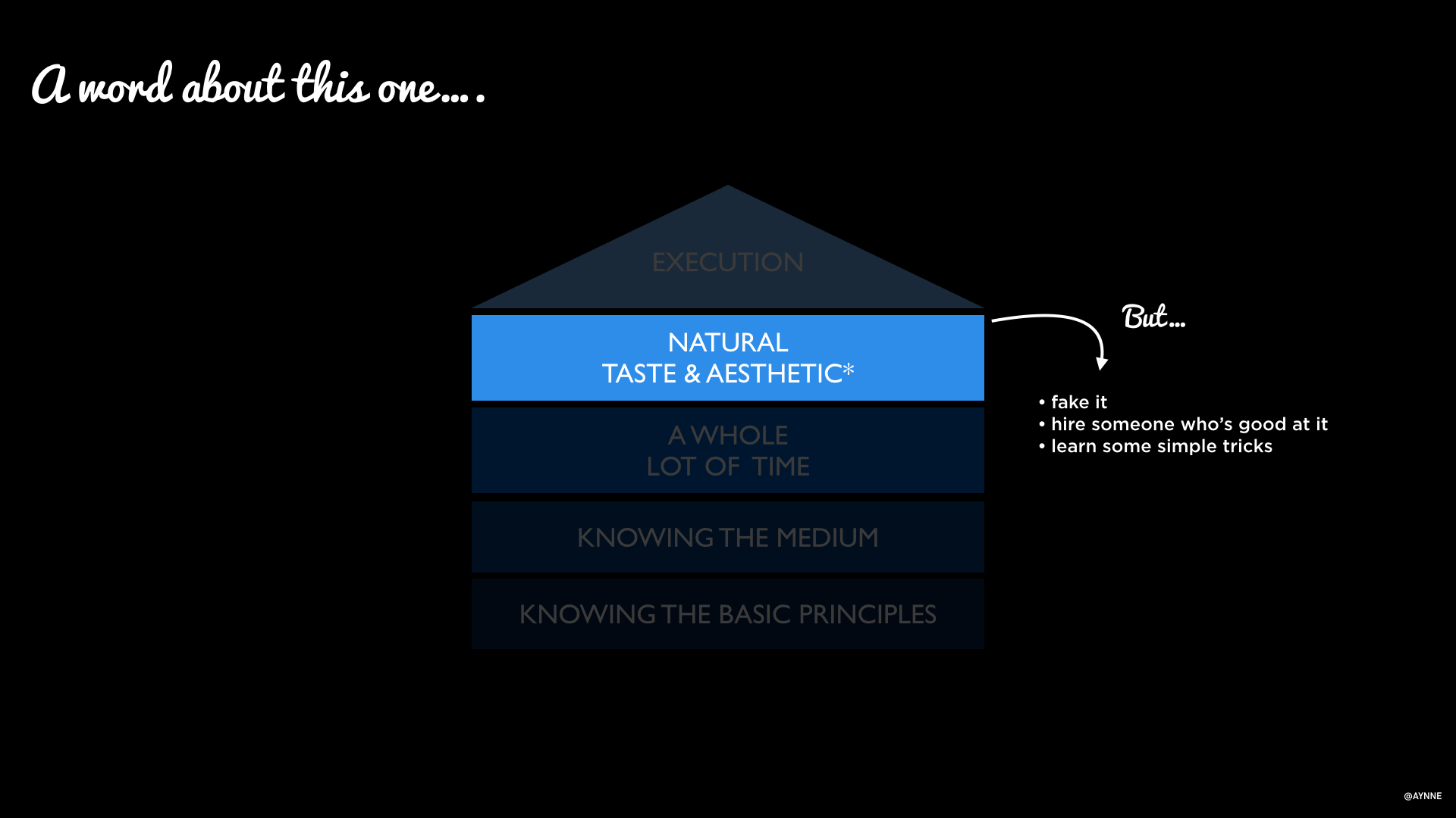

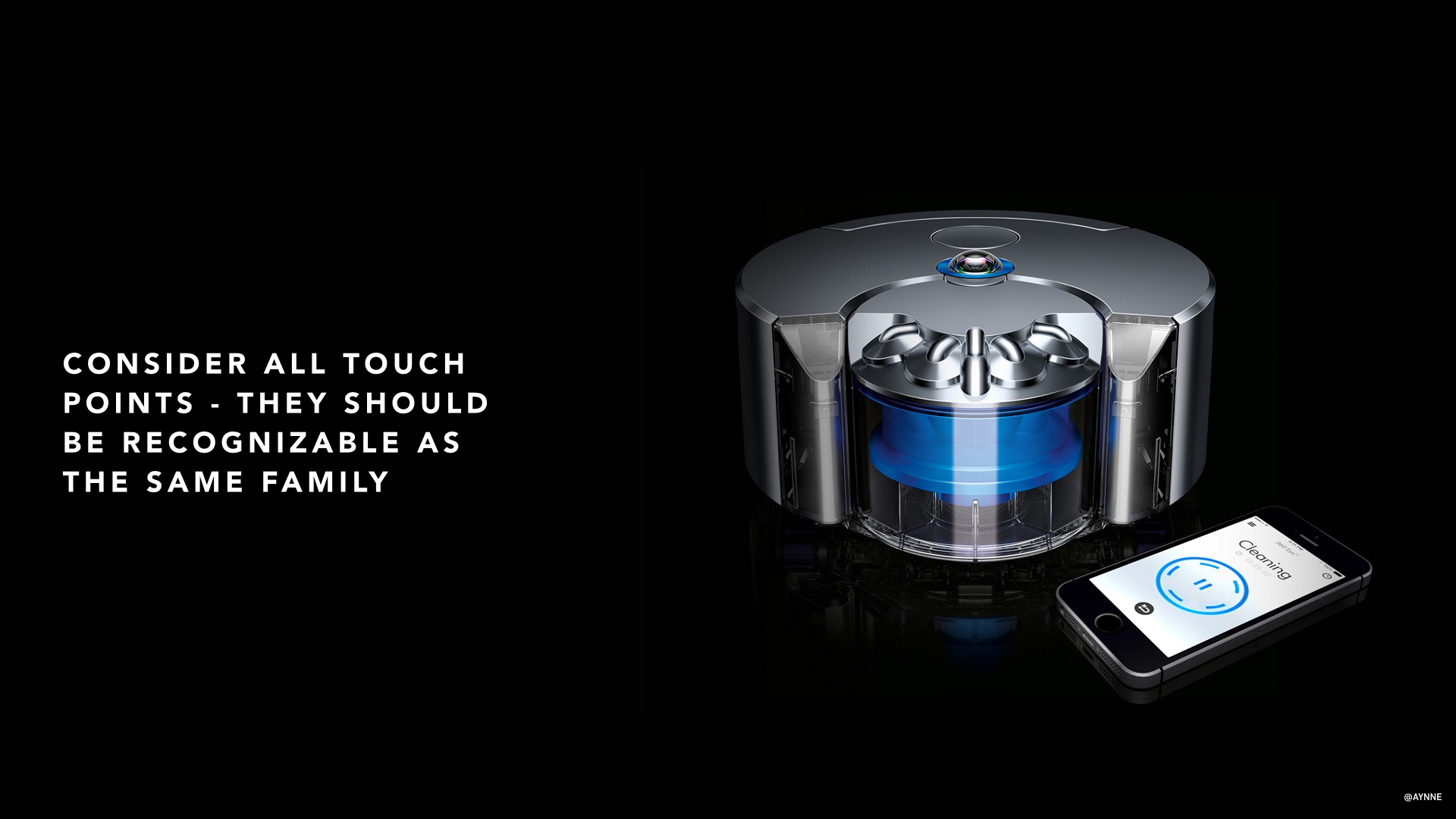
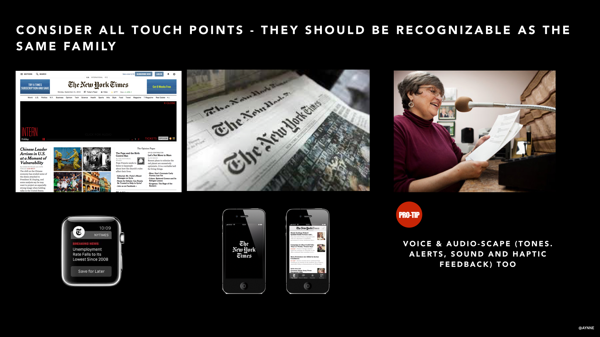
I teach Visual Design in the Interaction Design Program at California College of Art.
I will be posting some of the slide decks from my lectures here. I have collected resources and answers to student questions as well.
QUESTIONS STUDENTS ASKED:
1). Where can I learn more about grids?
I have a lecture on grid and responsive web sites stay tuned I will post that soon.
http://www.sitepoint.com/grid-based-layouts-101/
Info on hierarchy here:
http://webdesign.tutsplus.com/articles/understanding-visual-hierarchy-in-web-design--webdesign-84
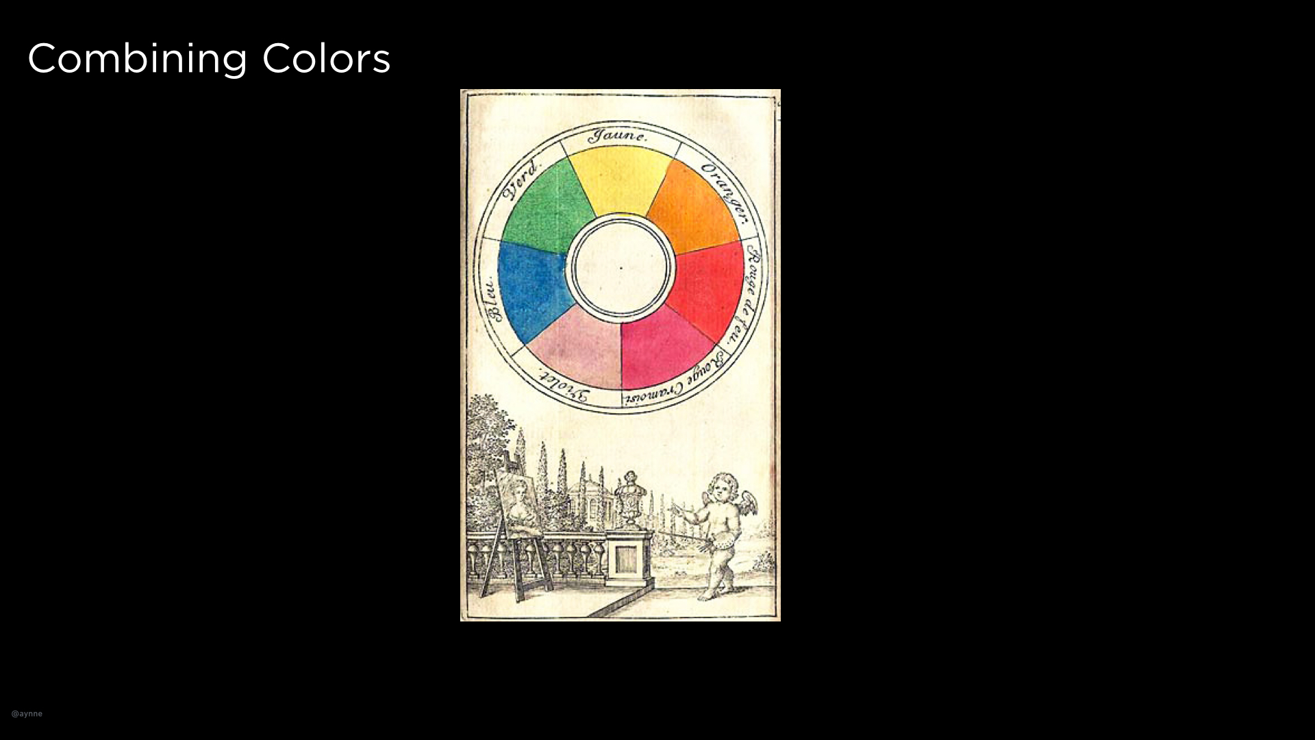
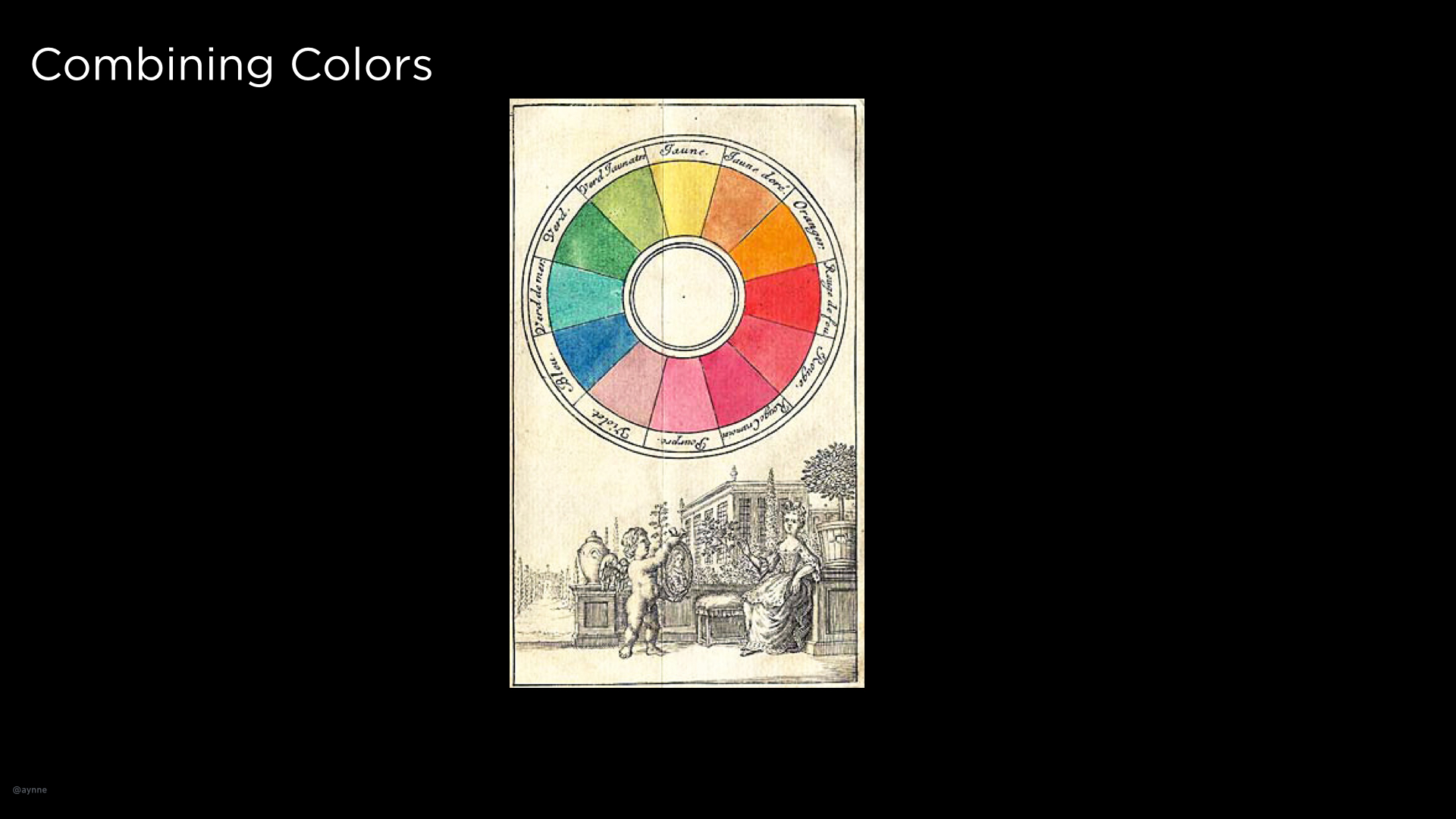
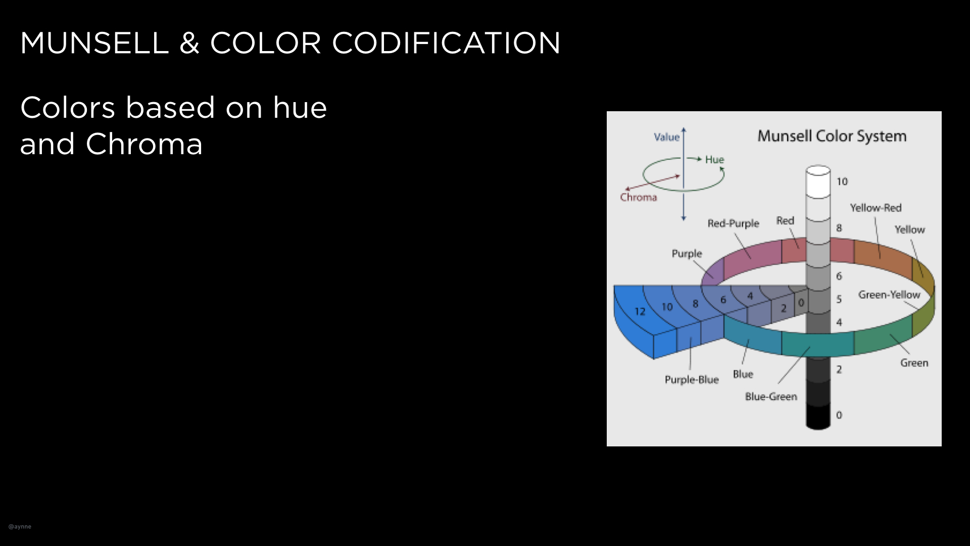
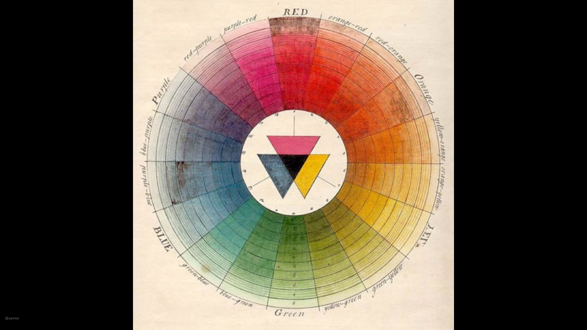
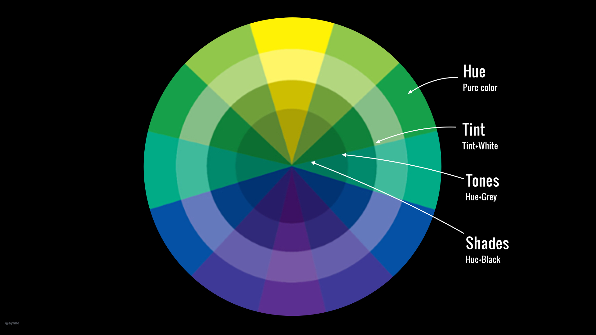
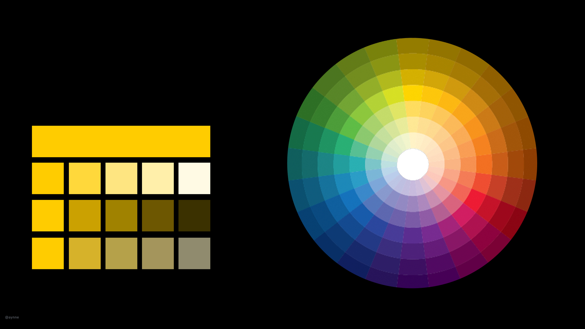
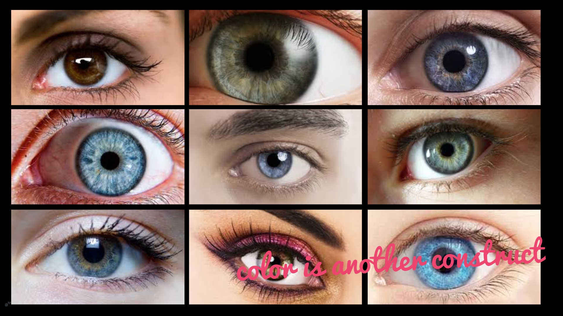
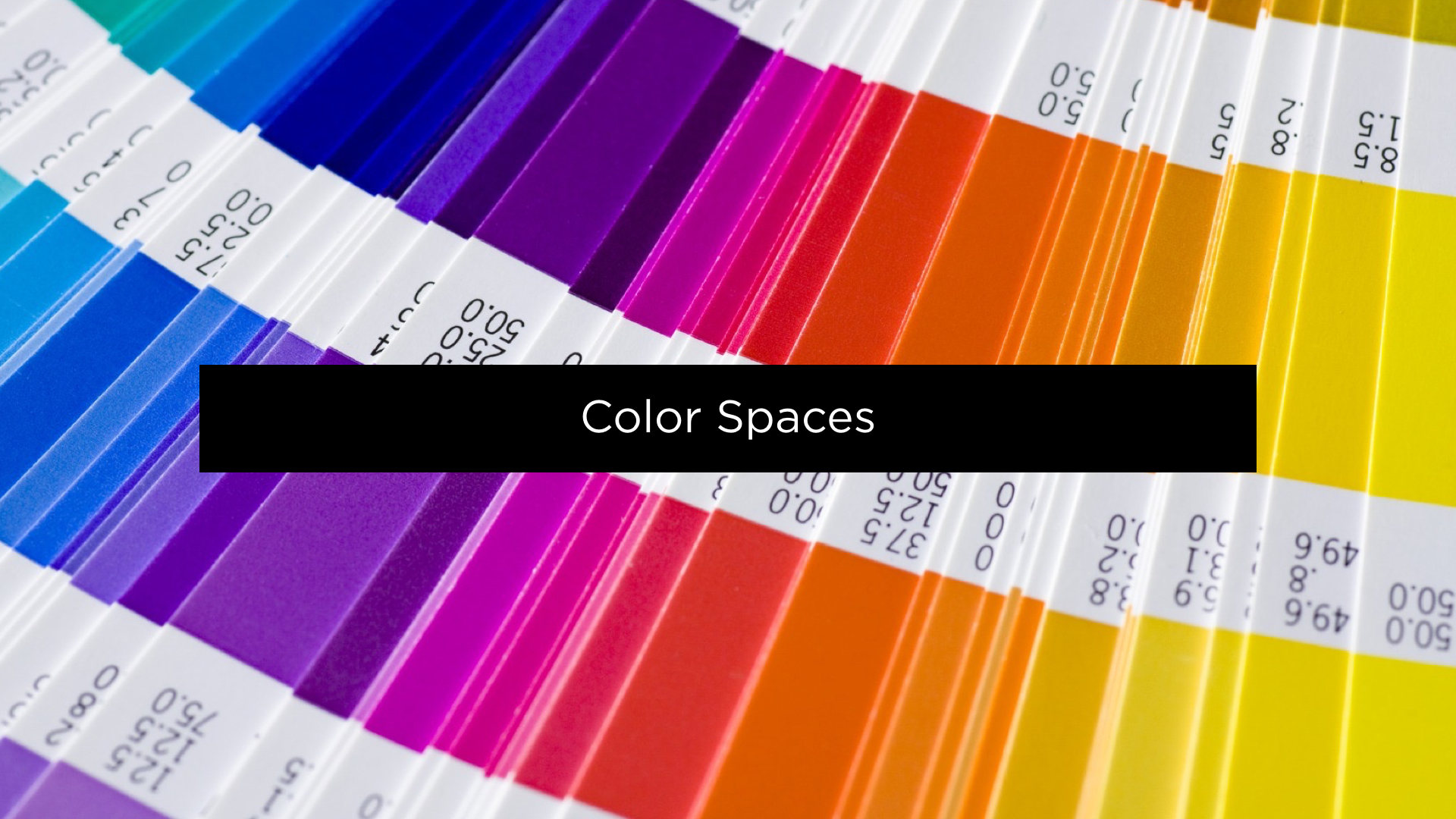
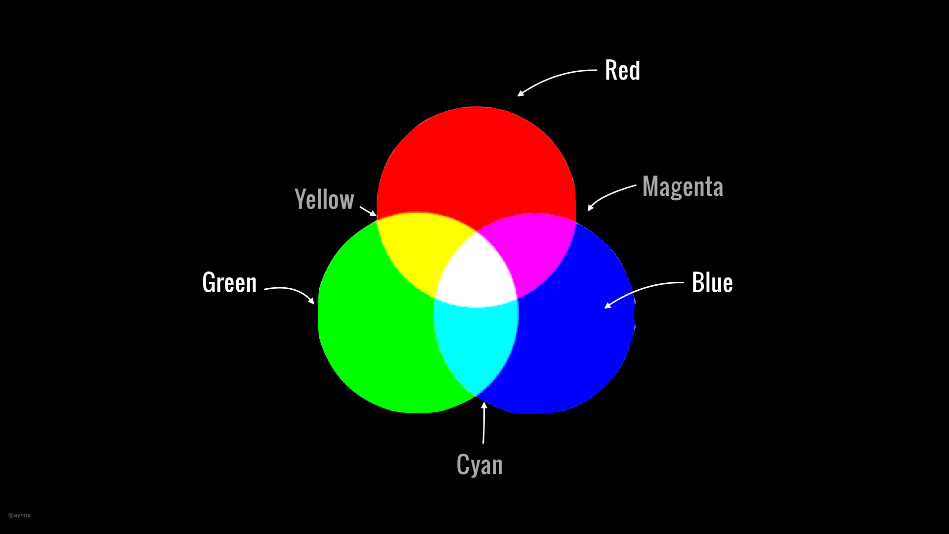
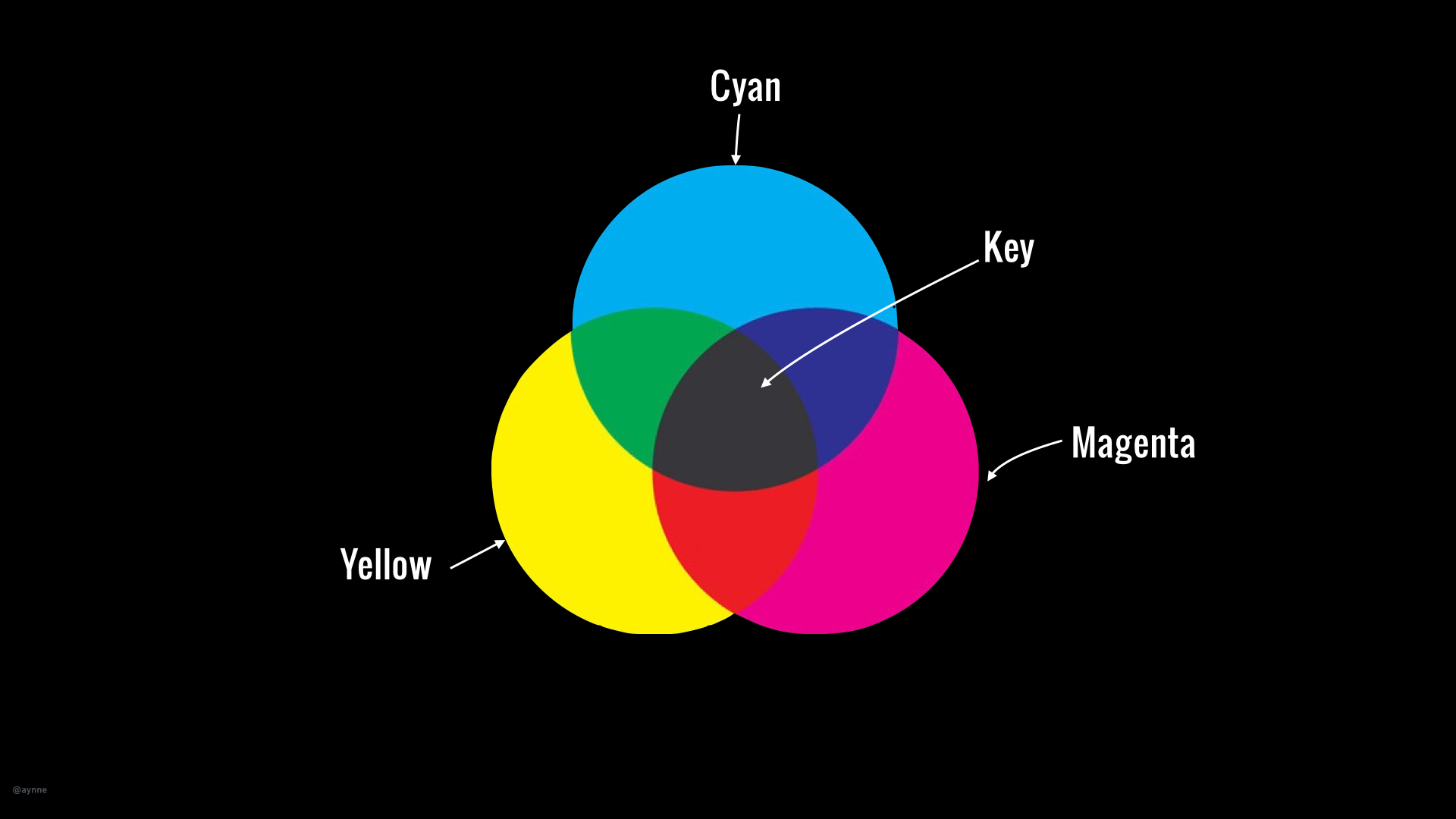
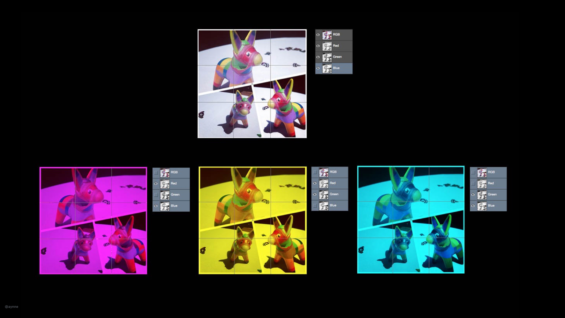
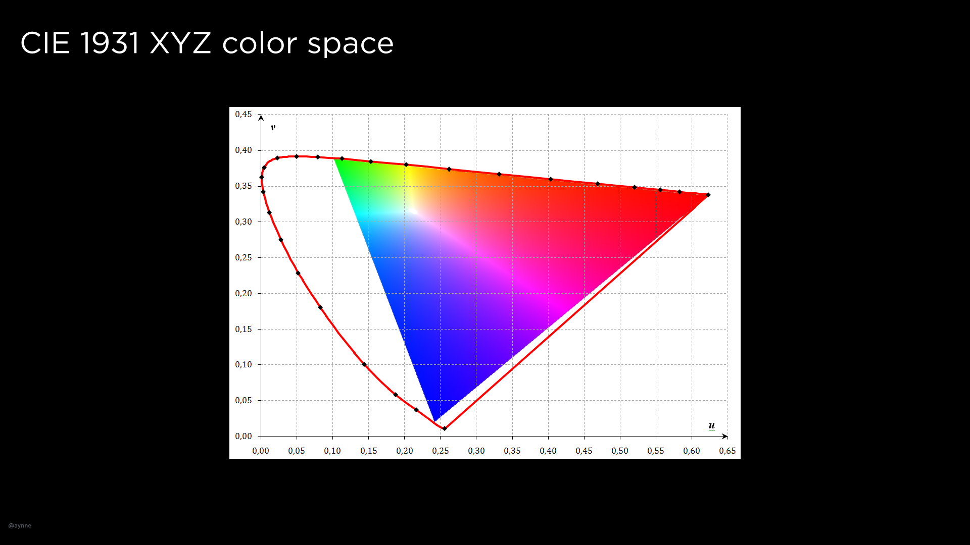
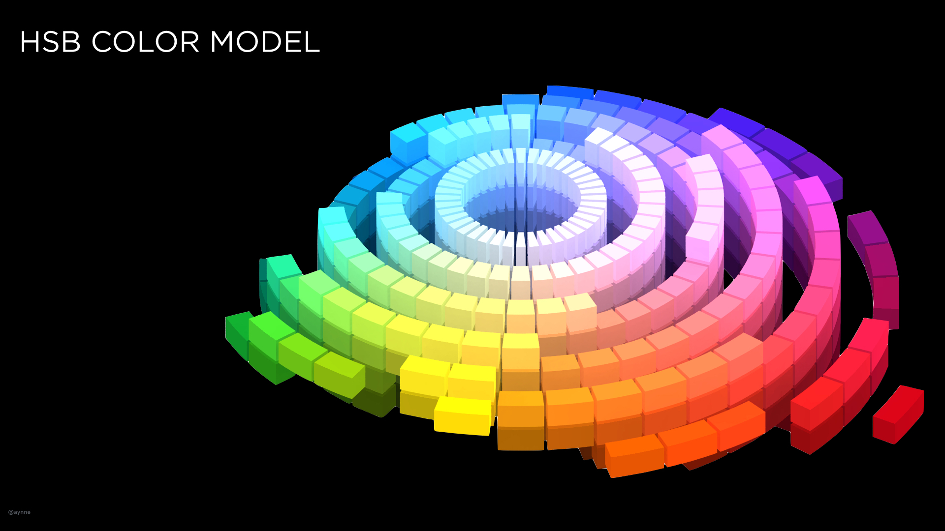
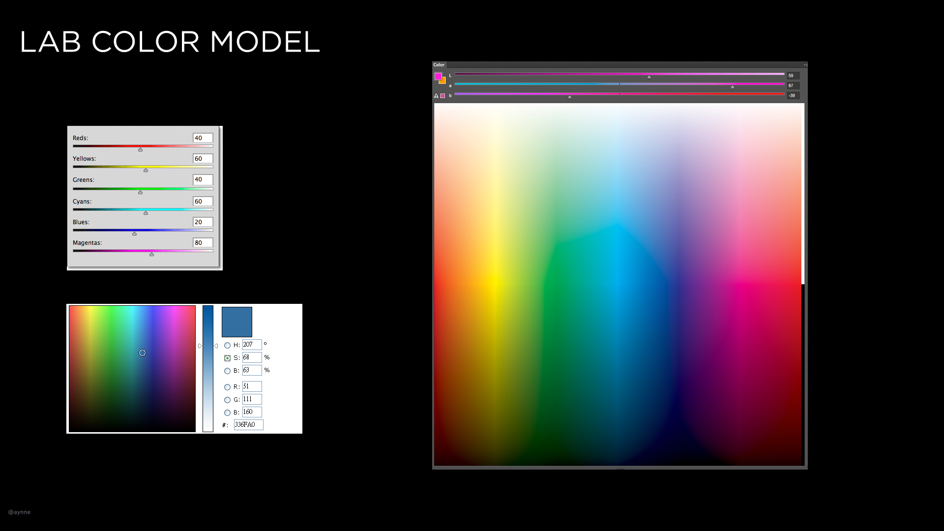
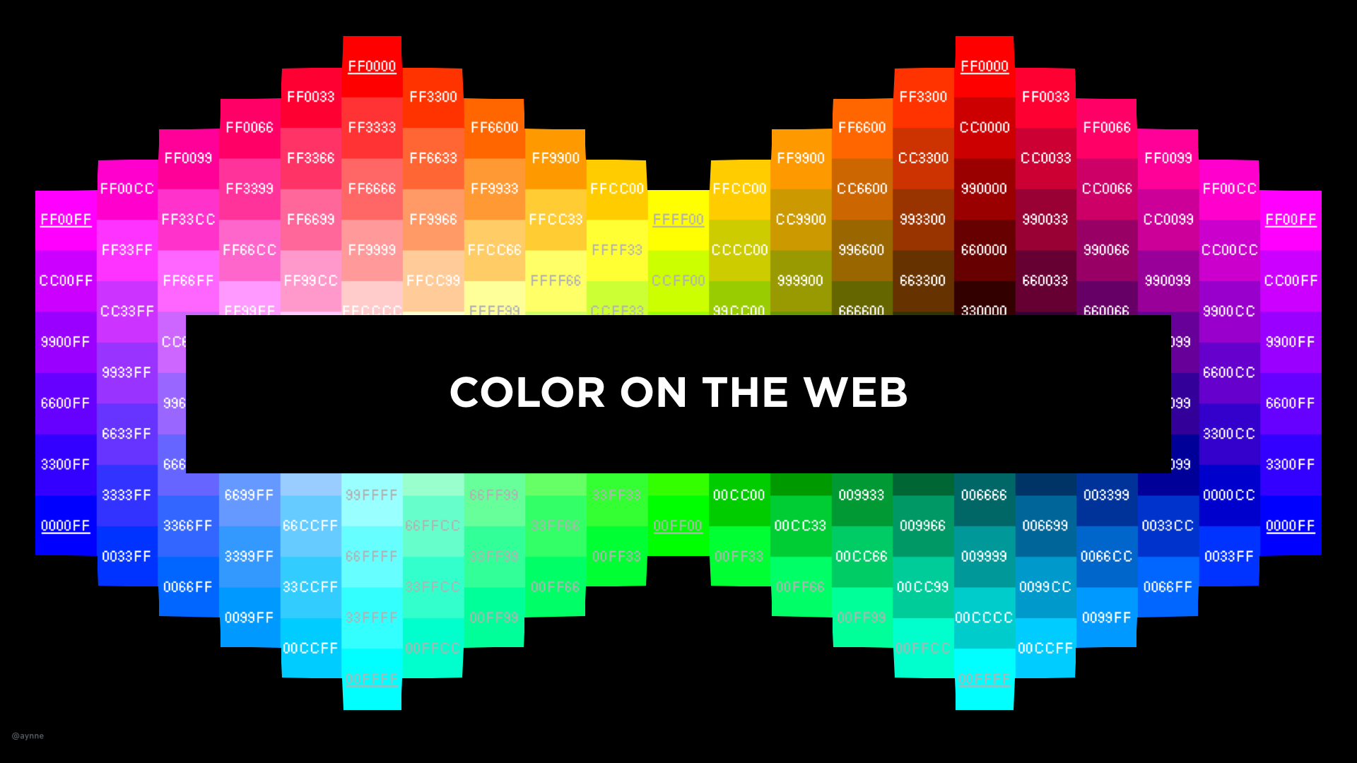
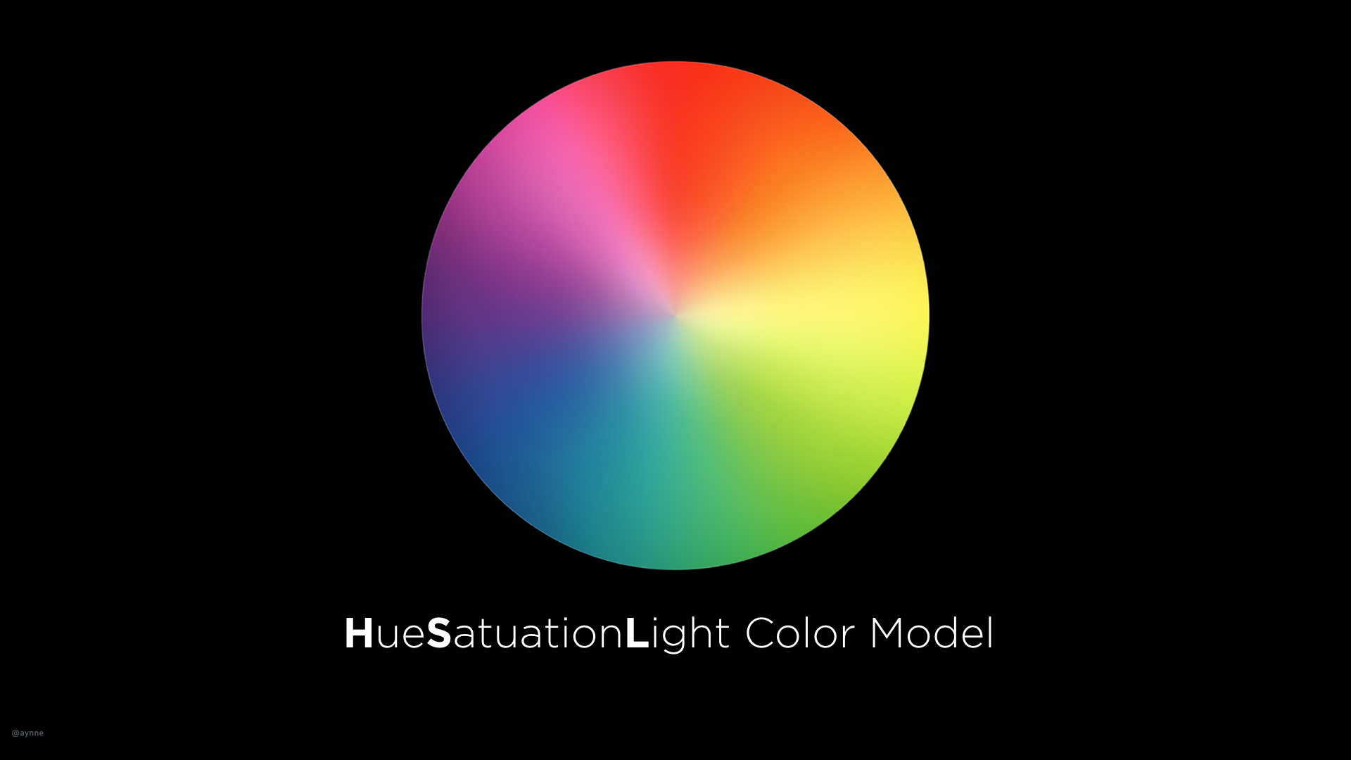
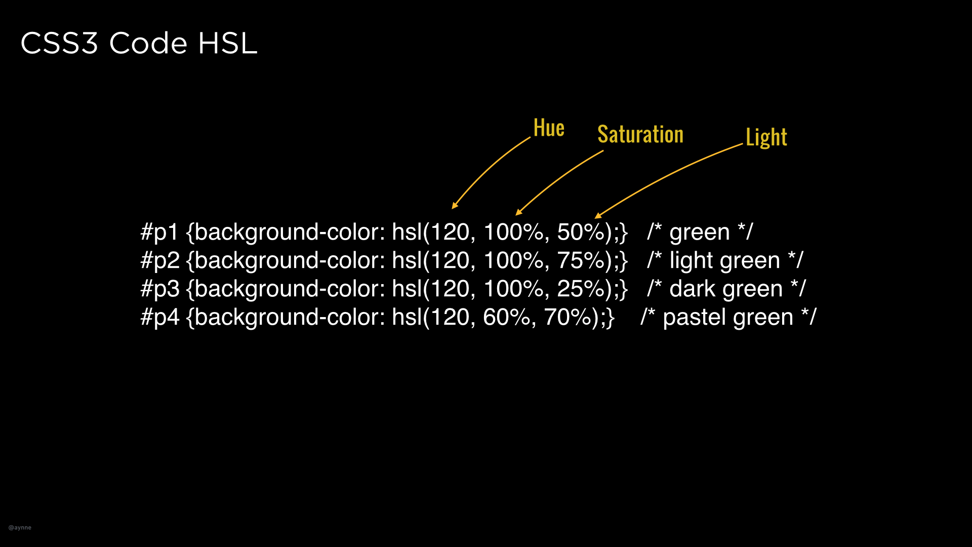
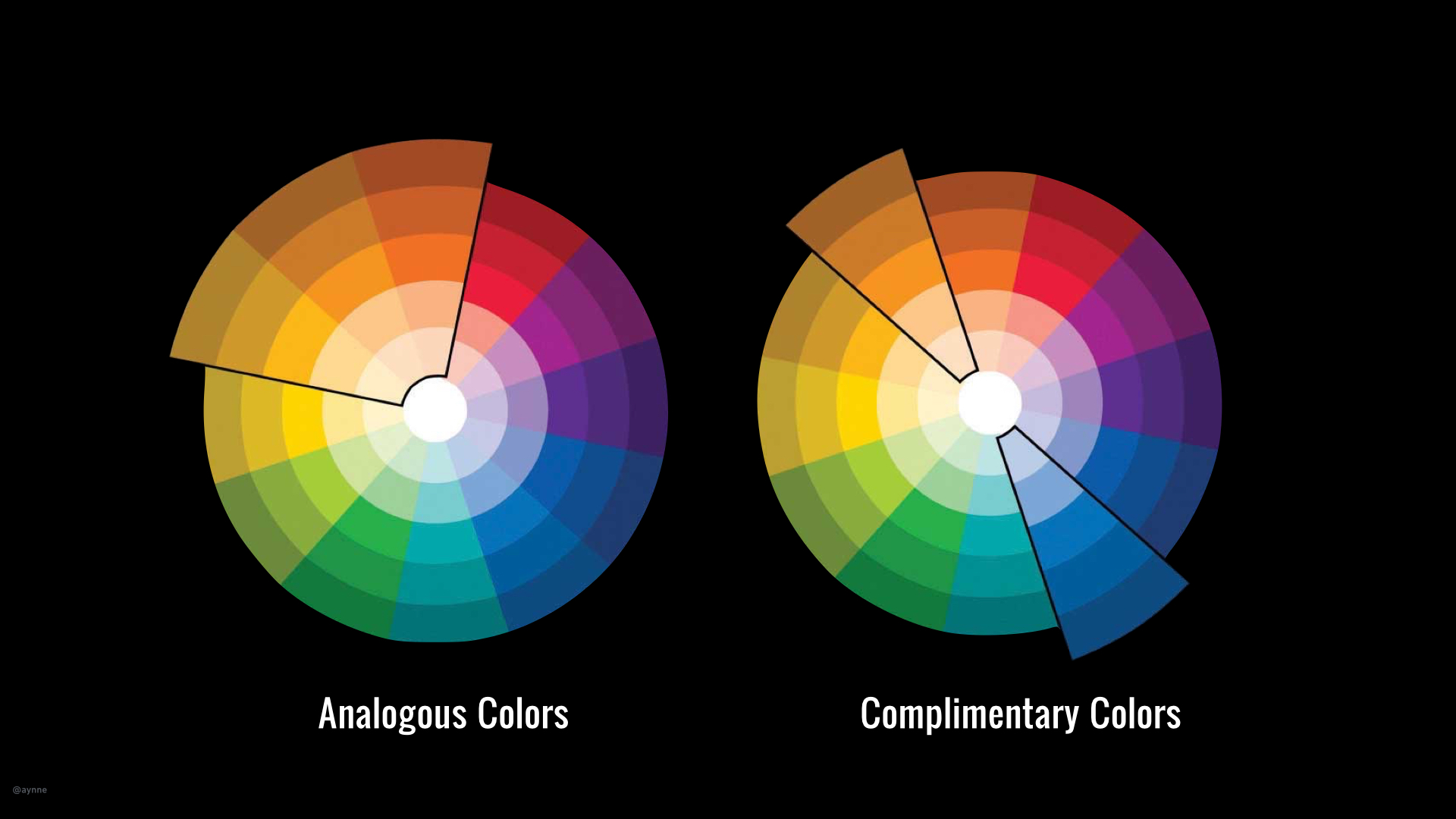
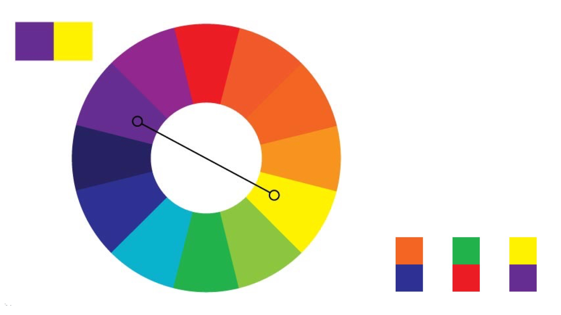
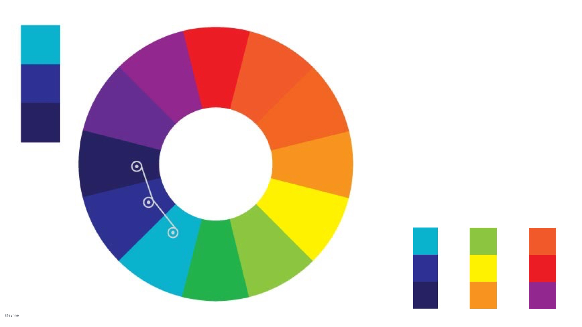
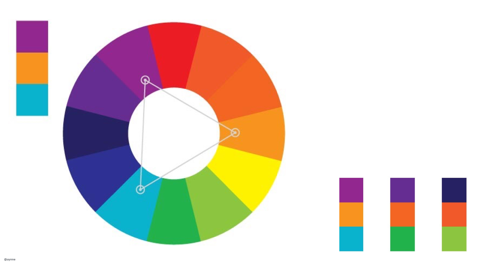
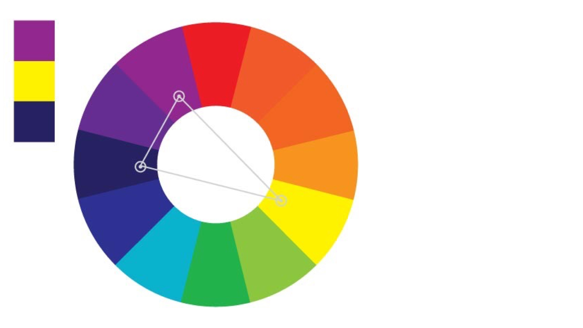
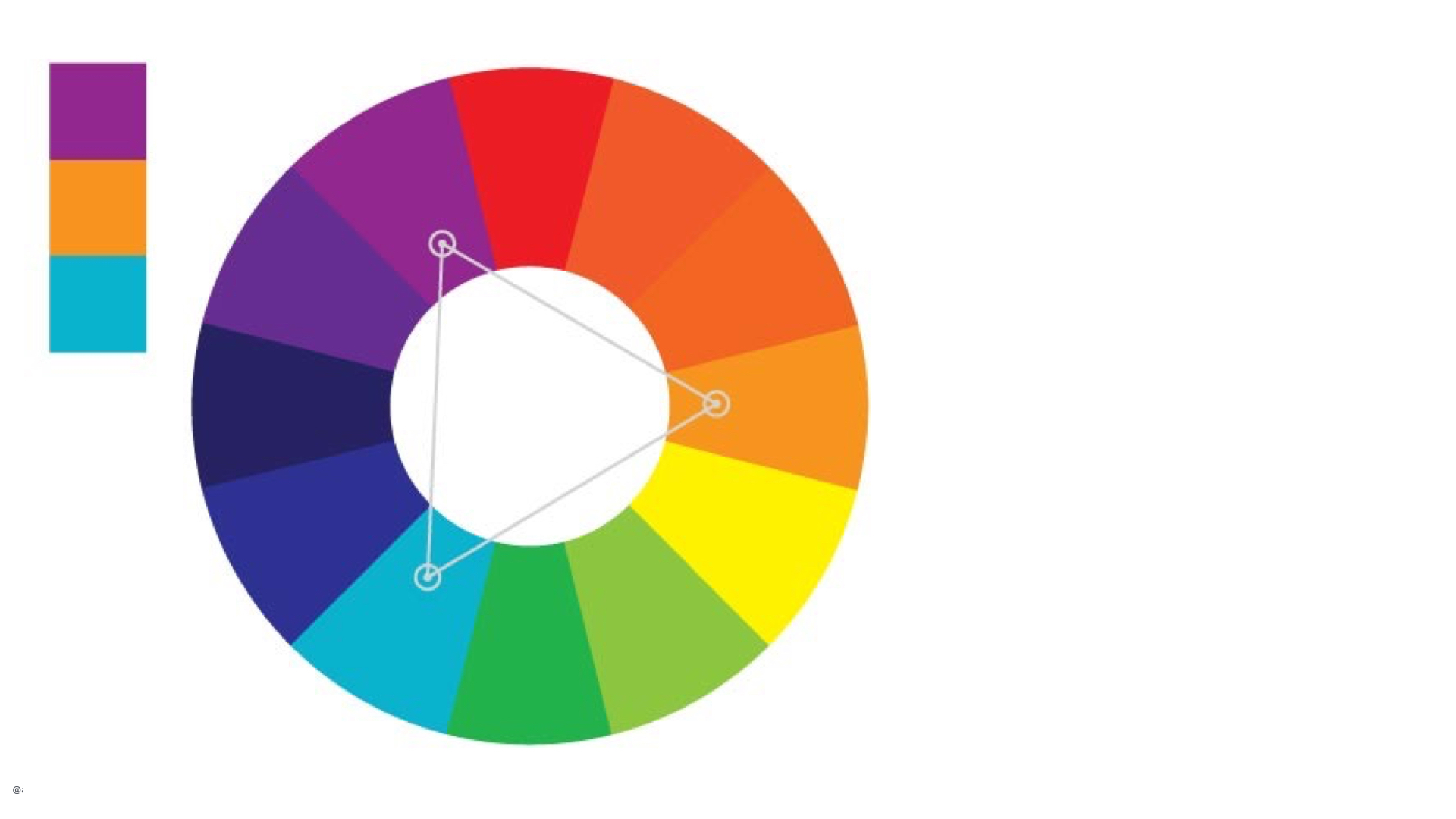
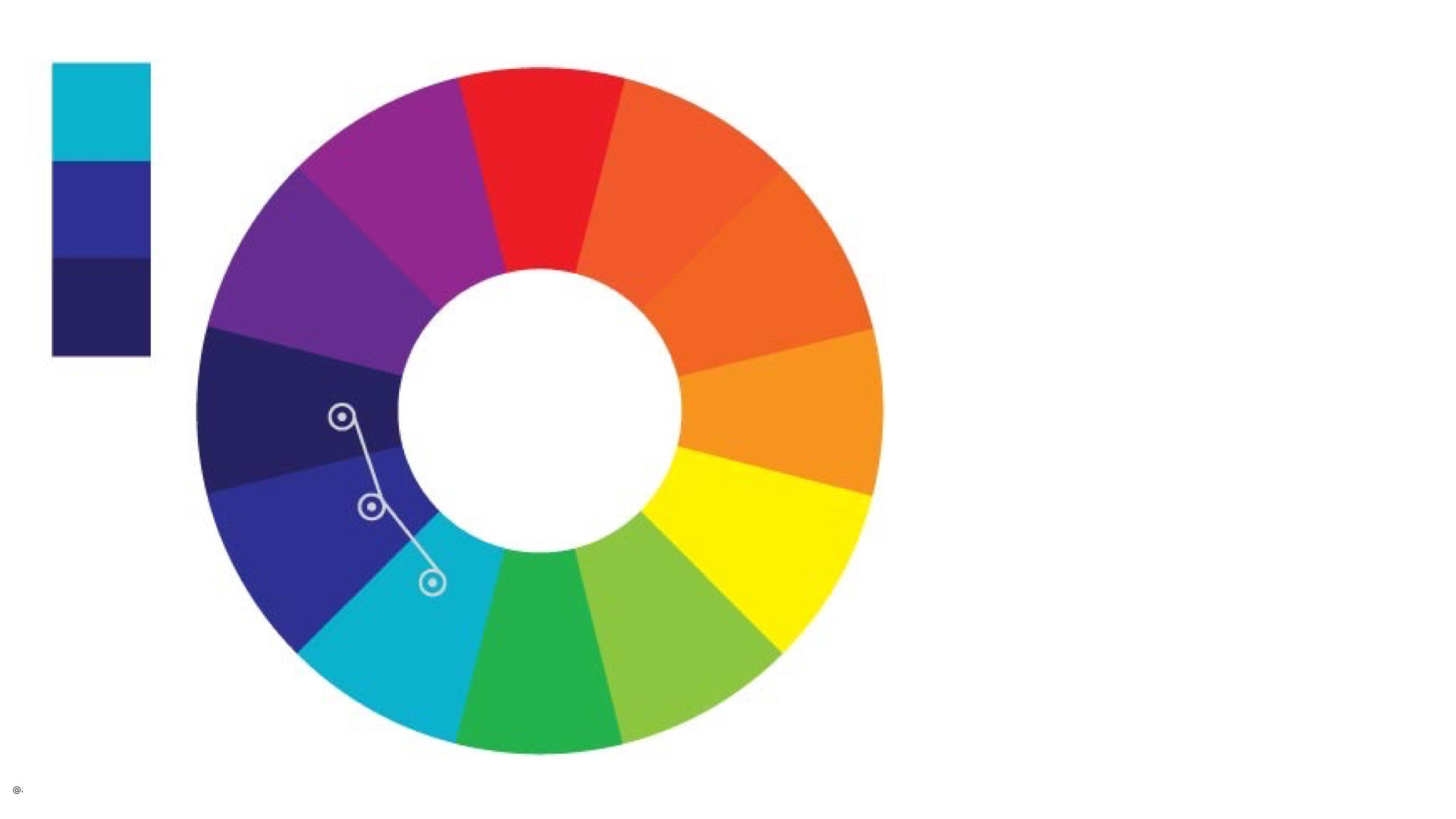
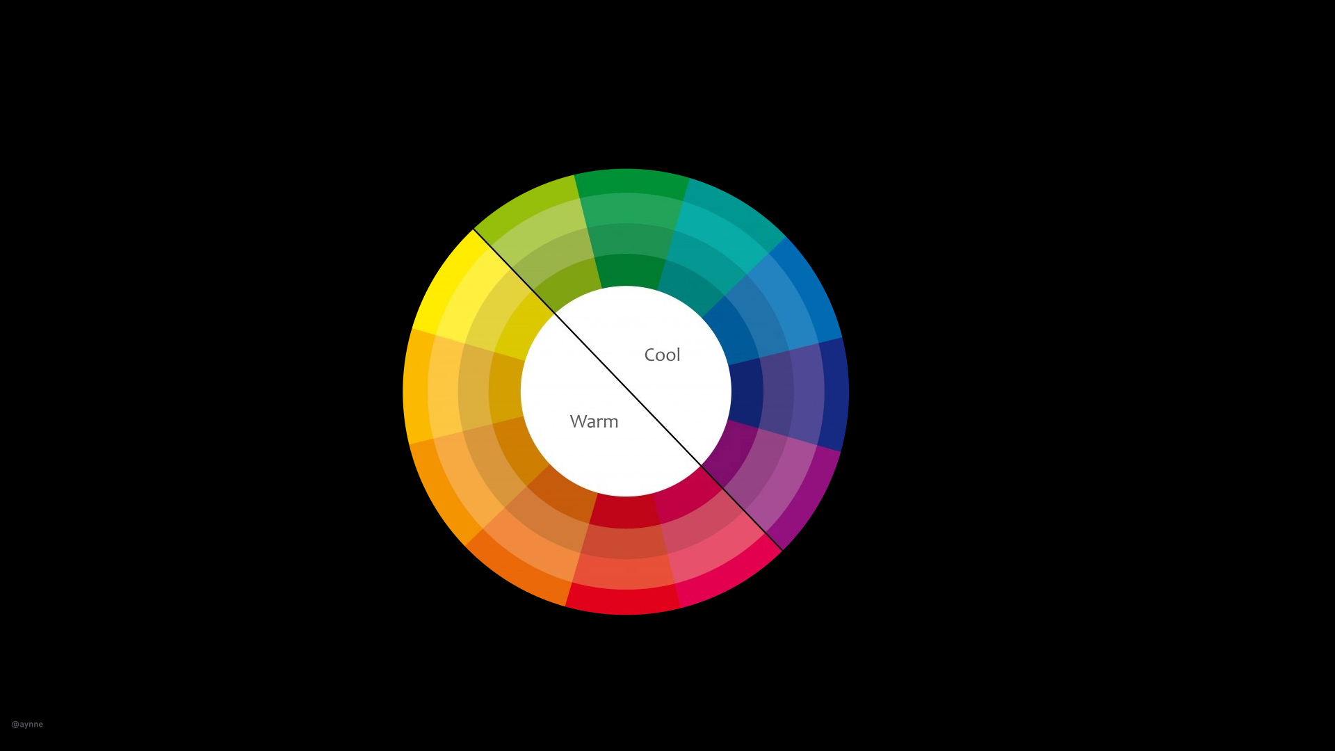
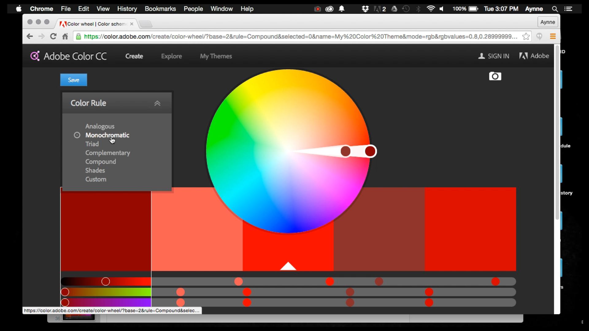
2). How do I choose color?
I'll be discussing color in an upcoming talk called The Construct of Color.
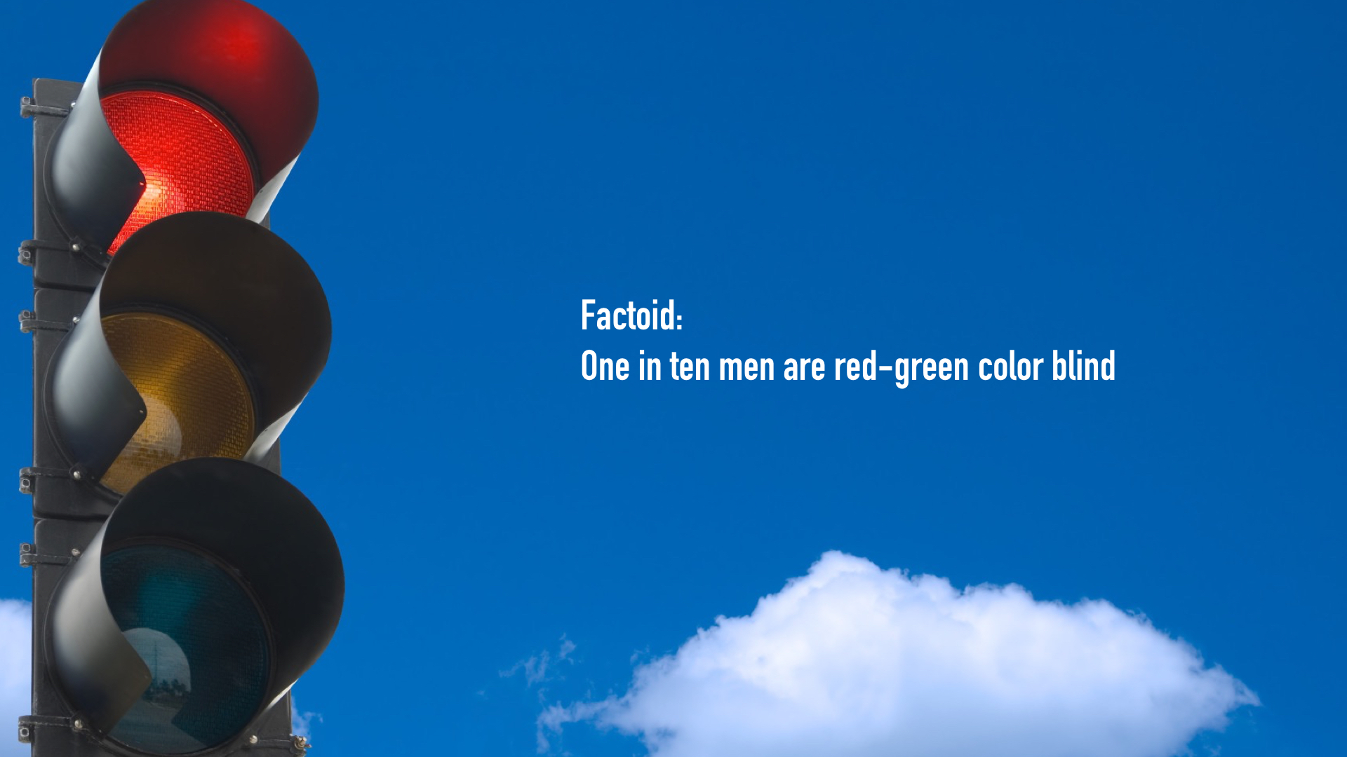
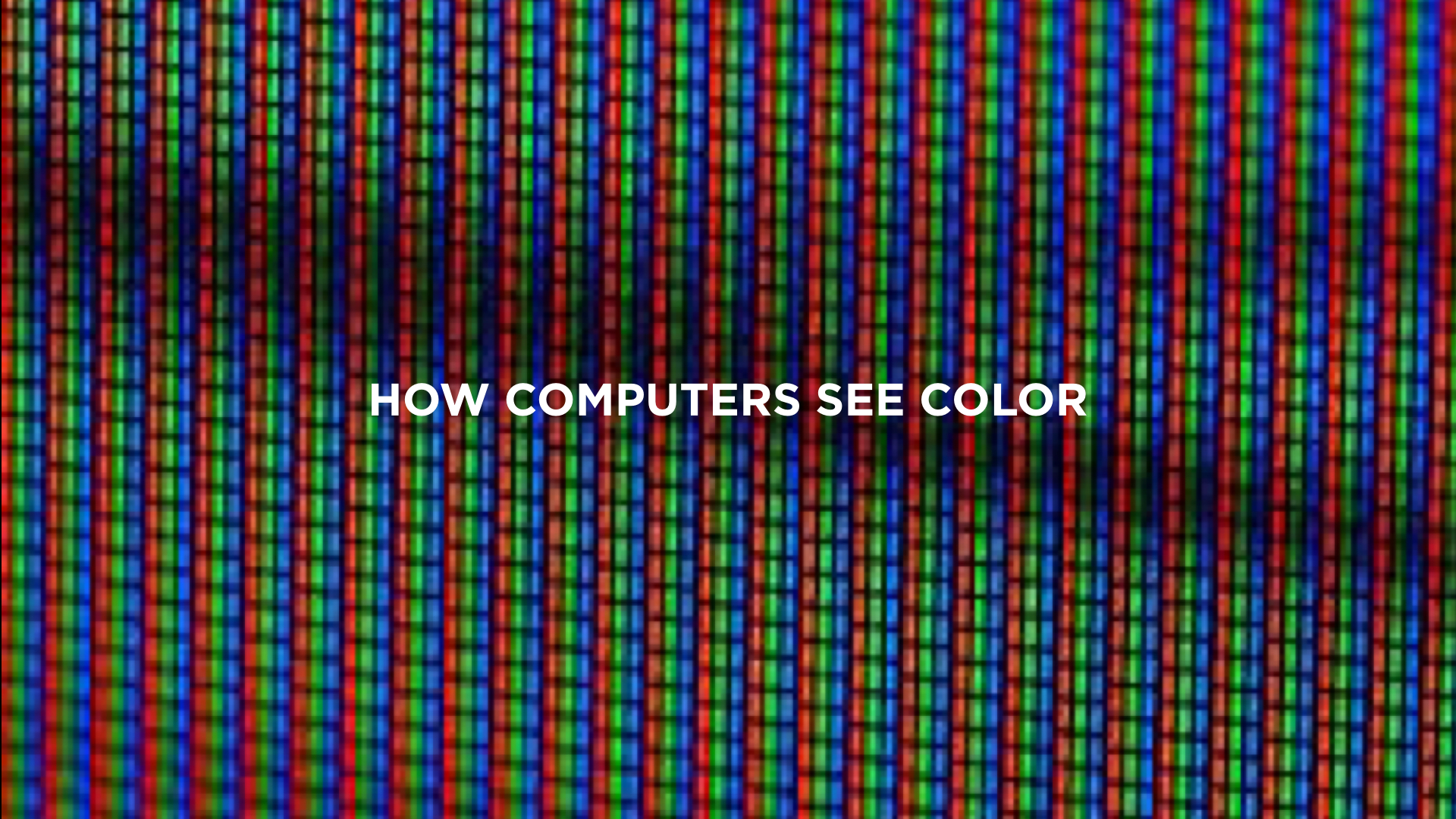
Random note: Keep in mind, when designing for the web you don't need to worry much about color because computers and monitors can handle millions of colors. However, different processors and screens handle color differently. If you are designing for devices (other than your basic smart-phone or tablet) don't assume the device can handle Millions, Thousands, 256 or even *gasp* 15 colors. When designing hardware, always talk to your dev/engineering team first before getting too deep into selecting color. In fact, you should be talking to your dev/engineering team all the time.
http://www.sitepoint.com/color-theory-101-2/
http://www.smashingmagazine.com/2010/01/color-theory-for-designers-part-1-the-meaning-of-color/
3). What tools should I use?
I'll be talking about great tools for prototyping in my The World of Prototyping lecture.
Bohemian Sketch, Illustrator, Photoshop, Invision and Keynote are the applications I use everyday.
https://backend.bohemiancoding.com/store/edu/
http://www.invisionapp.com/redeem/s/17166
4). What's the difference between a Typeface and a Font?
A typeface is a family of fonts, a font is a specific weight and size of a typeface. In web and application design you will mostly hear people refer to typeface as "fonts". I am not sure why but, this is probably because in many software applications type selectors are labeled font and CSS uses "font" to refer to type.
And also some synonyms frequently used: Logo/mark, stroke/border because code.
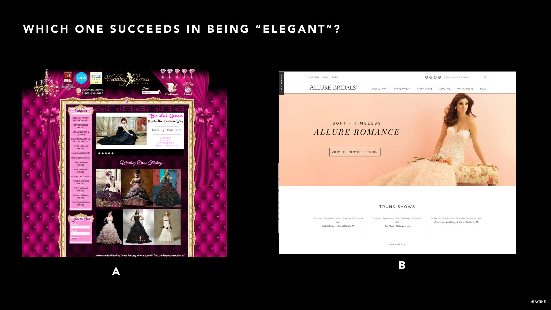
5). When do you prioritize aesthetics with usability?
They go hand in hand. Color, size, placement, hierarchy, layout should enhance not compete with usability.
Obviously, designing something for a consumer is very different than designing for task optimization.
For example, you would not design forms fields in a wizard for a frequent task on the UI of a customer service rich internet application used by a customer service representative (unless you are cruel and hateful).
You might break up a form in smaller chunks, however when you are designing input fields that have validation that requires a server call and you want to make error correction and control easy for a new consumer. Example: creating a user-name and password for a new account. This involves checking to see if this username or email is already in the database depending on what is being used as an unique I.D and you would want to have the user chose a new id or recover their old one before moving on to the next field. There are some simple tricks that look great and enhance usability so the user need never know of the complexity or that there even was an error depending on how elegantly the ui is designed.
Ah, forms. This is a topic for another time.
7). When/Why would you use different typefaces?
It depends on many factors:
Brand:
First determine if there is a current brand digital style-guide. Most brands have already thought about how their brand extends to the digital medium and to devices and other medium (and if they haven't, I can help them do that ;-) ). If not, carefully consider the current style and ask:
What overall look are we trying to convey?
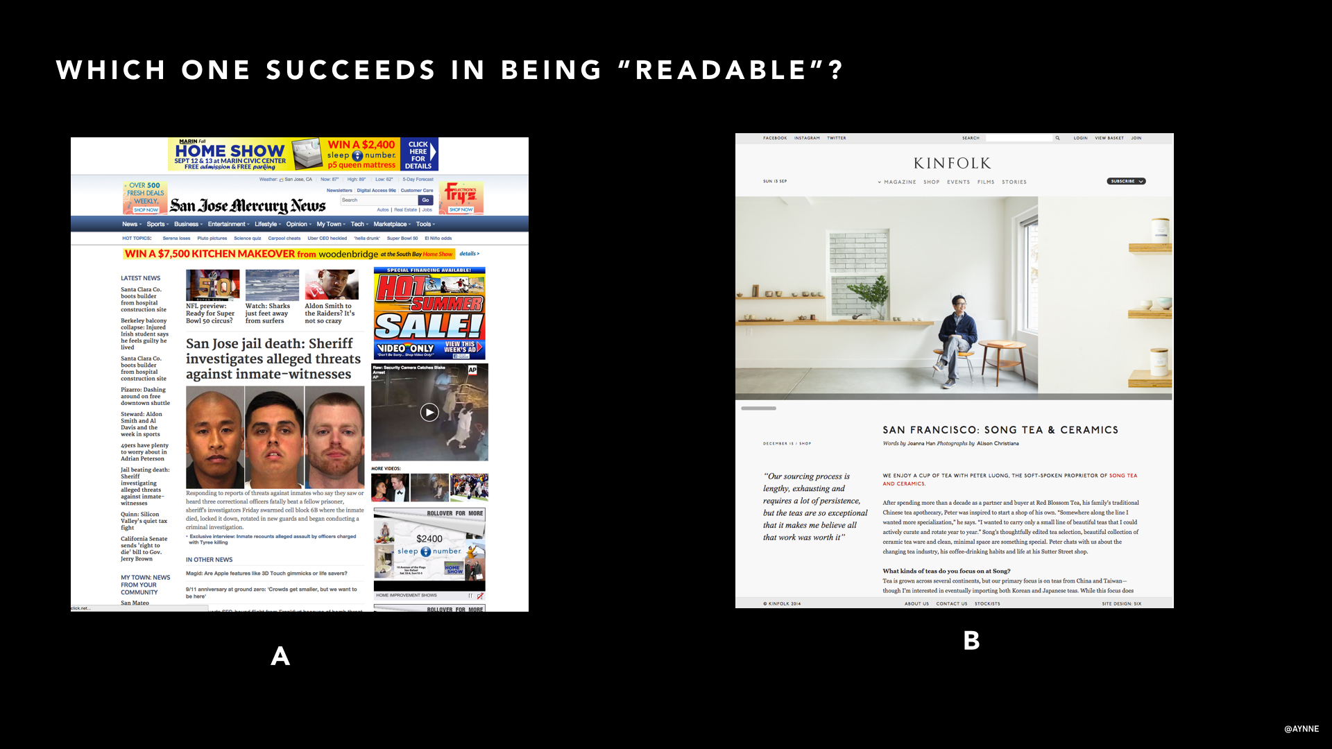
Sophisticated? Urban? Conventional? Hip? These lend themselves to a very different style for key typographic elements like Headlines, and Headers. One should never go crazy on the type to to the work of driving the visual style. Body type should be legible first and only.
I will be talking about this extensively in the upcoming Creating the Digital Brand lecture.
Some inspiration: http://mediaqueri.es/
More on Typography here: http://www.sitepoint.com/typography-101/
What screen size are you designing for? What is your medium and what is the context?
What looks good on the web might not look so great on mobile. What works on a tablet might not work on a watch. Car touch screens require much larger and legible size. If you are designing for something tiny and under 7 pt aliased fonts actually work better. There are lots of variables to consider.
The most compatible fonts across all platforms are: Georgia, Palatino Linotype, Times New Roman, Arial, Trebuchet MS, Verdana, Courier New.
Generally, UI, form labels and help text should use a highly screen-legible san serif font like Arial, Verdana, Trebuchet or Tahoma. Tahoma and Verdana is slightly wider, Trebuchet is slightly more condensed. For experiences optimized for reading, do your readers eyes a favor and stick with well crafted serifs Times New Roman, Georgia, Baskerville are easy on the eyes for dense copy. There are LOTS of choices out there. https://www.google.com/fonts
And please, for love of humanity, never, ever, ever use Comic Sans.

Long View Design - The art of an intentional future
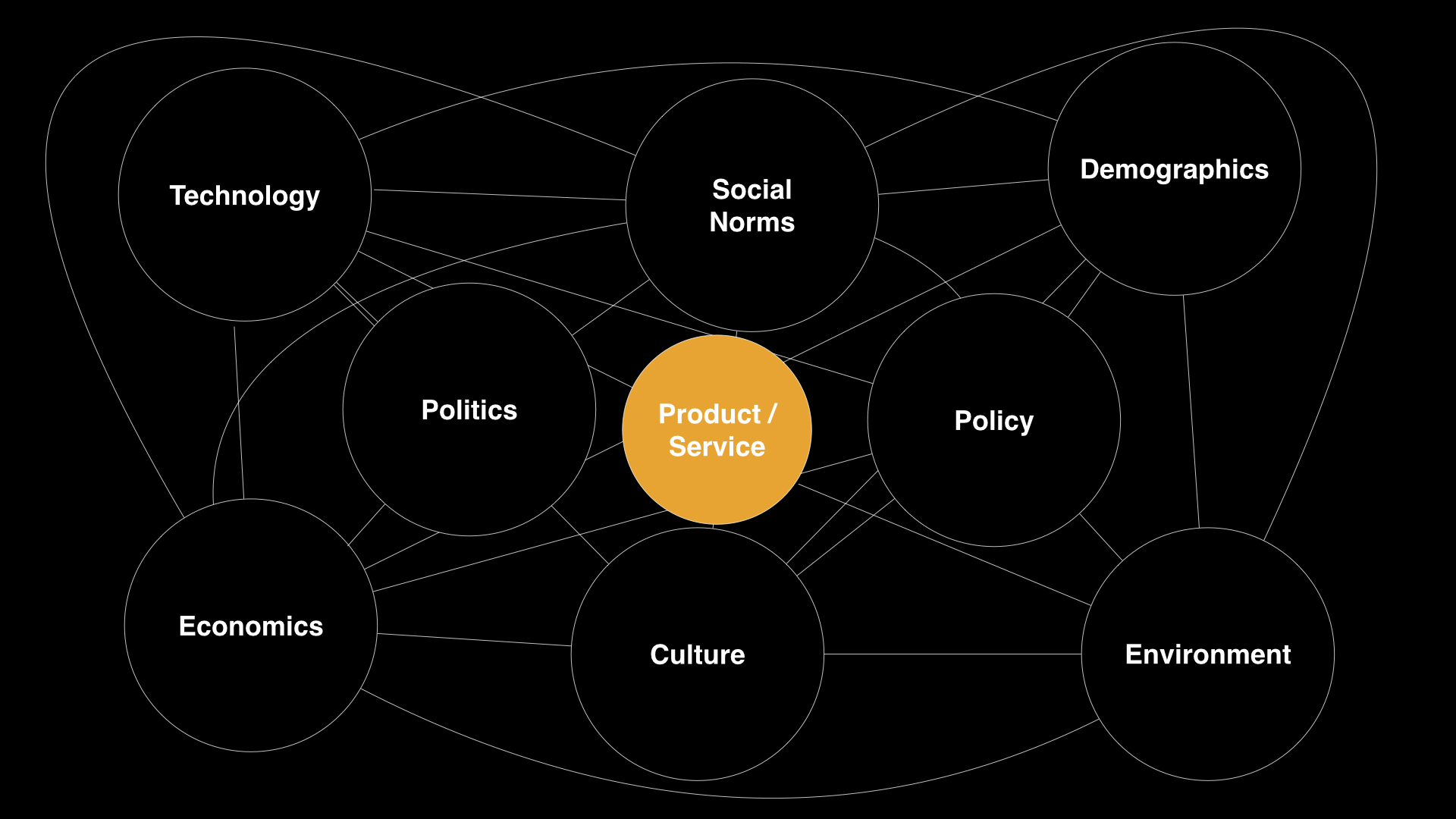
I presented a talk at the Re:Design conference this week. It was terrific event, purposely small and with a variety of speakers centered around the theme of Renaissance.
I spoke about "Long View Design" which is my term for incorporating systemic thinking, cultural norms, and economic forces into product and service design.
I gave an overview of Bruce Mau's Massive Change as the catalyst for my interest in the cultural impact and consequences of design.
I discussed the historical context of computer related design and how it fit into the cultural zeitgeist and then discussed the new era we are moving into and some of the mega-trends that will affect the constraints, cultural factors, policy and economic conditions we should consider.
I concluded with tactics designers can consider in preparing themselves for the mindset needed to think about the impact of the products and services they put into the world.


The Design of Aging & Death
Managing digital profiles.
Death is not a topic that frequently comes up in our youth obsessed culture. It is certainly not the most upbeat topic, but aging and death will impact us all sooner or later.
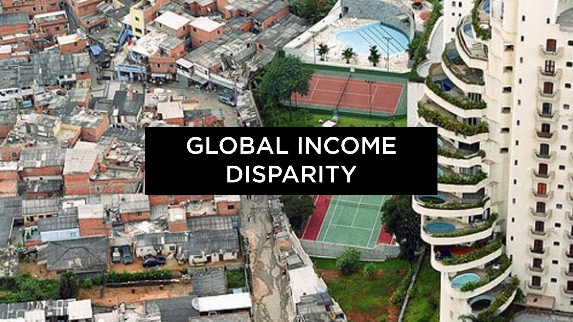
And our population is aging at an unprecedented rate. With the baby boom age cohort the U.S. and Europe will soon need to grapple with the implications of handling large scale retirement, assisted living and ultimately geriatric care. While unpleasant to consider, I believe we must think of this is an opportunity to think through how we handle our inevitable mortality in a way that is hopefully more graceful and conscious than it is today.
To get a better understanding of the potential scale and geographic areas where this impacts, one need only check out Governings excellent data visualization indicating the median age of specific counties in the US http://www.governing.com/gov-data/age-65-older-population-map-usa-counties.html
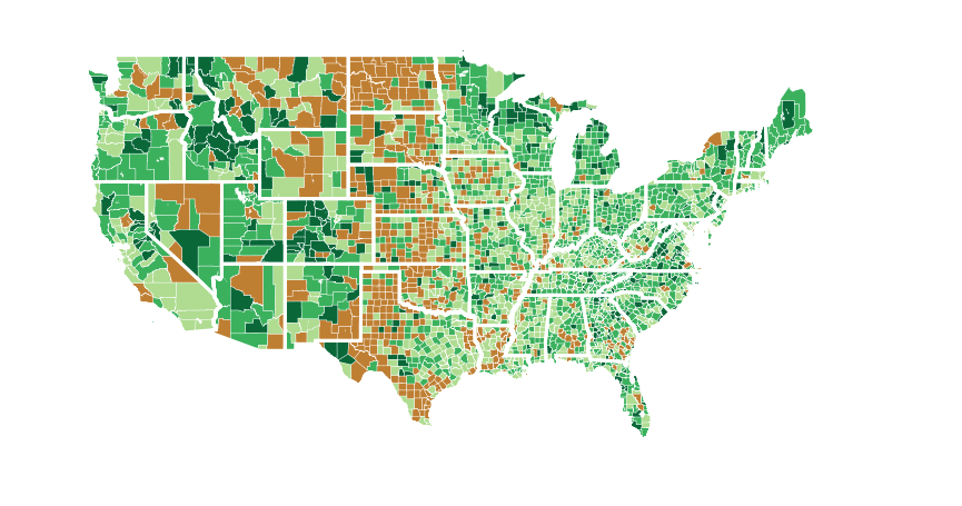
As you will see areas 45-65 tend to be in areas that are suburban or rural with lack of access to public transportation, health resources and social outlets.
More on this topic upcoming.
Some weak signals of this trend are in the new this week.
Fusion has an interesting article on the implications of the sharing economy and dead people.
This on the heels of Facebook's and Google's announcements of assigning a digital proxy to manage one's social identity in the inevitability of one's death.

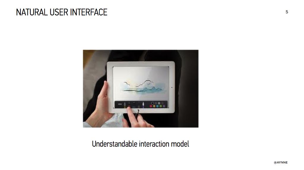
What my mobile can learn from my BFF
An old post from 2012.
An old post from 2012
“People are getting better with computers, but computers aren't getting better at People."
This is a paraphrase of something I heard someone say recently. I can’t remember who or where because I lack a keyword search field. Which begs the obvious statement:
I am a human, not a computer.
Despite the fact that our “computers” are now always with us in the form of smart phones and sensor devices, they still require that we act like them, instead of them acting more like us. This isn’t such a great deal, considering the promise of just how “smart” computers are supposed to be.
I ask you, would you hang around with someone who behaved like your smart phone? Do you really want to spend time with someone who constantly interrupts with and never remembers your favorite things? My best friend forever (BFF) would never do such a thing.
How can we make the pocket sized computers we carry around with us everyday more like our BFF and less like a computer?
My BFF and I are embodied with some of the following traits that my smart phone would do well to emulate:

1. Spacial pattern awareness through size, color, expression and sound
As a human, I am a born pattern recognizing expert. This is an instinct that has enabled us to survive as a species. I can tell at a glance approximately how near or far something is. The color red indicates a warning that needs my attention. I can tell by subtle cues on a persons face if they are friend or foe and I know if the bear that approaches me intends to make me dinner or just wants to say hello. People use sound and gestures to indicate approval or to proceed with caution.
Designers can use visual and auditory cues to exploit this human trait.
What if when I ask Siri to find a location I get a little “whoooooosh” or a “tsk”–a subtle audio cue to warn me that something is too far for me to walk to? If the same person has called me several times, what if a badge on my phone changes color or gets bigger? What if my phone can alert me to potential dangers or provide a subtle cue that something I like might be nearby?

2. Listening
Over the course of our friendship, my BFF and I have learned our mutual likes and dislikes. I know he is a foodie who likes a nice premium cocktail, and he knows I am a veggie who can’t stand the smell of seafood. We both like off-the-beaten-path places, yet neither of us would go to a seedy part of town too late at night. We know this because humans listen to each other and make a mental note of such preferences.
What if my mobile asked me once what my preferences are, and then did its best to infer more subjective, human information to suggest things that meet that criteria? What if when I look up a generic search like “restaurant” my preferences have already been stored, and I never have to see (or smell) Joe’s Fish Fry ever again?

3. Awareness of my surroundings and empathy
If I was in a work meeting, my BFF would never drop by, barge in the room, ring a bell and hold up a sign saying “Shoe sale! Get the lowest prices on new looks for Spring!”, even though he knows I have a weakness for a good shoe sale.
My BFF would know to weigh the information that he receives, and never interrupt me when I am “busy.” But he would also know that there are varying degrees of “busy,” and that an interruption is warranted if there is a true emergency, or if I have indicated that I want to be notified if a specific person is trying to reach me.
I am human, and I am hard-wired to respond to things that I perceive as needing nurturing. When my phone bings or bleeps at me, or a number shows up on a badge on my iPhone, I am going to pay attention to it, even if I don’t really want to, because I am human and that’s what we do. This is why things like Farmville and Draw Something are so darned compelling. It’s also why we obsessively check email. Each little notification gives us a little moment of excitement and provokes a desire to take care of something. Nurturing is an important motivator, but should be used judiciously. My smart phone doesn’t make the distinction of what or why I am receiving an inbound communication. From its tiny computer point of view, everything is weighted equally. Instead, what if my phone knows that when I have a calendar item marked “busy,” or if my phone is on “silent,” it would then pause all notifications from coming in so that I can concentrate on what I am doing?

Be a (hu)man about it
So as we begin to explore design for new computer systems, what if we pause to ask ourselves:
How can I make this system more like my BFF?
How can I endow this system with the good human qualities of using sound, color, and size to give context to patterns, make it listen more to the important details I tell it everyday, and help it to be more aware of my surroundings and to respond appropriately?
If we start from this place of making the things we carry more lovable, not just because they are pretty objects, but because they love us back through attention and respect, I think we will find some very creative and unexpected solutions. So the challenge is, now that we have the toolset to do it, lets see how we can make human computer interaction, well, more human.

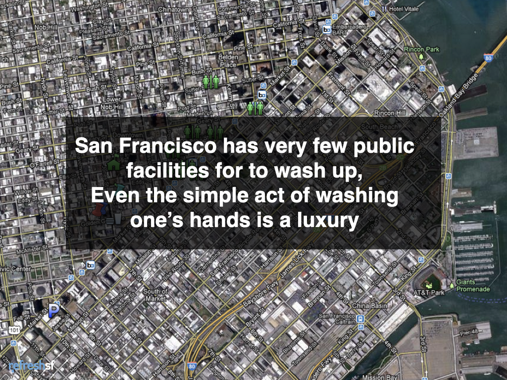
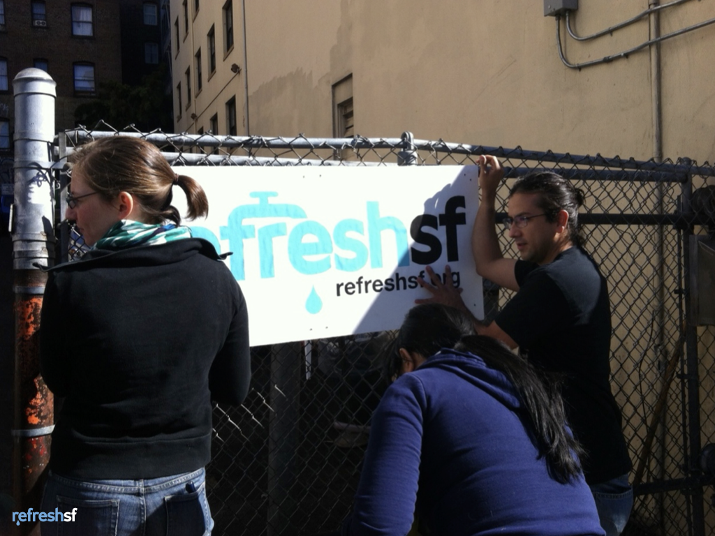
RefreshSF
RefreshSF, SoCap Creative Currency winner
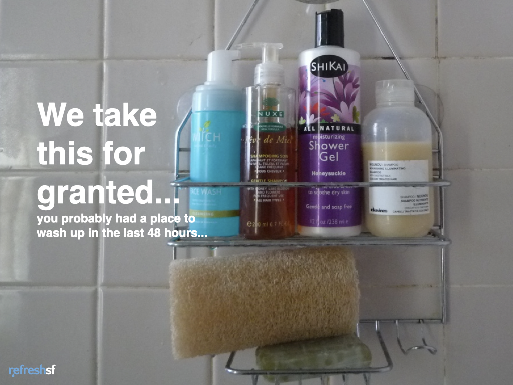
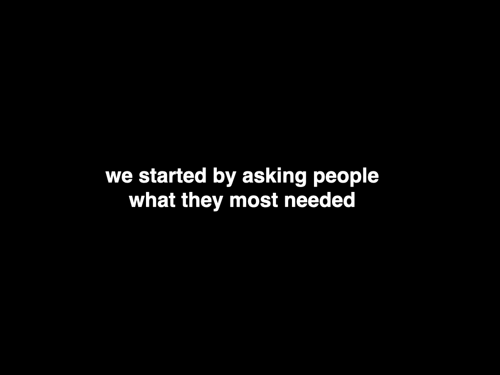
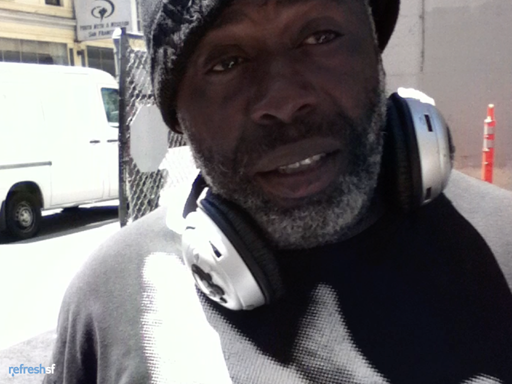
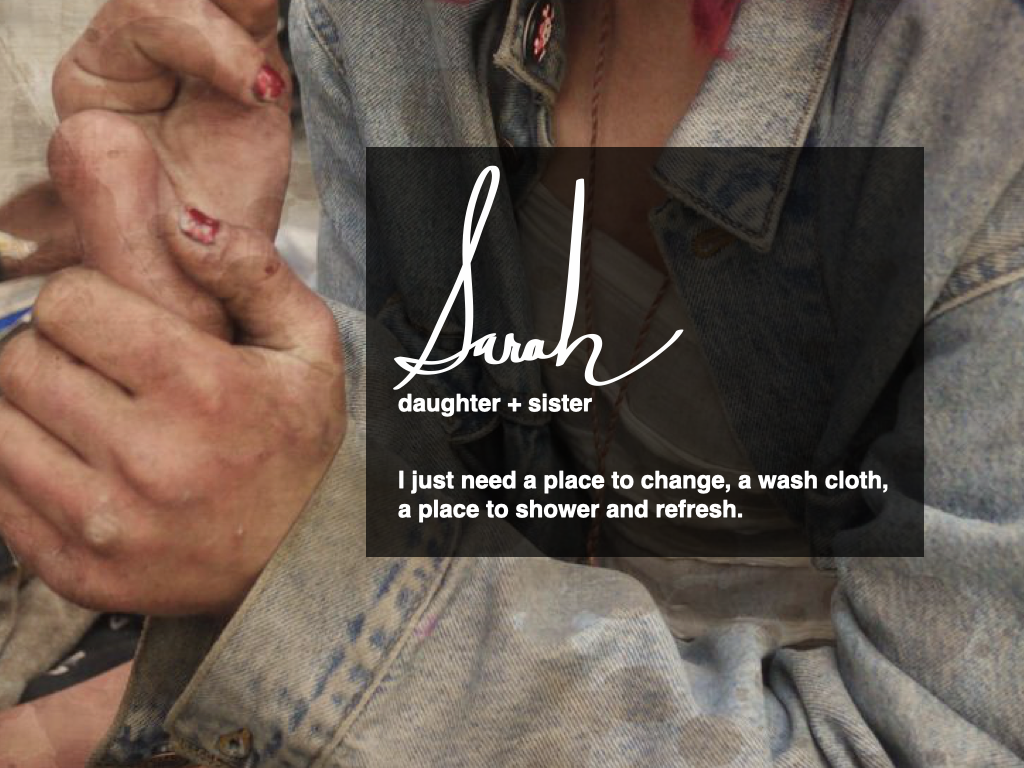
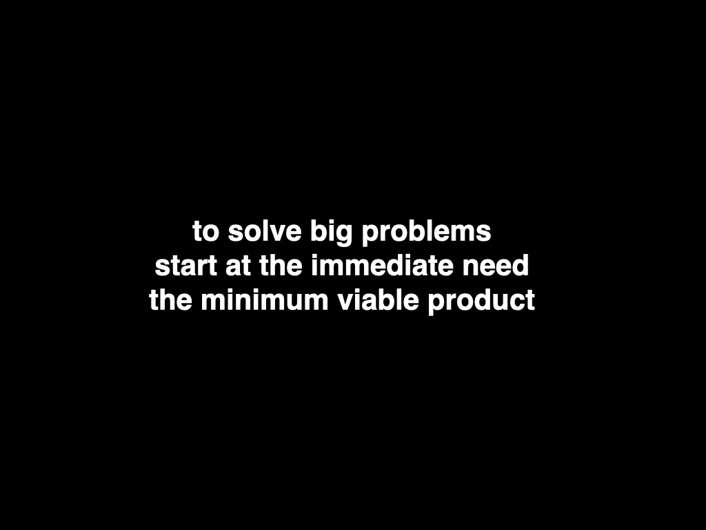
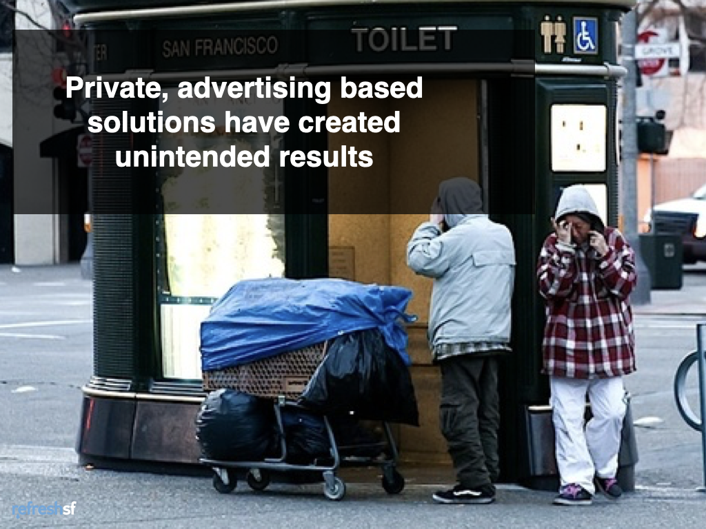
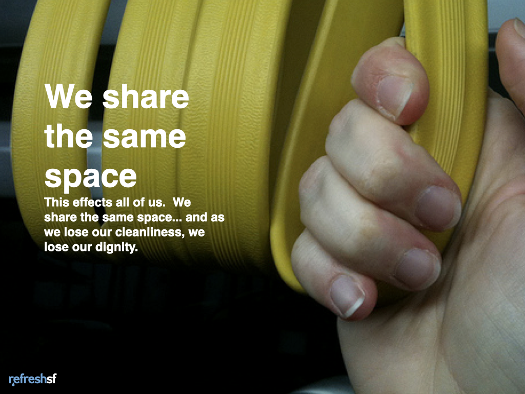
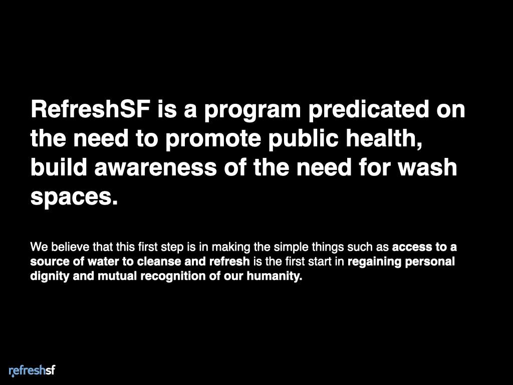
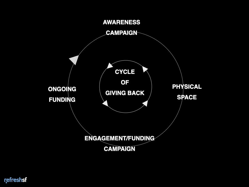
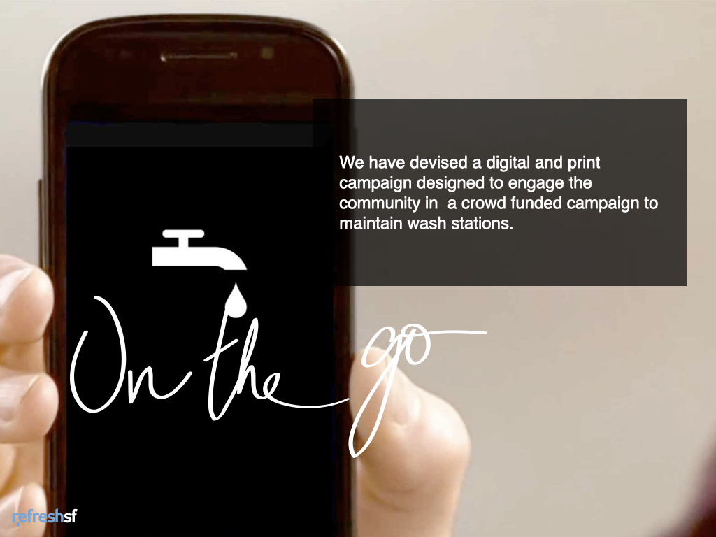
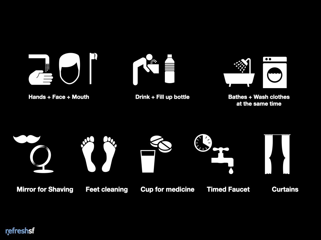
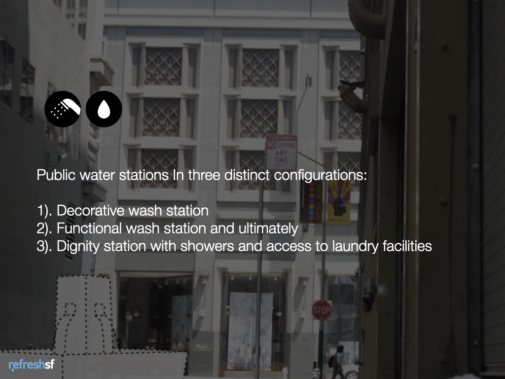
RefreshSF was a project aimed at helping people access fresh water, a critical need for homeless people. This project sought to reopen the City of San Francisco public restrooms and get funding to open public stations for bathing, washing clothes, laundry, etc. The idea is to use unused or underused urban spaces. This project used crowdsourcing with a public awareness campaign and a mobile system for citizens to donate small amounts of money to the project.
Our team did three pilots of our idea in San Francisco, setting up temporary wash basins with a water hose to attract attention and get feedback. .The feedback was positive, we discovered that many people who used the service were not homeless, and the general public would find the service proposed to be desirable, and they would use it as well. We also found department stores, the Ferry Building, hotels, and local churches willing to support the program.
This project won the Creative Currency hackathon and was presented at the Social Capital Markets Conference.