CalAlert
Envisioning a universal Emergency Alert System for the State of California
CalAlert
CalAlert is a consolidated emergency alert and response system. This system allows residents and visitors to California to view information from multiple verified state and federal agencies and local, crowdsourced information. This system allows local municipalities, police, fire, and other emergency response organizations to push information with little to no overhead.
The climate crisis is the existential threat we will all face in the upcoming decades. In 2020 alone over 4 million acres burned in California. Fires, hurricanes, and floods are only going to get worse, so we must build accessible platforms and communications infrastructure to warn people of danger.
Sign up flow
Designed to gather helpful information to local fire departments and law enforcement.
Customizable Loading screens for Local agencies
Agencies can use custom images or choose from a palette of colors to create a branded visual design.
Related projects
Food for the Hungry
Emene is an ecosystem that allows FH to conduct client relationship management, service and supply deployment to regions in crisis, and overall measurement, evaluation.
Team communications and response deployment for humanitarian crisis situations
About the Product & Service
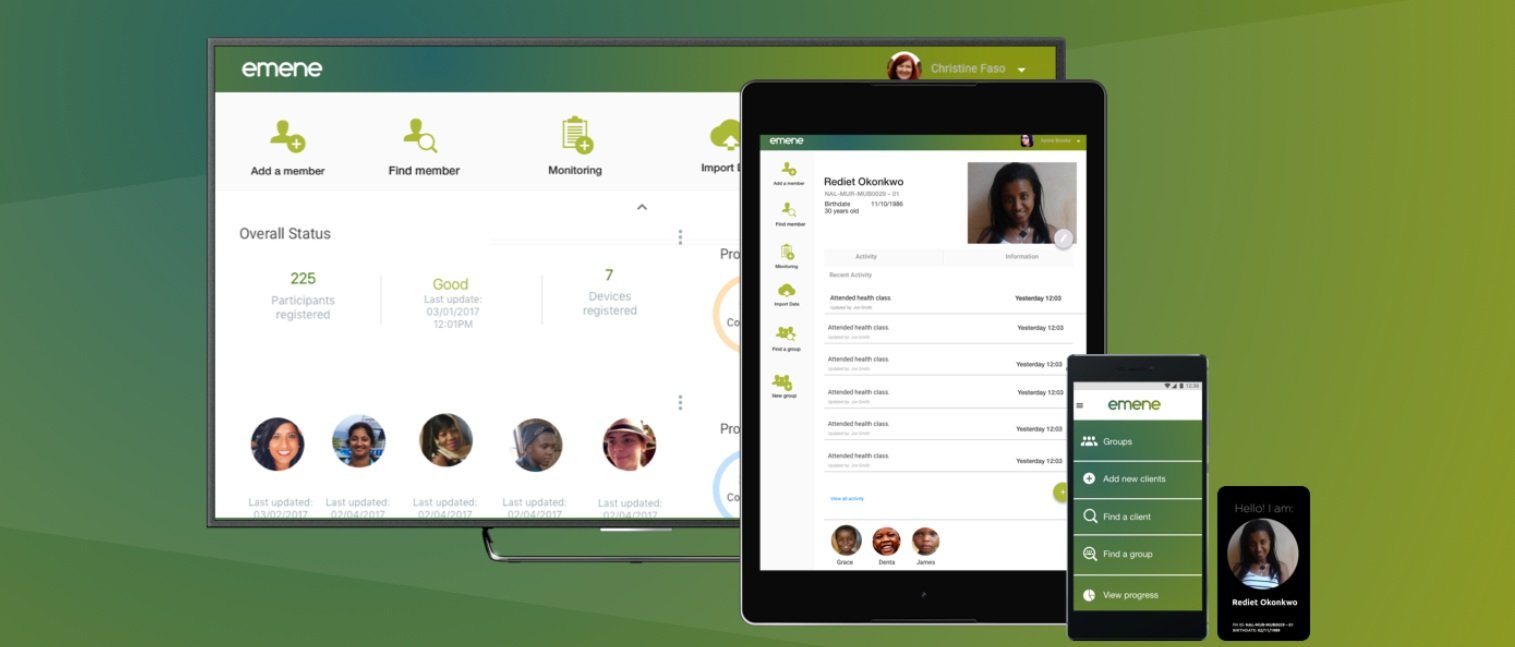
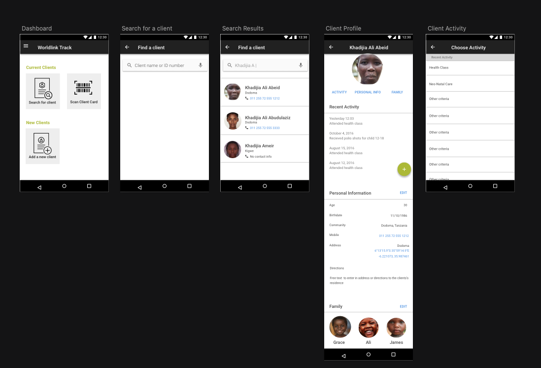
Emene is a system designed for FH (Food for the Hungry). Emene is an ecosystem that allows FH to conduct client relationship management, service and supply deployment to regions in crisis, and overall measurement, evaluation.
Emene aka; Xindicate is the white label version of this measurement & evaluation system for Global Aid providers. This service and digital system enables NGO field staff to enroll aid participants, distribute goods, money and services, track where aid is most needed, record activity, send metrics and evaluate program metrics.
This product launched in 2017 for use in Central Africa (Tanzania, Ethiopia and Democratic Republic of Congo as a beta pilot for Food for the Hungry in cooperation with USAID global NGOs.
Role: Service design, visual design, interaction design
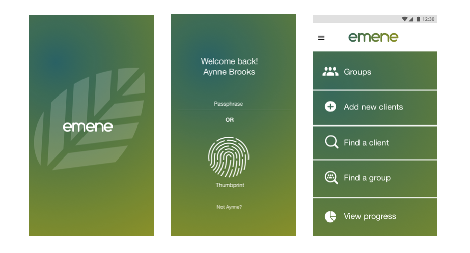
The entire system is comprised of a desktop web service that shows program analytics, an android tablet application experience used for large scale client registration and crisis deployment and an android mobile application that allows for remote, ongoing client data collection and supply distribution.
Team leader using the cards to take attendance in Tanzania
Create new client record flow (online and offline)
Search for client flow
How the system works
Users and touchpoints
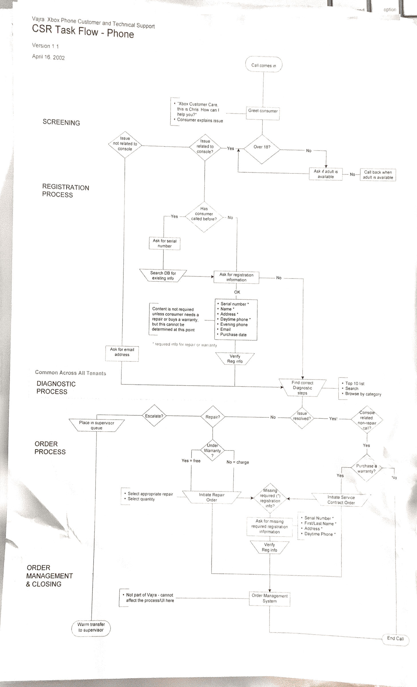
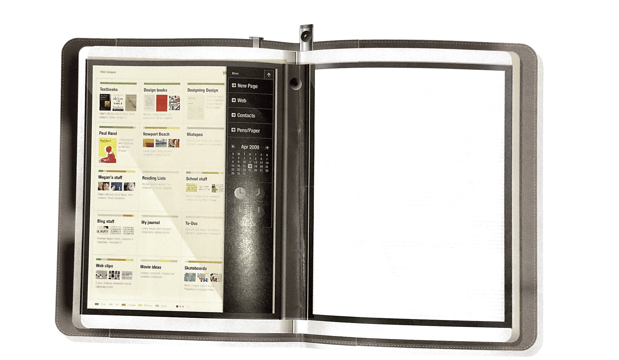
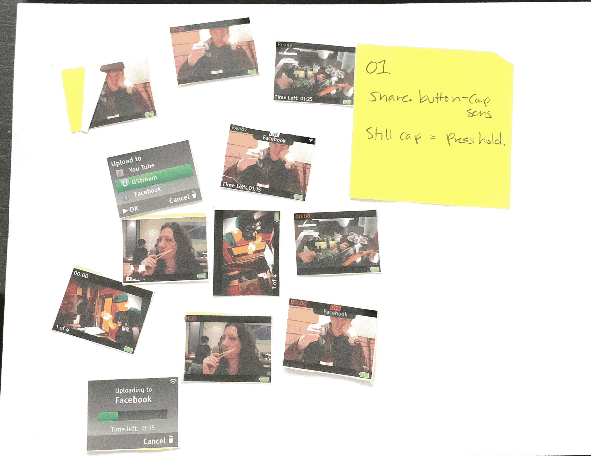
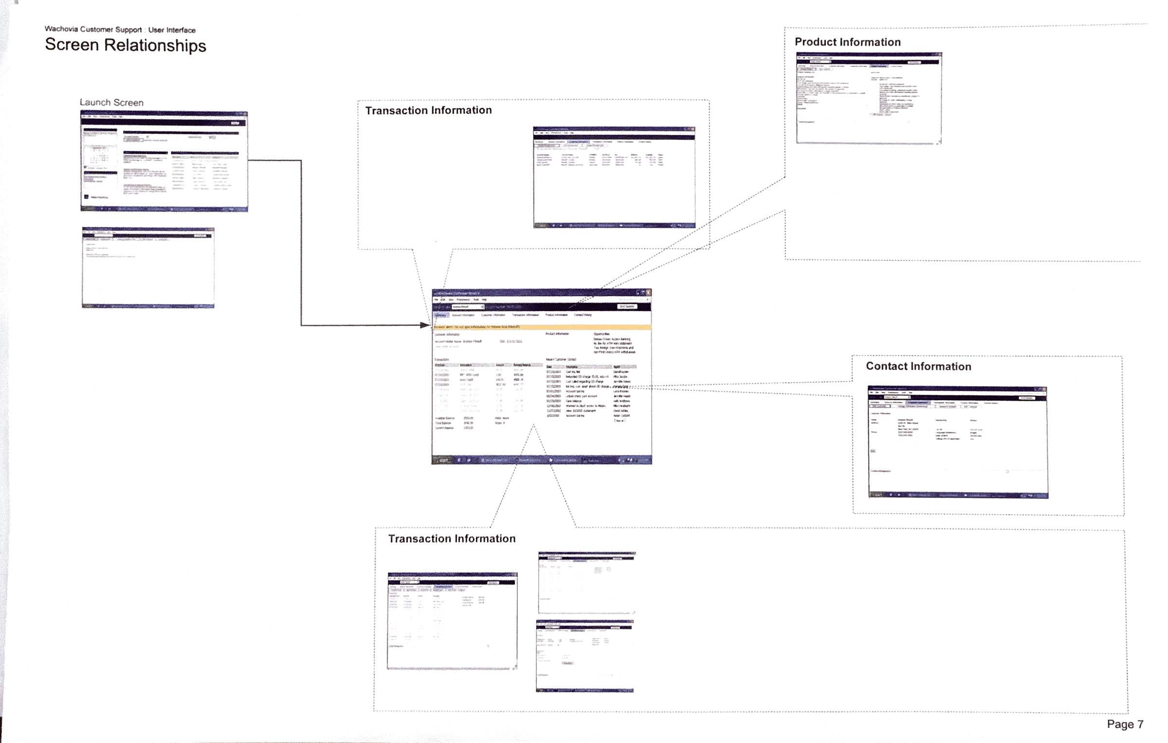
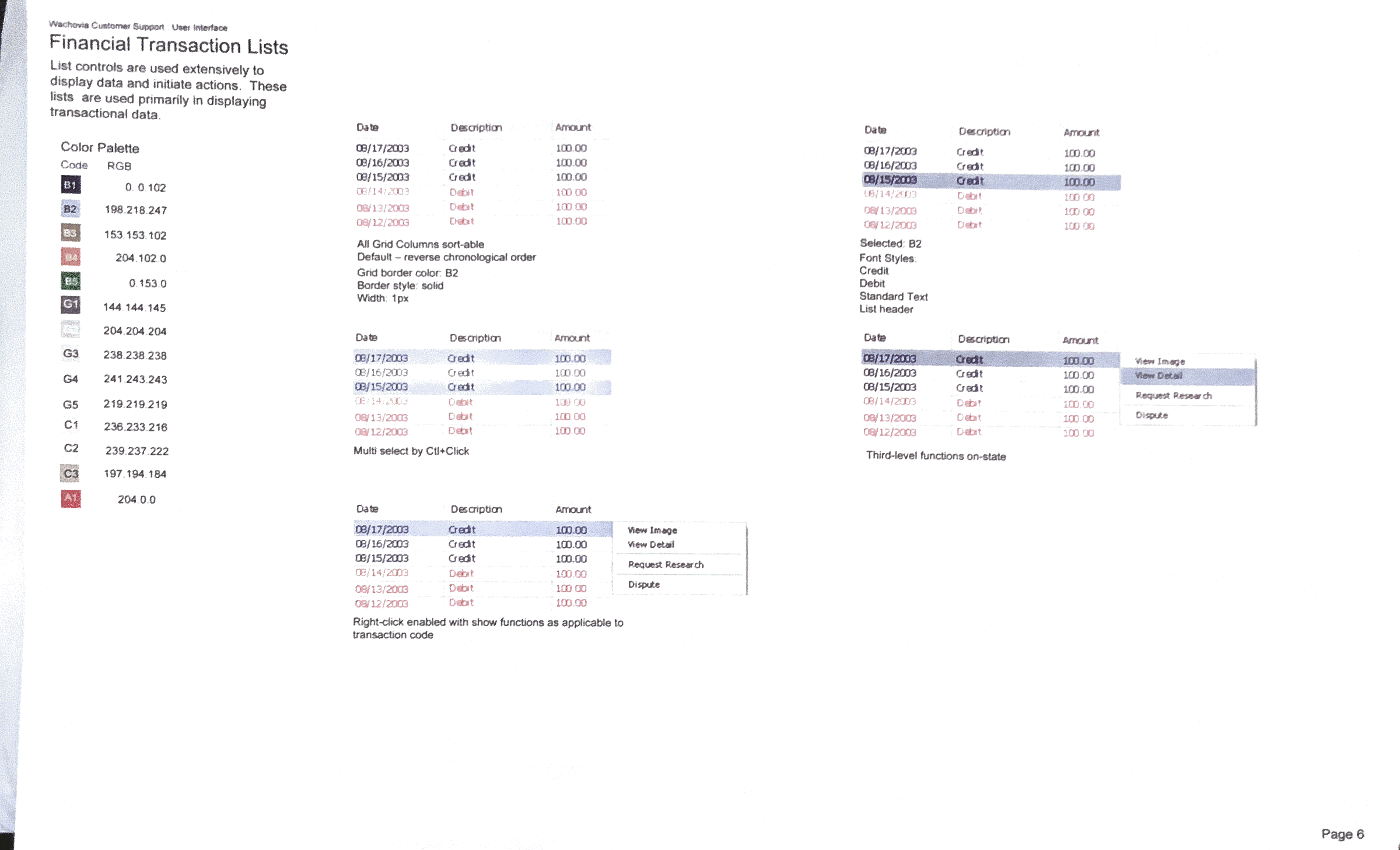
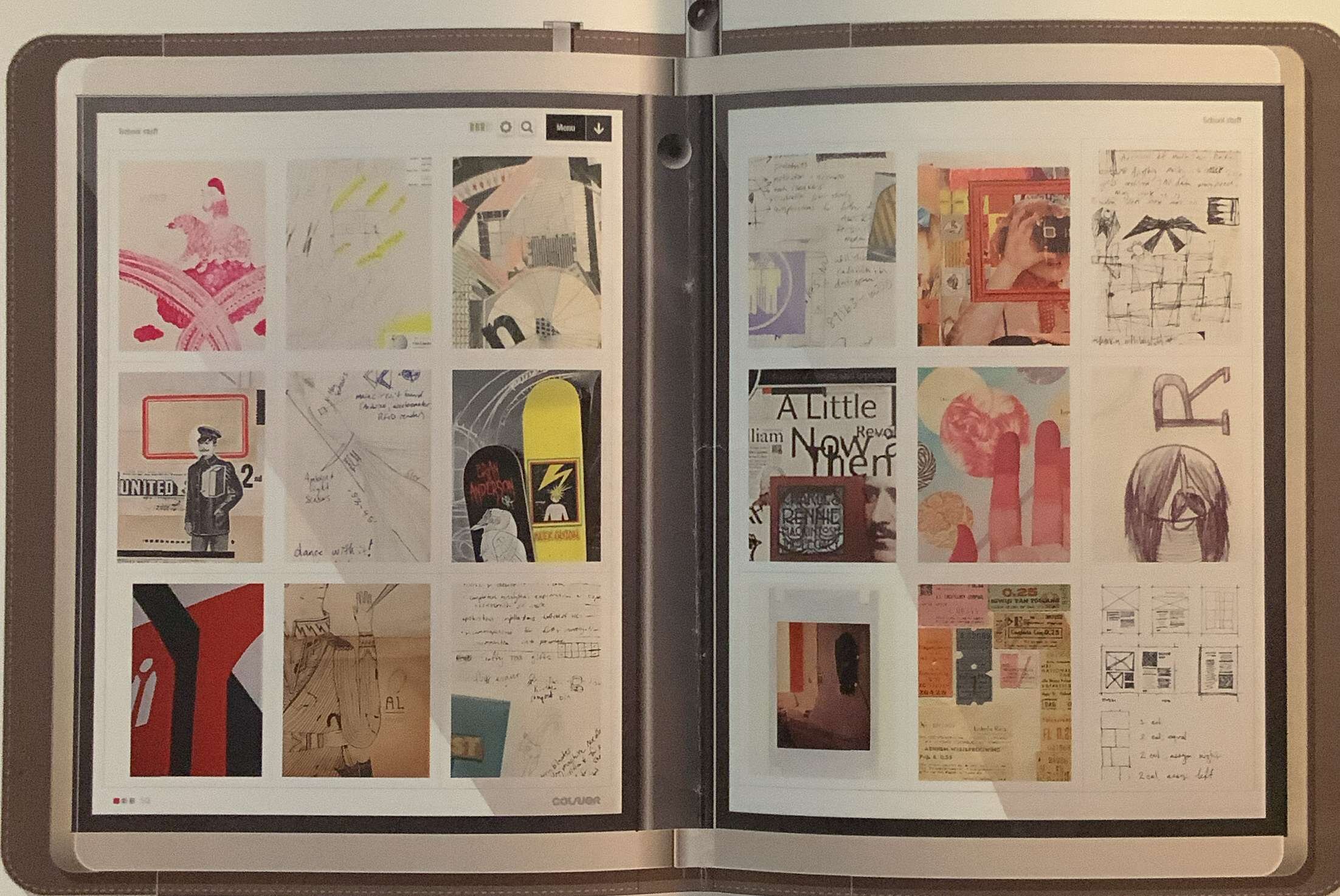
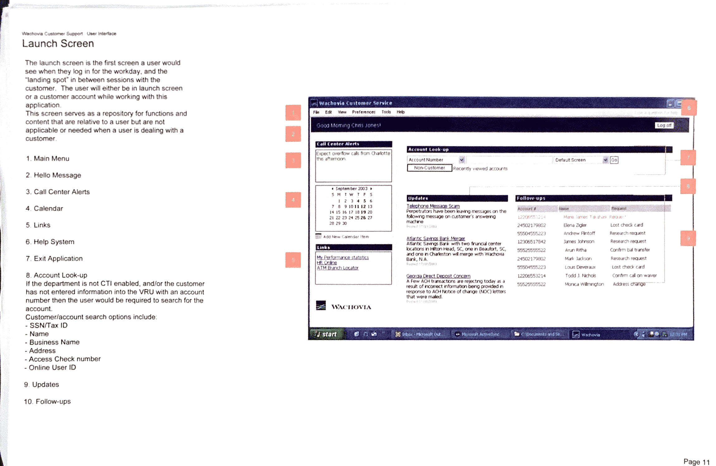
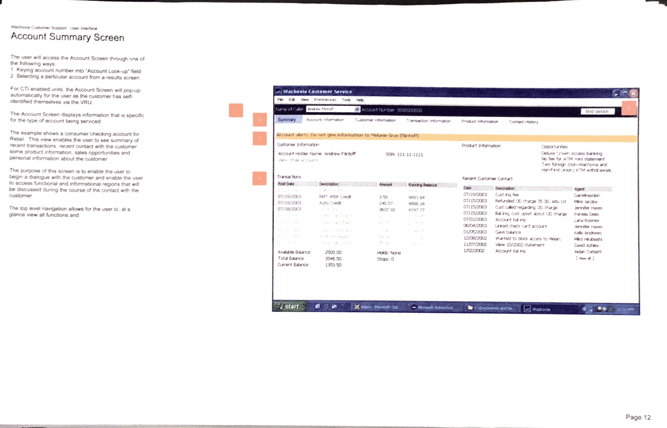
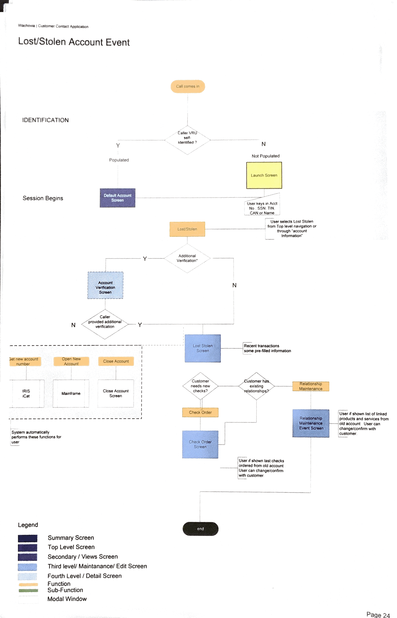
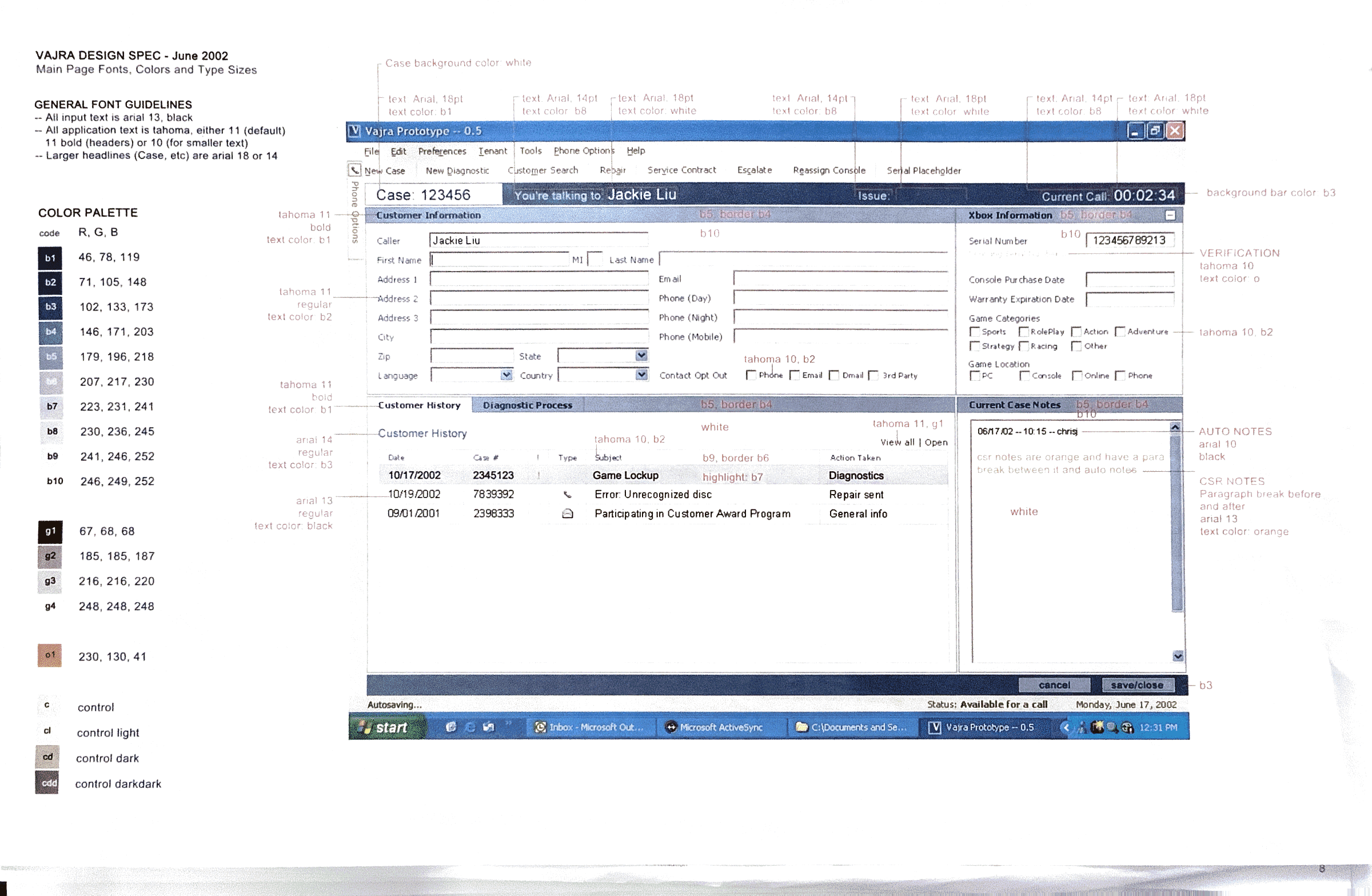
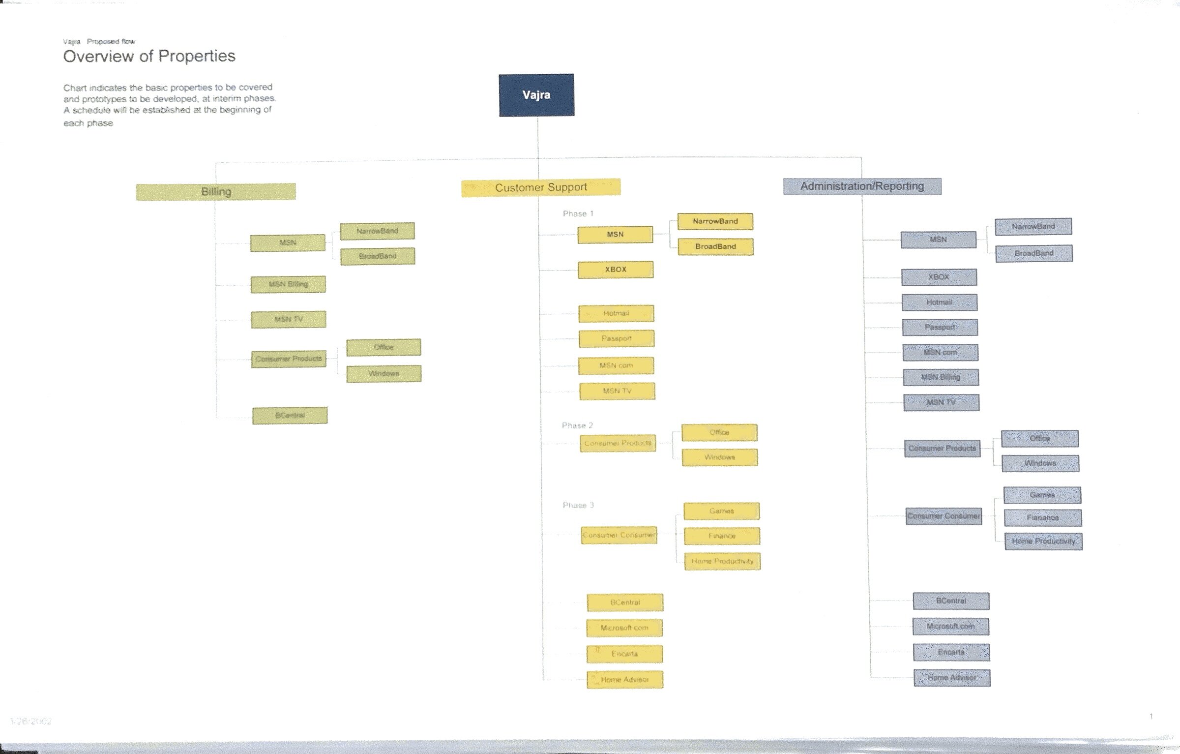
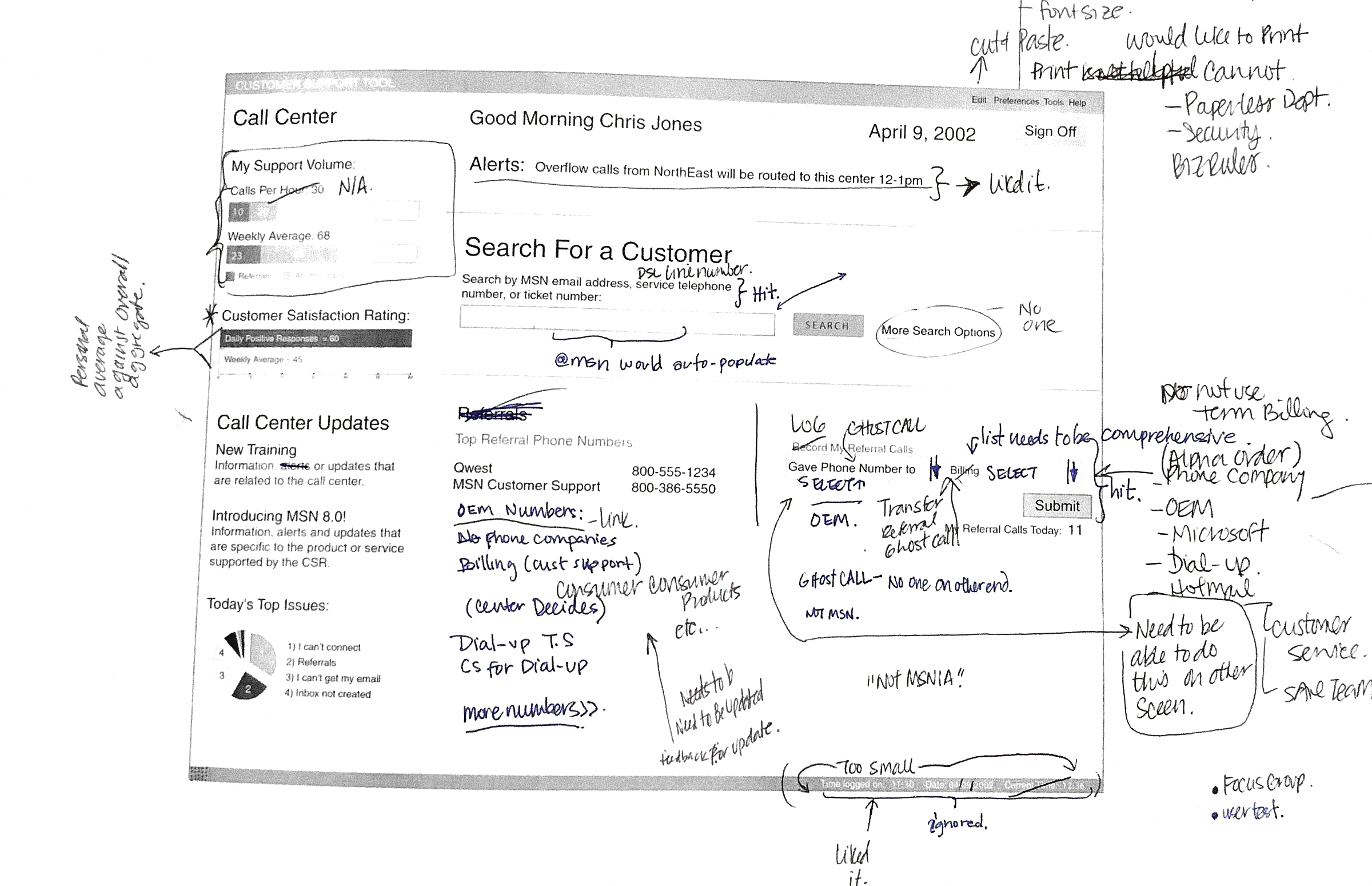
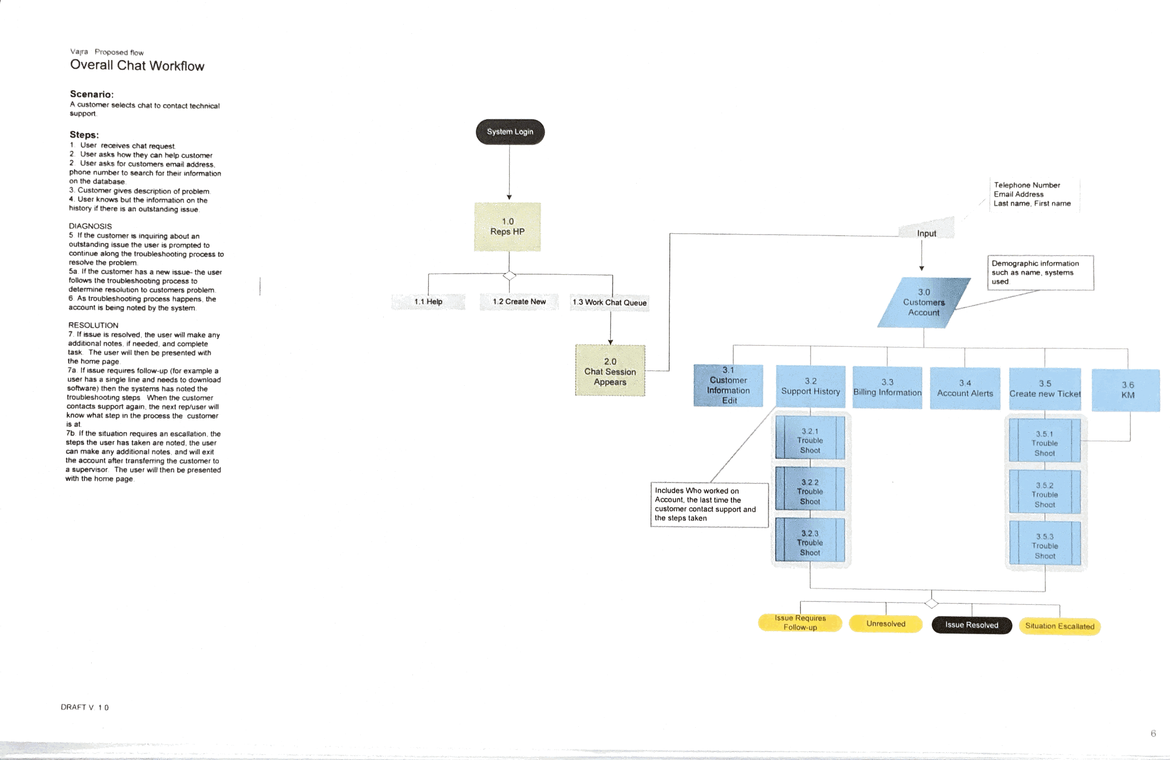
Designers Archive
some very old projects I worked on
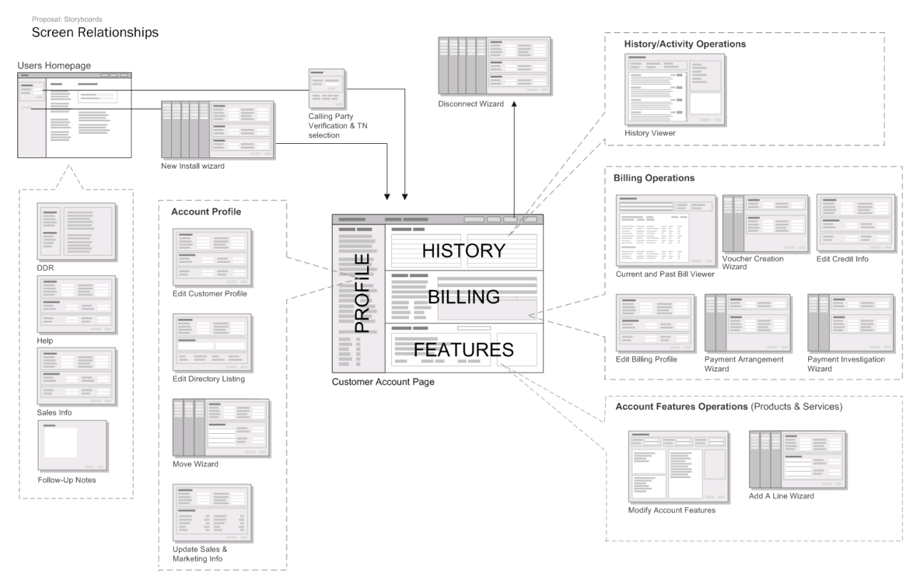
A recent move has prompted me to go through the five large storage boxes I have been keeping in a closet the past 15 years.
In it I found a treasure trove of old design work, printed documentation that I always meant to get shredded or recycled but did not ever get to it.
These are very old and the companies and products are long defunct or dramatically different.
It struck me as being interesting to see how the process of designing has evolved with the tools and technology that are available.
Here is a random collection of work that I have done over the years, mostly hardware/software design and in no particular order.
See even more older work on my Coroflot page.

Dear SF
#DearSF is a campaign, an open letter to San Francisco.
From workers in the industry to their beloved supporters, we welcome your expressions of survival, resilience, support, pride, and love. This project was initiated by the Entertainment Commission and my role was social media strategy and creative direction.
DearSF is a multimedia love letter to San Francisco.
San Francisco’s small businesses and entertainment venues are going through a dramatic, disorienting, and painful transition during this unprecedented pandemic.
#DearSF is a campaign, an open letter to San Francisco.
From workers in the industry to their beloved supporters, we welcome your expressions of survival, resilience, support, pride, and love.
This project was initiated by the Entertainment Commission and my role was social media strategy and creative direction.
This project began on June 6th and is part of the cities reopening process.
https://www.dearsf.org/
https://www.instagram.com/dear_sf/
Related Projects
Stay in place shelter
The stay-in-place shelter is for people in at-risk situations and families experiencing homelessness during the coronavirus crisis. The first location was at Bayview pier. I worked with several departments at the City and County of San Francisco to pull together experience design, signage, and materials.
The stay-in-place shelter is for people in at-risk situations and families experiencing homelessness during the coronavirus crisis.
The first location was at Bayview pier. I worked with several departments at the City and County of San Francisco to pull together experience design, signage, and materials.
This was used for postcard outreach and main signage at the entry to the shelters
Some considerations for the design approach.
Informal
Should not feel like a government institution. Many people experiencing homelessness have had negative interactions in the past and we want them to feel safe.
Open
While folks are expected to stay in place there, we don't want them to feel trapped
Warm
Through colors, giving the temporary rows of trailers street names, and trailers addresses the intent is to create a sense of dignity and normalness.
Temporary
Use of the word Guest, Staff will be hosts. Implying a relationship that is akin to a hotel or any temporary stay.
Signage
Signage in place prior to opening day
Related Projects
CityTestSF
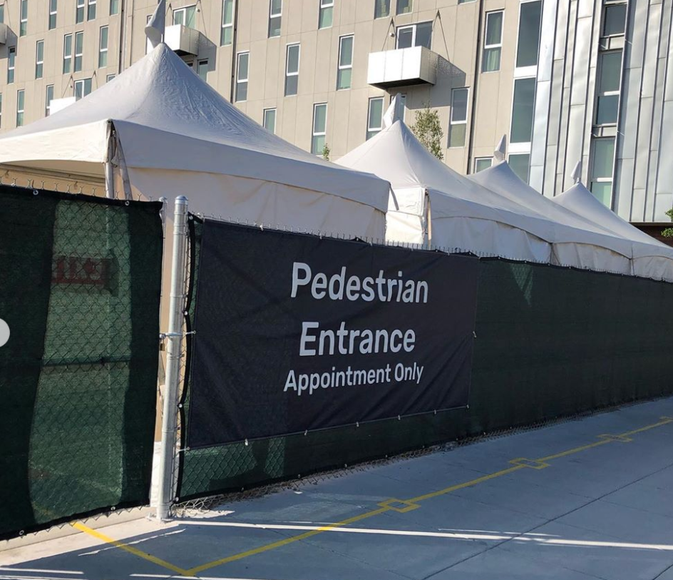
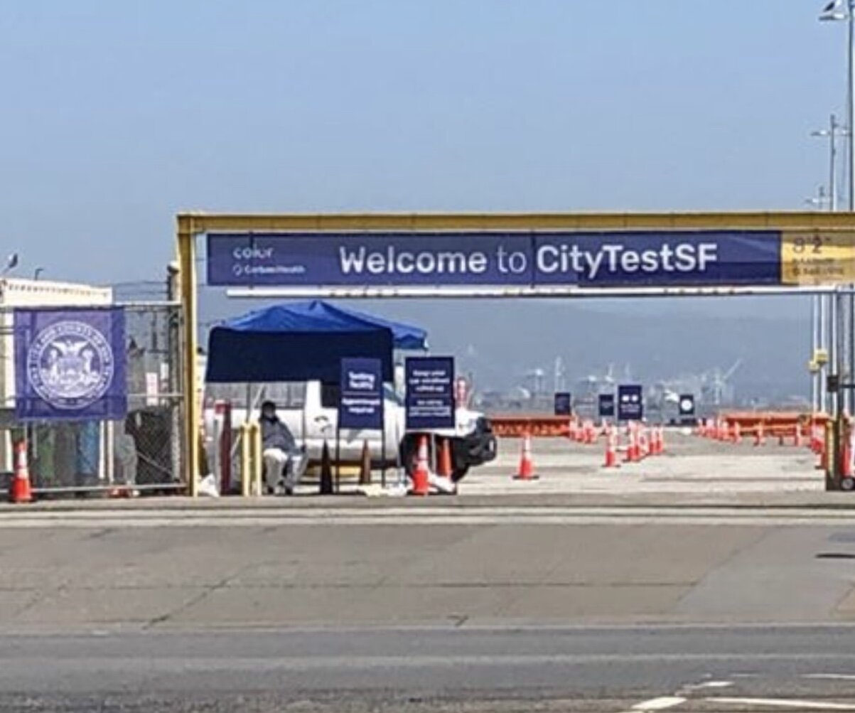
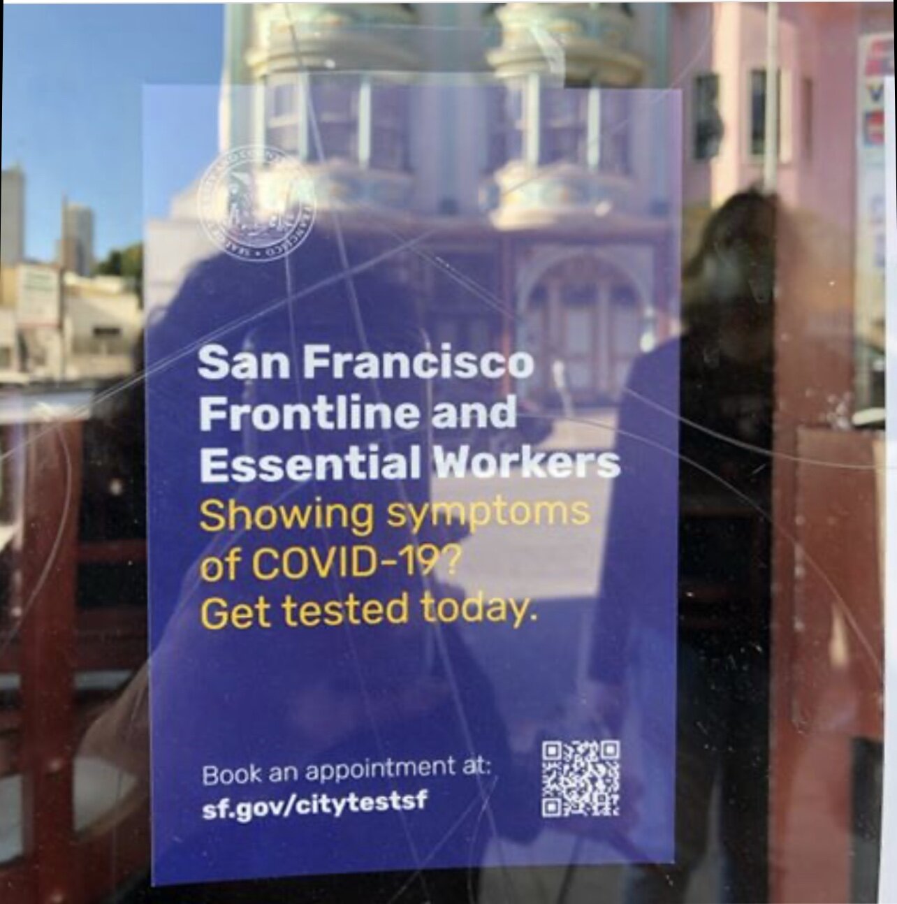
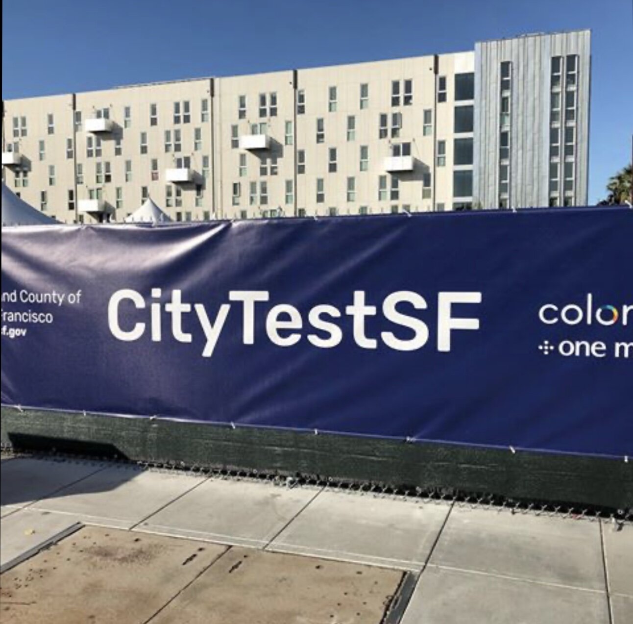
CityTestSF is a Covid19 appointment-only testing spot for essential workers by the City of San Francisco in partnership with Color, Carbon Health, and One Medical. My team at SF Digital services designed the onsite signage, the online booking system, and a solution for safe distance on-site communications.
Rapid response in a global emergency
CityTestSF is a Covid19 appointment only testing spots for essential workers by the City of San Francisco in partnership with Color, Carbon Health, and One Medical. My team at SF Digital services designed the onsite signage, the online booking system, and a solution for safe distance on-site communications.
Things we considered:
Clarity.
Being clear about what this is, who it is for, and what to expect.
Safety
From gathering information prior to arrival to anticipating questions and creating a safe way to handle questions so we never put people working on the test site in harm’s way.
Friendliness
Getting a test for a potentially dangerous virus is scary. We wanted people to know we care. And did this by using some small touches like simply emojis in strategic areas to take the edge off a stressful situation.
Consistency
It had to feel like it came from SF. We wanted to make sure that from the first touchpoint like an email, or poster, to the test results, everything felt like a cohesive system.
One of the many services we are launching to help the people of San Francisco and the people who protect and serve them.
Learn about it at:
https://sf.gov/citytestsf
Related projects
Design in the time of a pandemic
This last month has been the most rewarding time I have had in years. I have been delighted to be able to roll up my sleeves and pitch in to help during this crisis.
Going digital, fast.
In the Fall of 2018 I saw an opportunity that I couldn’t possibly turn down. I saw an opening for the Design Director for the City and County of San Francisco Digital Services. The fact that I already had a job was certainly a deep complication, but the opportunity to serve the city I love to lead the design team and apply what I have learned all these years in tech and design was too tempting to pass up.
The first few months were an adjustment. I had a new team who didn’t know me and who I didn’t know either. While I understand the hierarchies and politics of big companies, I didn’t know how to navigate the waters of Government from the inside. I found that the timelines were paced differently than I was used to, and while the problems we were solving were complex, they were not complex in the more experimental/pushing the envelope on technology that I was used to. I thought the biggest challenge ahead of me for 2020 was design operations, scaling the team, and evolving the existing design system. And then, the COVID-19 Pandemic happened.
The first signs things were changing were so small they were almost imperceptible. I attended a conference in Milan, Italy, and we discussed the possibility of something major happening, but still, it was in a distant, academic way. And then came the day we were told to work from home. And suddenly, everything sped up and slowed down at once.
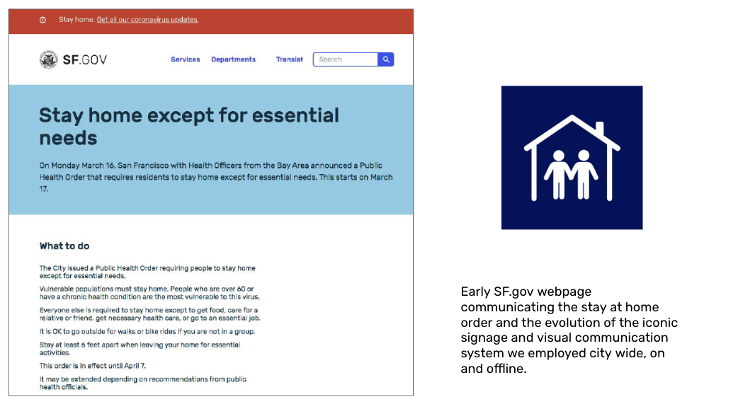
The city suddenly needed to go digital and fast. In a month or so my team delivered:
High-level UX flow for worker and family first program
SF.gov COVID Response Content News and information for everyone in the city
Workers and Family Fund: A program to help small businesses pay sick leave to employees
Electronic Plan Review: An online Electronic plan review process and service to keep critical building permits moving along
SF VolunteerAn online service for people to volunteer to help seniors
One of the mentions The Mayor made of a program I worked on.
City TestSF A COVID testing site and the online scheduling tool used to book an appointment and a touch-free communications platform for on-site communications.
My team members worked in the Emergency response command center and created the signage anyone could see throughout the city.
I was delighted to be able to roll up my sleeves and pitch in to help during this crisis. I have been proud and amazed by the team who has been working tirelessly to make this frightening and bewildering situation calmer and organized for the staff of the city and, most importantly, to the residents and businesses of San Francisco that we serve.
Related Projects
ixd@cca
About the CCA’s interaction design undergraduate program. During my time as the Chair of the program, I developed a strategy for CCA’s Interaction Design Undergraduate Program, this is some of the plan I put together and what I set out to do.
During the last five years, I was Chair of the Interaction Design Program at CCA.
During my tenure, I developed a strategy for CCA’s Interaction Design Undergraduate Program, this is some of the plan I put together and what I set out to do.
An opportunity I couldn’t possibly pass up happened with the City and County of San Francisco so I left my Chairship just as some of the changes I was making have started to come to fruition. However, the program is in the safe and capable hands of my mentor and friend, Erin Malone. And I will continue to be involved at CCA.
ixd@cca
Our program is committed to designing a better future.
We believe we can shape a future that is inclusive, diverse, vibrant and just.
We believe tech done ethically and responsibly can be a force for empowering and enabling human connection.
We are creating complex systems today that will determine what the world tomorrow will look like. And we need change who has a seat at the table when these ideas, products, and services are being created and elevate the voices of the people who these systems will harm or help.
Emphasize exploring emerging technologies
Continually engage with the industry and keep current with cultural and technology trends that will affect our students. This will involve:
Forward-thinking projects for our students in the framework of longer-term, deeper project work that is tied to specific subject matter contexts. This will result in projects that will attract more industry and place CCA as a thought leader in design for the future
An emphasis on partnerships and long-term “labs” that are centered on looking at broad questions facing the design and tech industries.
Focus on professional skills
We want the students to have early exposure to studio culture and the opportunity to work with industry partners and in focused, rigorous projects. We are working to integrate our courses so they are closer to the way Design is practiced in industry. We believe this will give our students an edge in an ever crowded and unpredictable job market.
Give students the skills for entering the professional workforce. Possessing the appropriate technical skills, and feeling prepared with high-quality portfolios and sufficient confidence during interviews.
Time management, including letting go of following a process or ideas (protracted user research, lengthy ideation) when time is too short
Dealing with ambiguity — of a design brief, project goals, user needs, priorities of needs or features, etc.
Collaborating effectively - will be part of Junior review evaluations
Projects that lead to portfolio - Practical examples of digital design assets such as traditional wireframes or other artifacts that relate to contemporary digital platforms.
Seek Socioeconomic Diversity
We attract some of the top talent in Silicon Valley to teach at CCA.
We are proud that our program is one of the only tech design programs that have a majority of female faculty. This is unique and rare among Interaction design programs. We also have the only women of color in the leadership of a tech/design program in the country.
We want students to see that despite what representations they see in the media that people of color, women and those of socioeconomic diversity are currently working in this industry and making an impact and we are need of more in this industry.
2+2 with one or more community colleges.
It is a goal of the program to actively seek to increase our domestic student population, second-degree seekers, and provide an on-ramp to students of socioeconomic and racial diversity into careers in tech and design and this is a part of that goal.
Flexibility to accommodate inbound transfers
We are considering offering our core classes in fall and spring and de sequencing the programs so we can successfully accommodate inbound Spring transfers from other programs and other colleges.
I hope to see the efforts continue. In the meantime, the video below shows the results of the second and third Design for____ Series from the program.
Design for trust Studio with Oracle Design - Fall 2019
Future of work studio + SwissNex
CCA iXD + Oracle
eBay Network Audit
Large-scale visualization of the eBay network.
Using data to inform a redesign
Zoomed out version of the seventeen foot poster
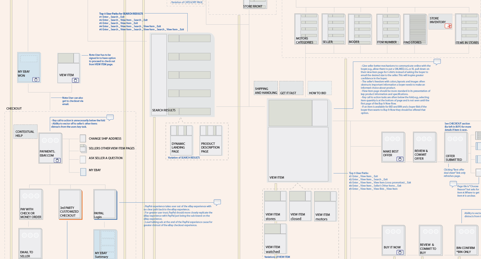
Large-scale visualization of the eBay network, including key monetization flows, identification of flows that could be optimized, and organizational and information architecture change recommendations.
I consulted with Tangible UX to audit eBay’s key user flows. My partner and I audited their entire network. We created an information graphic that leadership and individual teams used to reimagine their Buy, Sell, Help, Support, and Community experience and set them up for success in their redesign.
The result was a series of information graphics and a seventeen-foot poster kept in several locations on the eBay campus.
Team:
Aynne Valencia
Andrew Lynch
James Young
My role:
Design strategy
Design Research
Information Design
Visual Design
Buy Flow diagram detail
Close up of one of the sections
Legend detail
Detail of the legend describing what the symbols mean
Clients exploring the diagram
Related Projects
Identity - Design Is series CCA
Identity for an event series
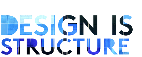
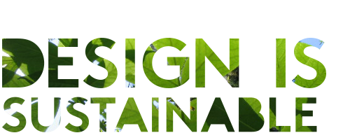
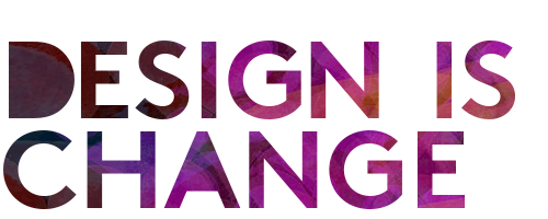
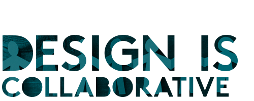
The Design Division of California College of the Arts started a design series and newsletter titled Design Is. I created a flexible design system based on a dynamic logo for the print, digital and in person presentation channels.
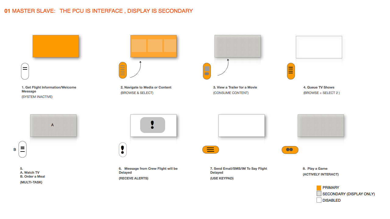
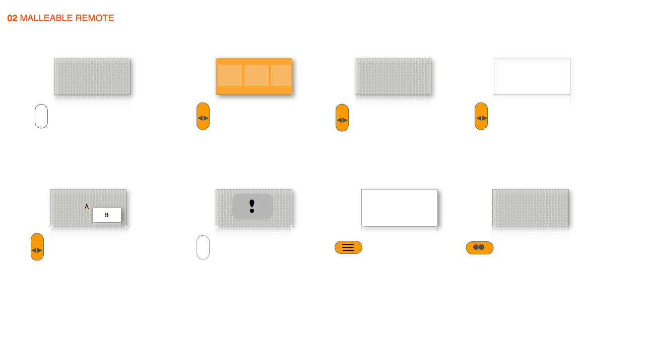
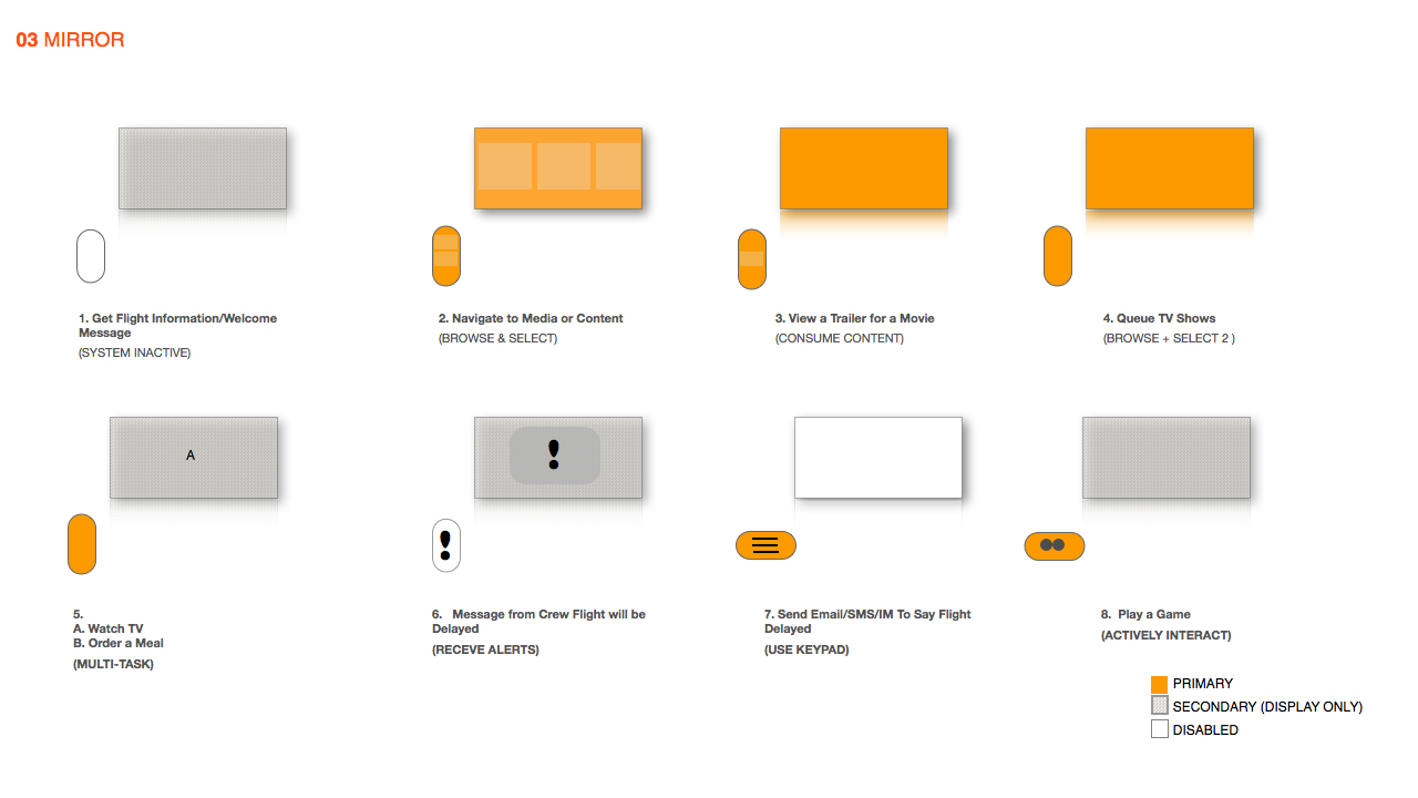
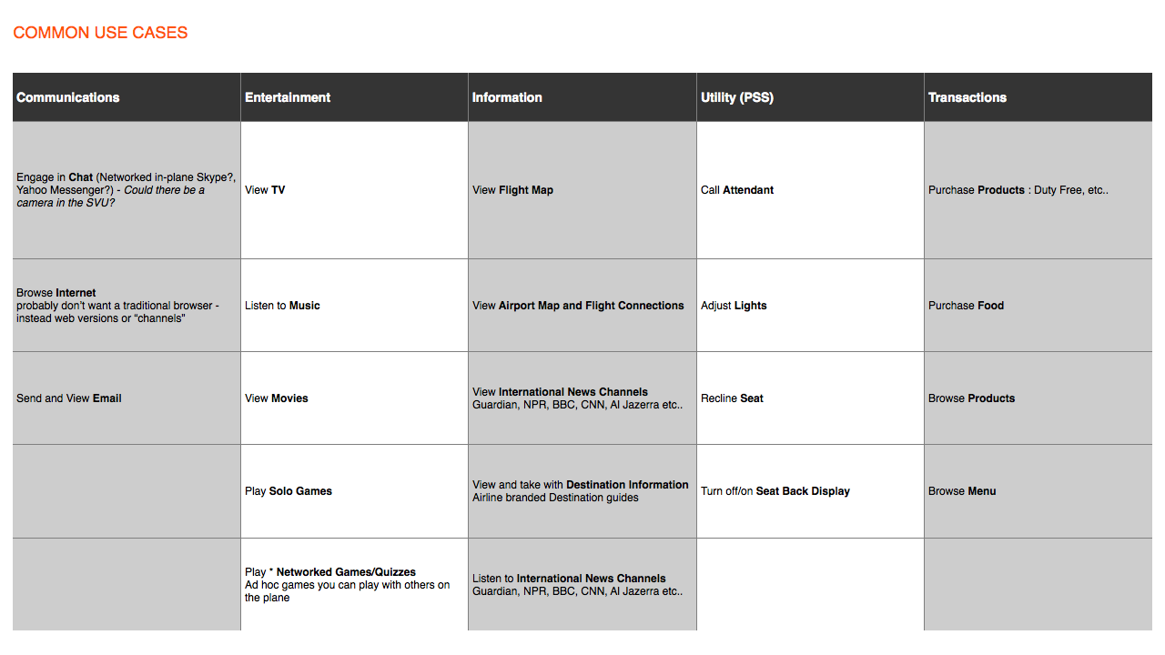
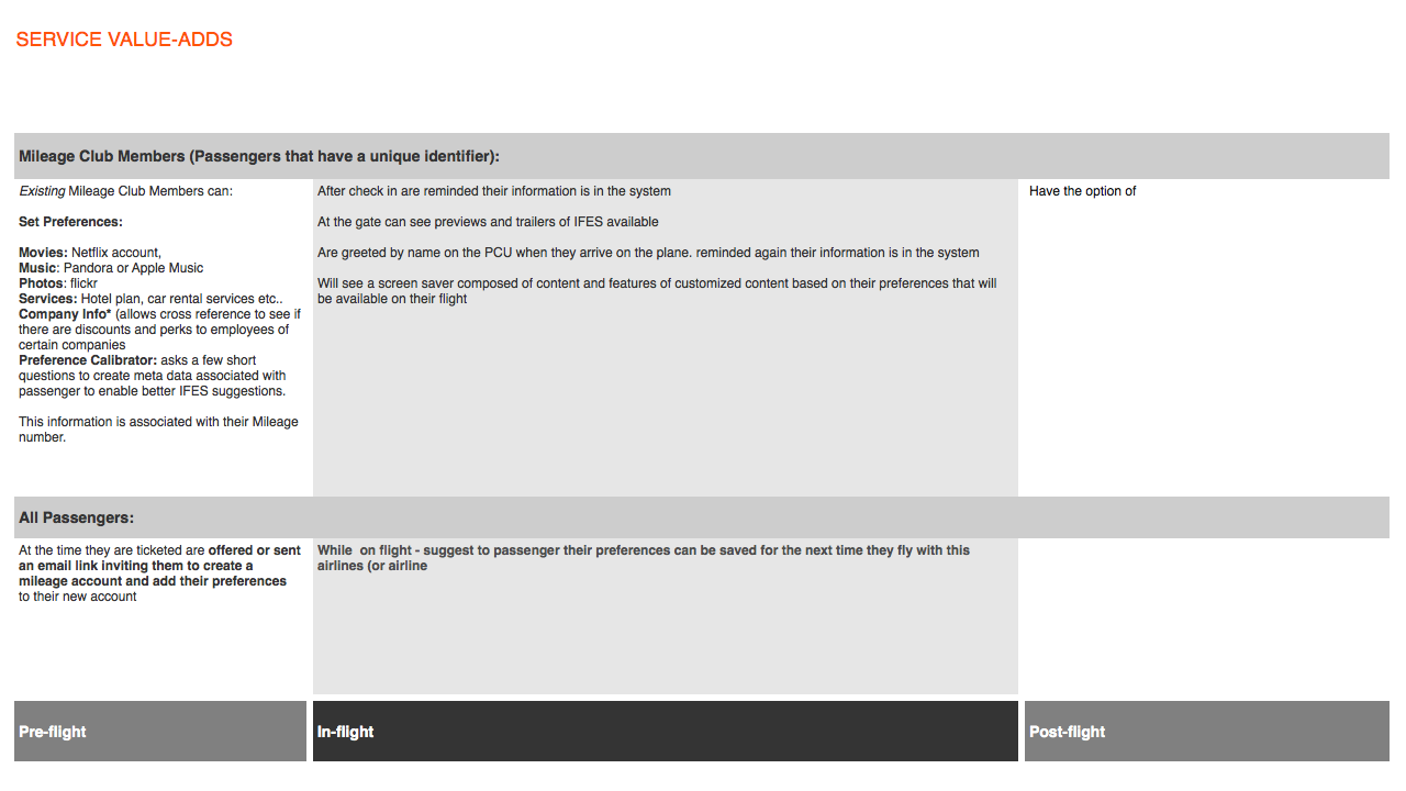
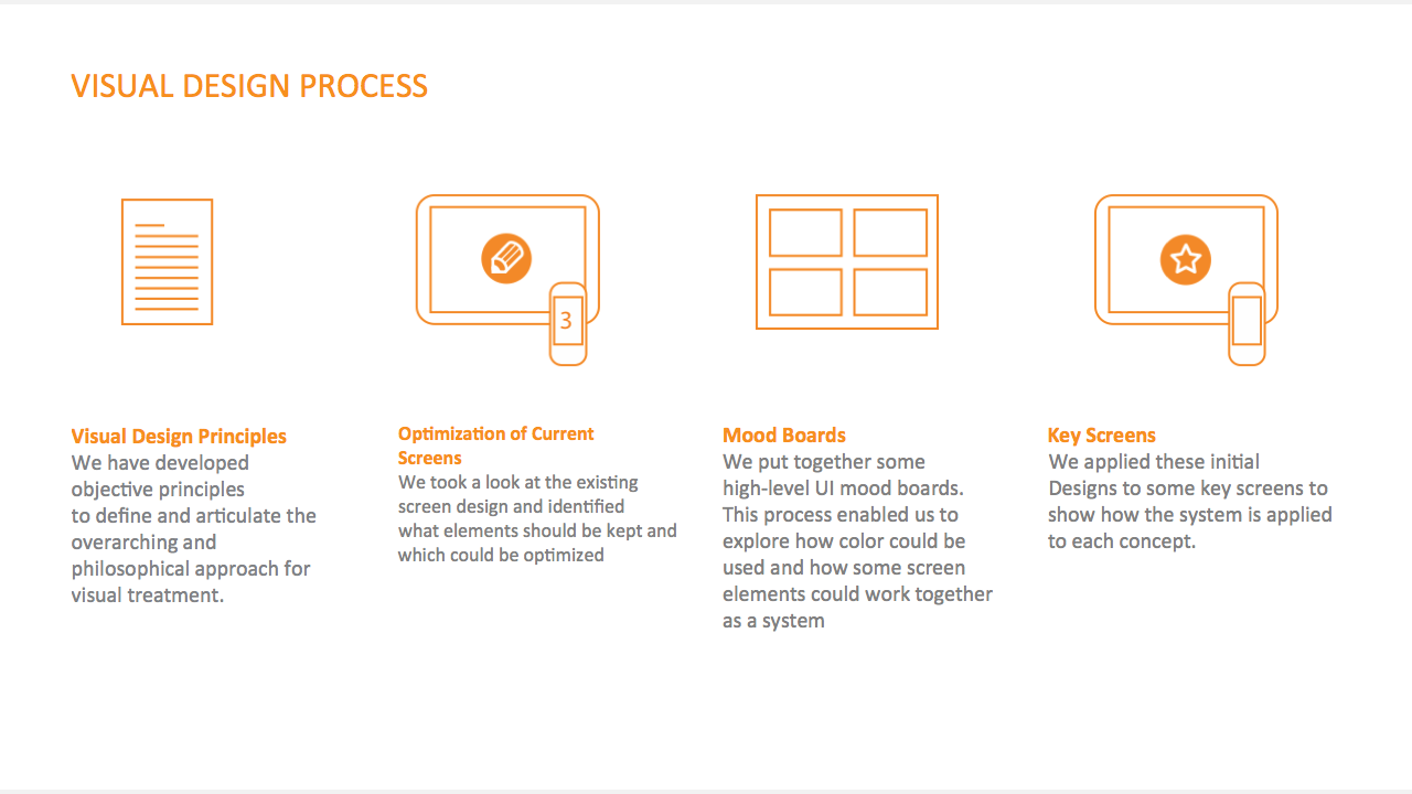
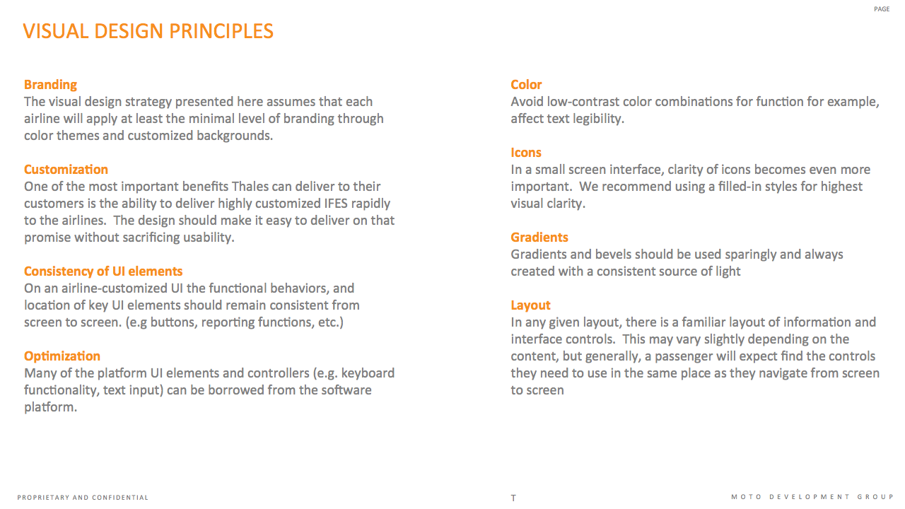
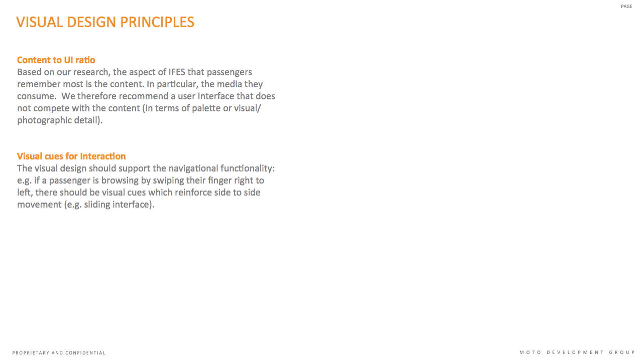
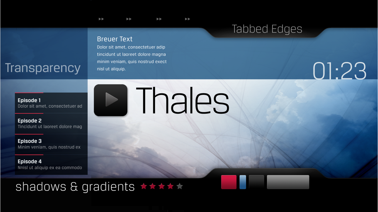
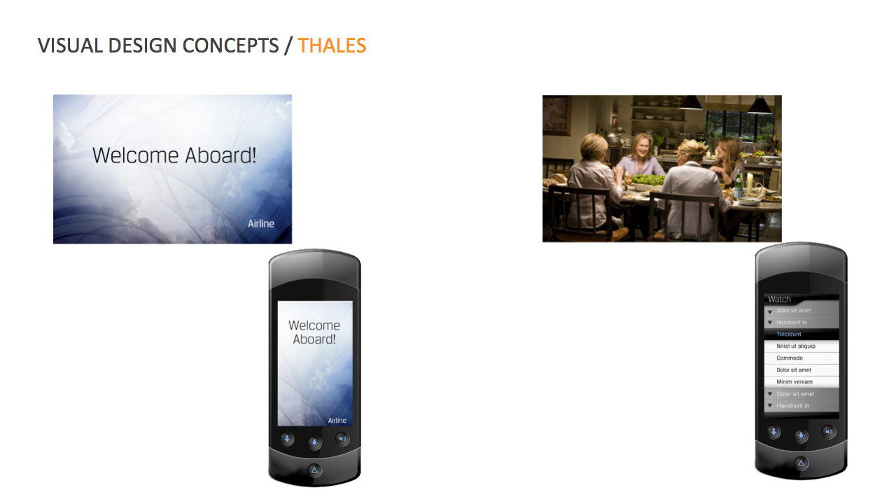
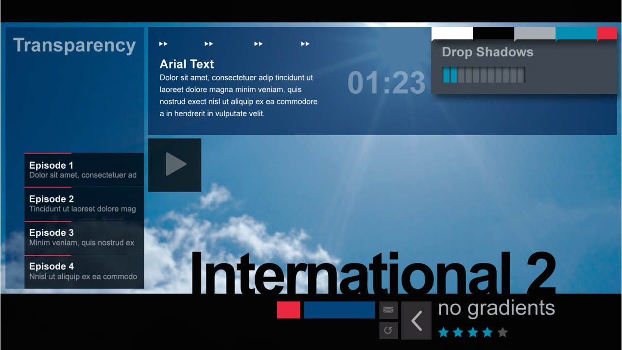
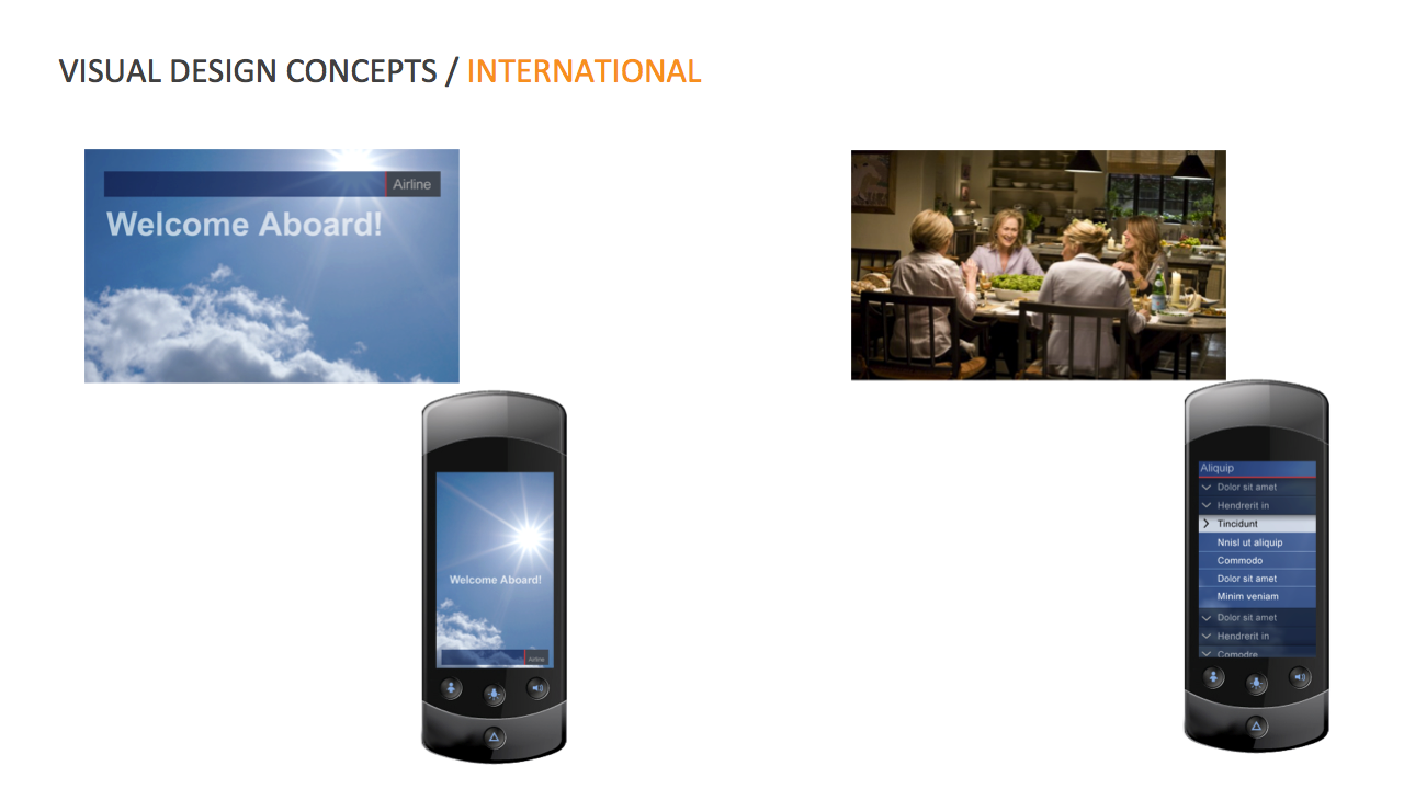
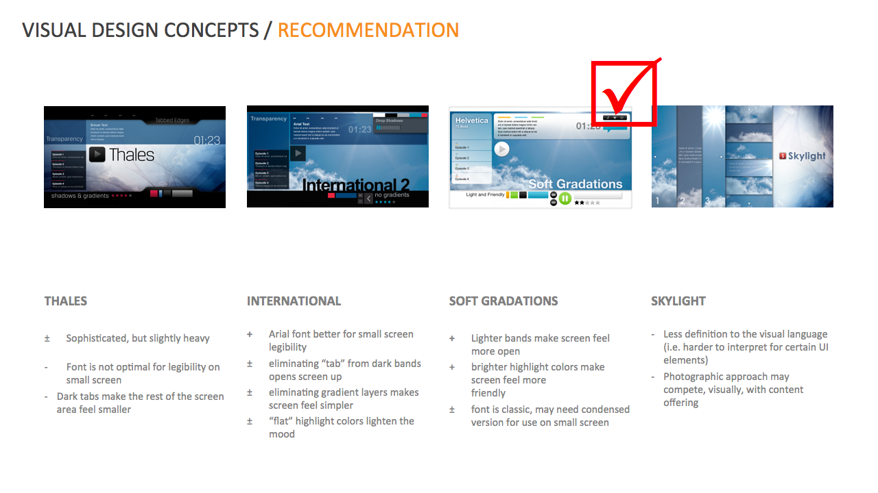
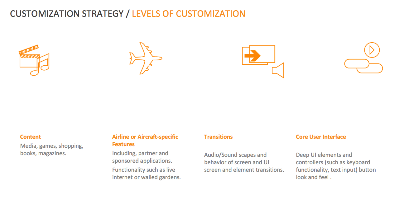
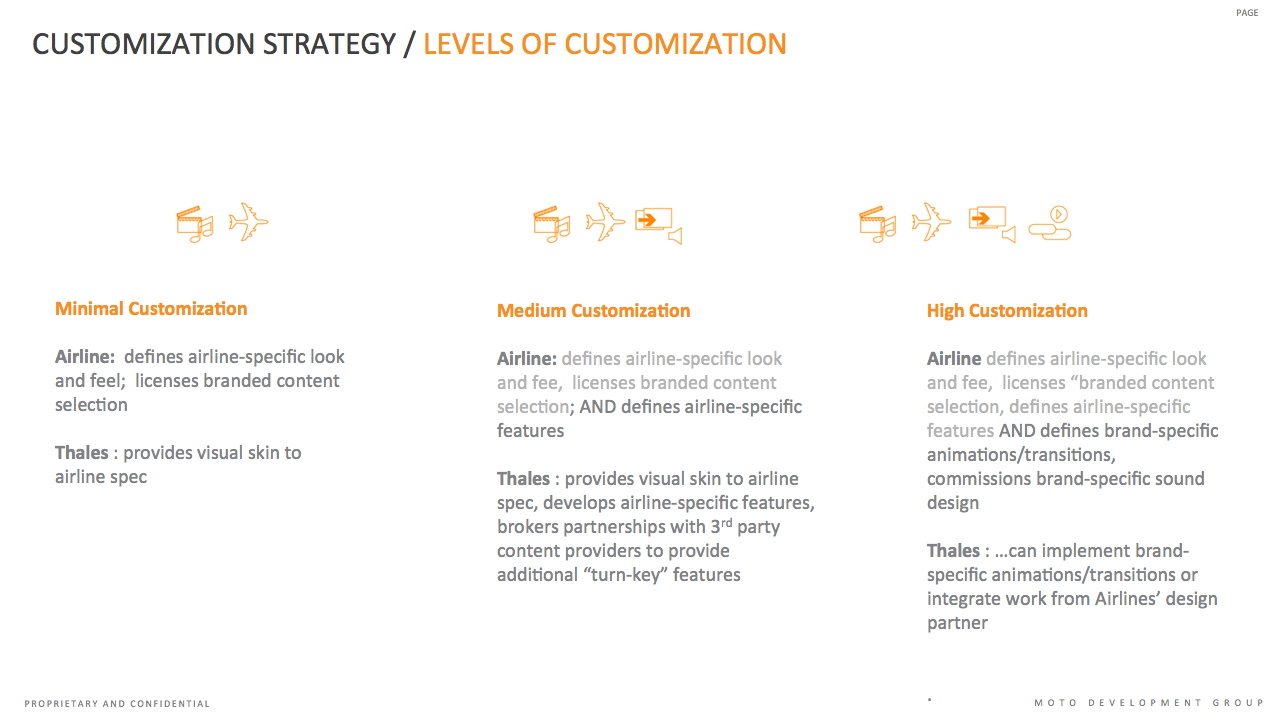
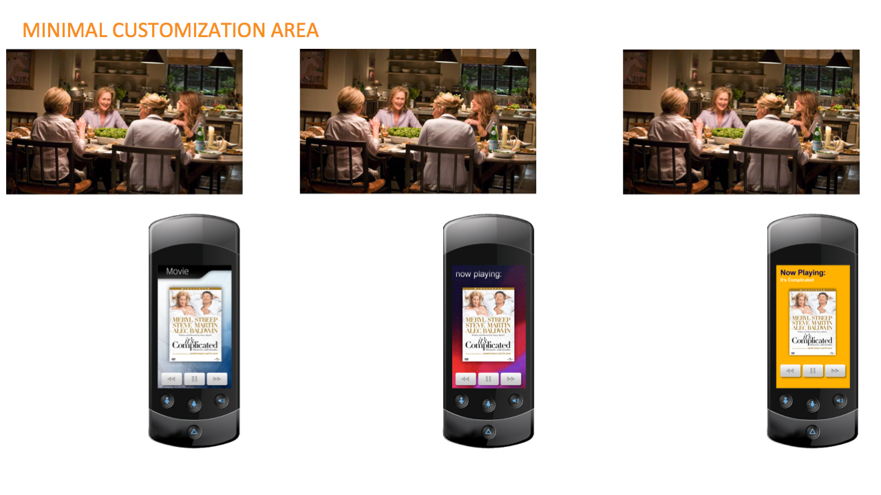
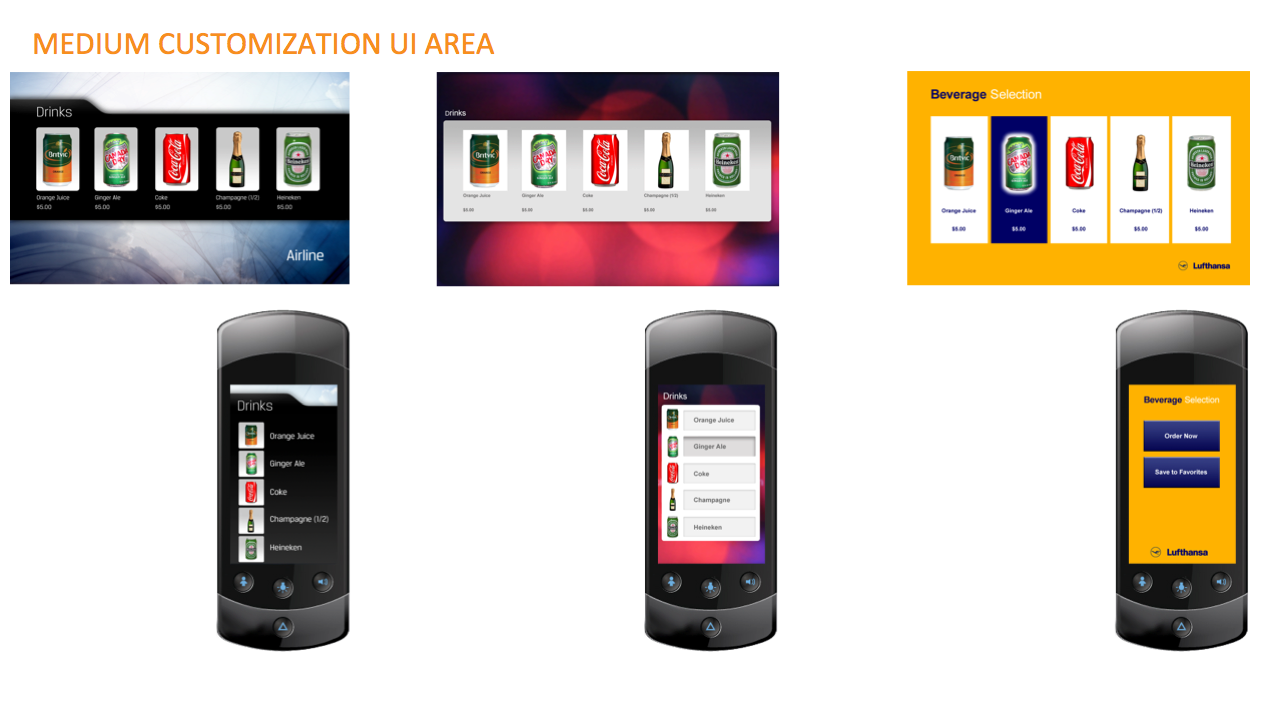
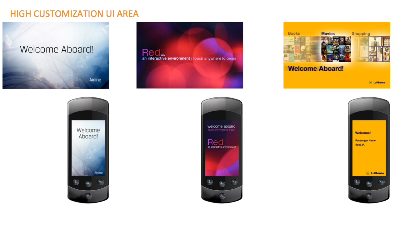
In-Flight Entertainment System
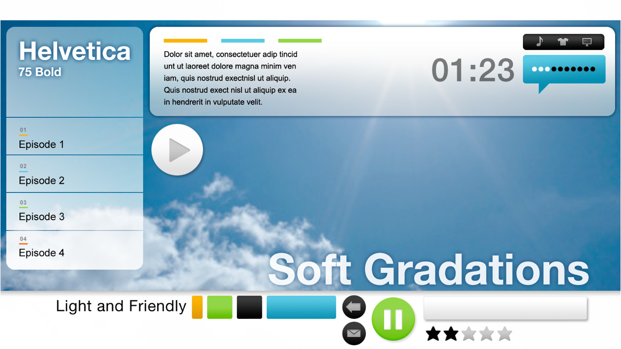
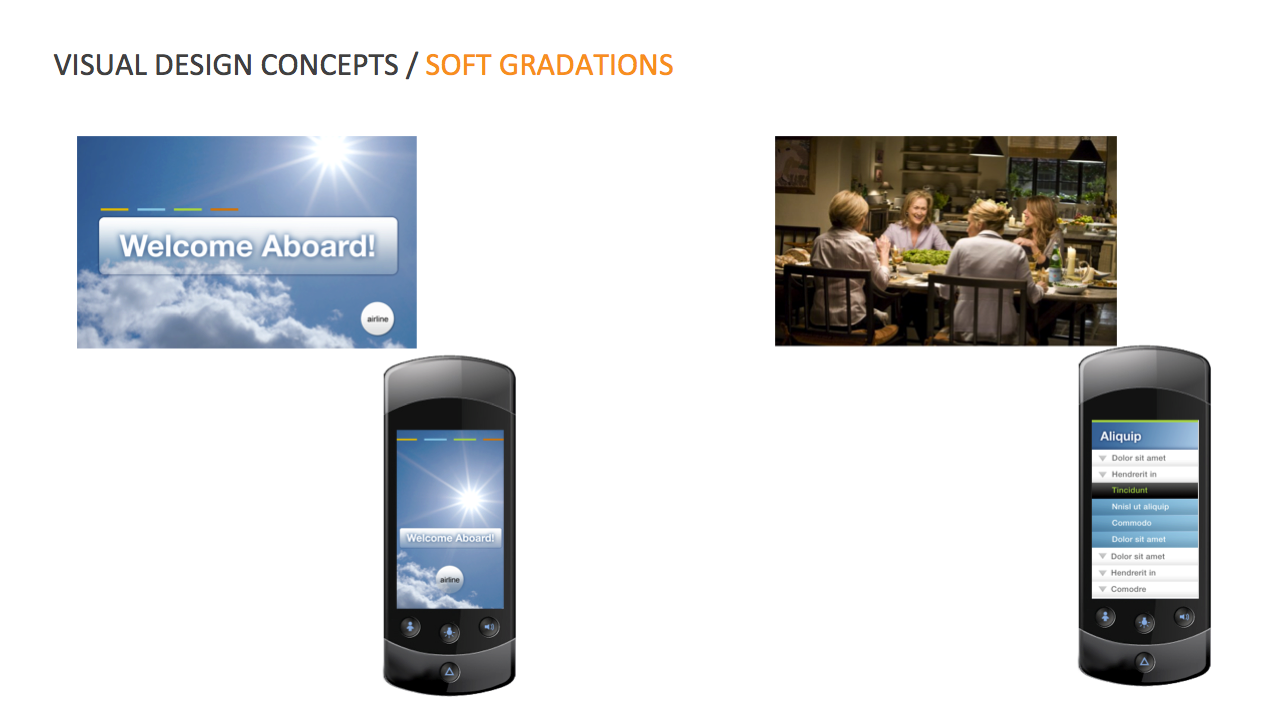
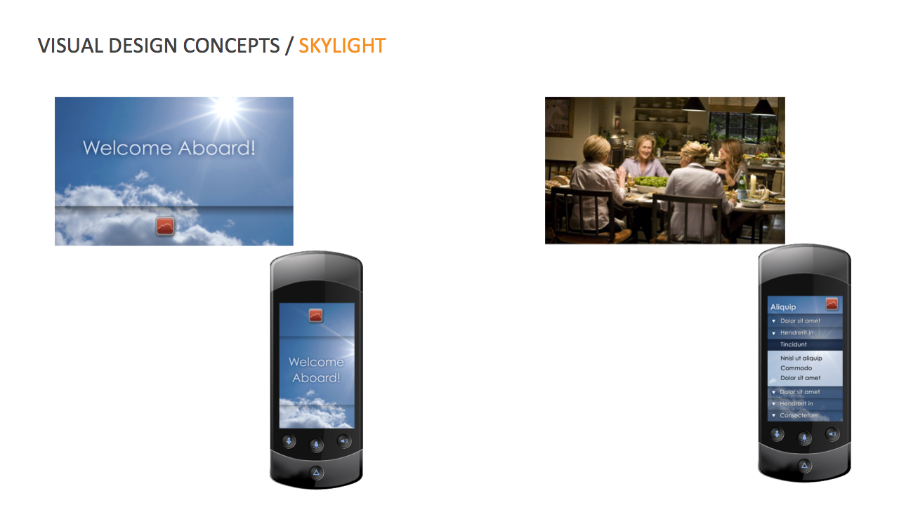
Designs for Thales In-Flight Entertainment platform
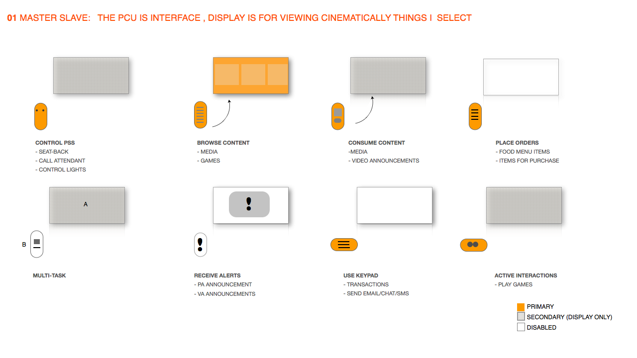
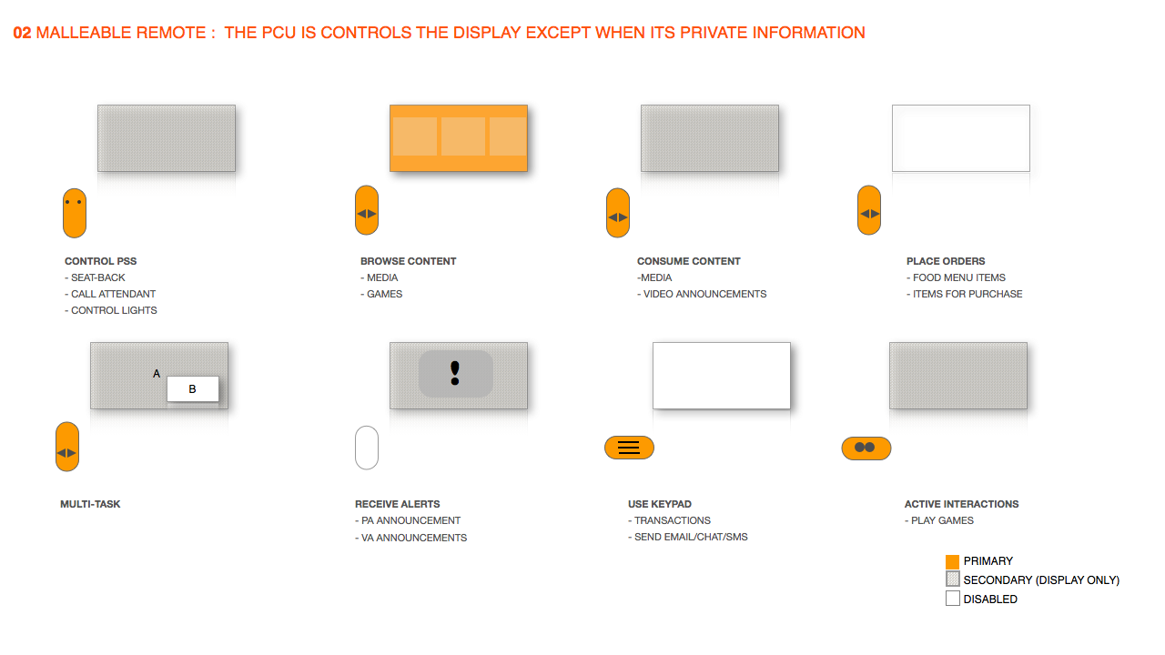
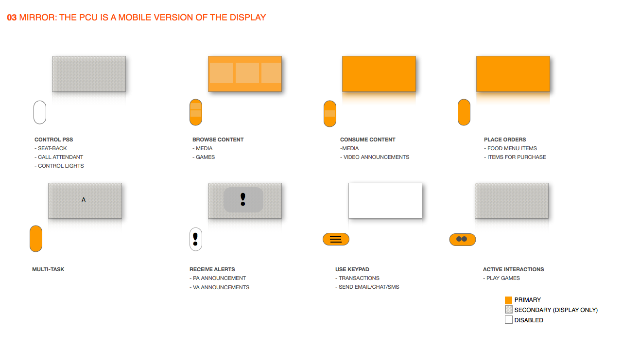
Visual and interaction design for the Thales In-Flight entertainment system base OS platform
Glam Studio
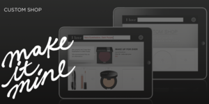
Design Strategy for a cosmetics retailer. Glam Studio was the output of a digital strategy pitch for Sephora.
GLAM STUDIO
Glam Studio was the output of a digital strategy pitch for Sephora.
The Brief
Sephora wanted to explore how to use the iPad as a potential eCommerce Platform.
My Role
Design Strategy
Approach
Conducted design research
Spoke to 35 female Sephora customers in the target age group. I asked a series of questions centered on what brands they enjoyed using, what devices they frequently used, that apps they used most and what activities they tended to use their iPad for.
Competitive Analysis
Looked at a range of other cosmetic retailers, department stores and makeup related games. I did an analysis of what the range of offerings were, what was getting the most downloads and usage and what the nature of the features on these applications.
Organizational Research
Since this product would ideal go to market within a year, I spoke with the e commerce, point of Sale group and other people in the organization to analyze what a realistic scope for how robust the eCommerce experience could be based on the current or easily repurposed SKU features they already had. I also looked at what capabilities, bandwidth the organization could support in the timeframe allowed.
Metrics of success
Worked with the team to identify what metrics we would use to determine usage and success of the product as well as what the company hoped to get out of the investment in this channel.
Deliverables
A comprehensive presentation of findings, a persona of the specific customer archetype for this product channel and a series of recommendations for product, services and their rollout strategy.
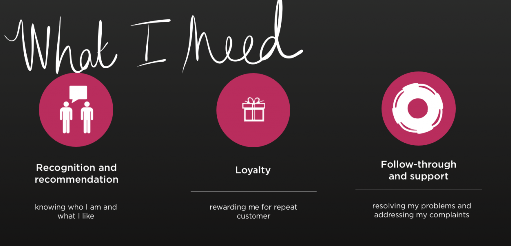
The samples show a small part of the market research, customer personas from segmentation and a few of the concepts that came out of the retail digital product and service strategy.
MBA in a Box
Platform for students and college professors. This desktop and tablet application powers the online learning and communications component for a large university.
Features
“Classroom” screen
Online education platform tool for Apollo Group
Fjord
Role: Creative Direction, Service Design, Client Lead
The Brief:
Apollo group was seeking a tablet based solution for online learning for student and teachers.
This touchpoint needed to easily port over content from their existing web platform and needed to keep the existing user interface conventions and metaphors and the architecture needed to adapt to the existing system as much as possible.
Process
This project was a year long engagement. My role was leading the concept and design process and transitioning work to the IOS development team. We had 6 weeks for information gathering, user interviews and identifying business rules and workflow, 6 weeks of rapid prototyping and design validation/co design sessions with users. 4 weeks of application architecture and template design, 2 weeks of visual system design and documentation and 3 weeks of design validation. We then went to development and continued to do user validation and QA.
JCP Digital eCommerce Strategy
E.commerce strategy for the proposed rebrand of JCP. JCP wanted to identify a new breed of customer the new brands will attract.
Web experience
JCP
e.commerce platform
R/GA 2013
Role: Design Direction
The Brief:
Develop the e.commerce strategy for the proposed rebrand of JCP.
JCP wanted to identify a new breed of customer the new brands will attract.
Approach:
This engagement included:
Identifying the new JCP customer and creating personas for this new customer
Developing an information architecture that supports the planned launch of 80+ new brands in 2013
Designing a series of experiences designed to increase conversion
The Challenge:
New brands were coming onboard but the site platform cannot handle a significant visual or navigation overhaul.
The site and organization did not support editorial or curated content
Providing strategically placed vehicles for building richer customer profiles
Browse category template
Product detail template
early mock-ups
Visa - Go Campaign Digital Strategy
Visa global marketing - Go Campaign launch digital strategy
Campaign Landing Experience
Bank cards co-branded for Visa Go
Point of Sale Branding
The Brief:
Make Visa the preferred payment method over others at the point of sale.
I was digital product design director on the team that created a series of strategic programs to make Visa the preferred payment method over cash at the point of sale.
This project included looking at how Visa can provide compelling online, point of sale and socially oriented
services and experiences that would make the consumer choose Visa.
The example is below is one of the programs.
Research Insight:
Selecting your payment option at point-of-sale is more habit than conscious choice, making it very difficult to change. in Visa World of Change I considered how we might we turn everyday transactions into socially rewarding actions.
Visa World of Change
With every transaction, cardholders donate one penny to a cause they care about. As people around the world join in, pennies add up to big changes, giving cardholders a real reason to use Visa over cash.
Purchase Funnel: Focus on point of transaction
Channels: Targeted point of sale placements and social networks
MCC’s: Inclusive of all categories •Global: Identify charity with global appeal and tailor executions and communication channels based on countries digital lifestyle
POS Considerations: Core to the idea, advertising will focus on POP placements to drive Visa preference at the final step of the transaction
Details:
1. Visa kicks off World of Change by contributing $1 million (in line with FY09 levels) to five charities it already supports.
2. Initially, Visa partners with it’s the top issuer in each of the five markets.
3. Visa/AKQA promotes the program through PR and recruits cardholders with advertising and direct mail.
4. Cardholders join the program by registering their Visa card with the issuer and choosing a favorite cause.
5. POS signage reminds cardholders to use the card over cash and competitors. Each month the issuer adds a penny per transaction to the cardholder’s bill and forwards the total to the designated charity.
6. Issuers forward contribution data to Visa for display on the World of Change site.
7. Cardholders recruit friends through social networks and track progress online.
8. As the program grows, Visa partners with other issuers.
RefreshSF
RefreshSF, SoCap Creative Currency winner
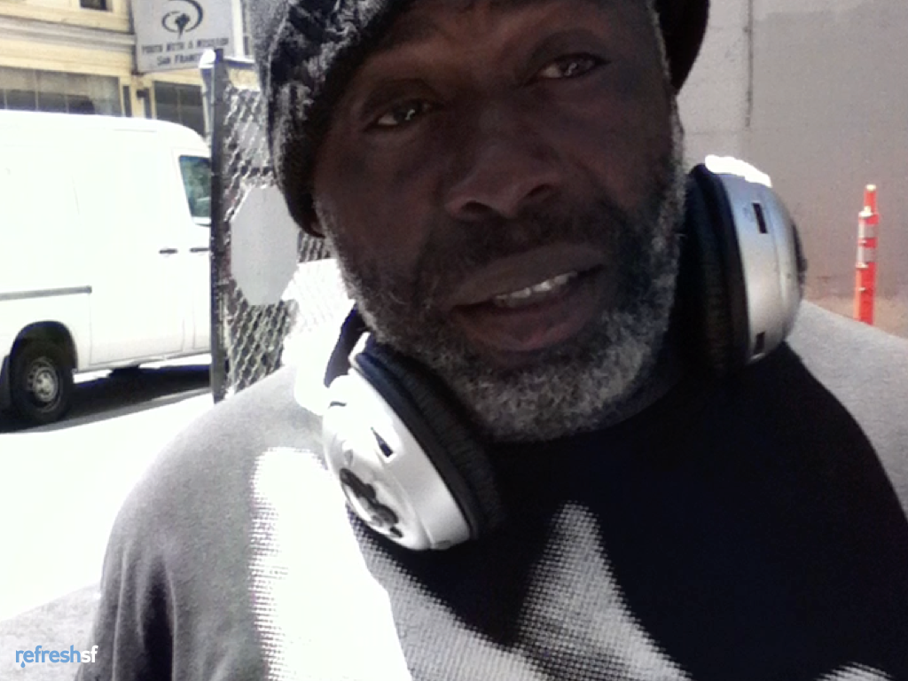
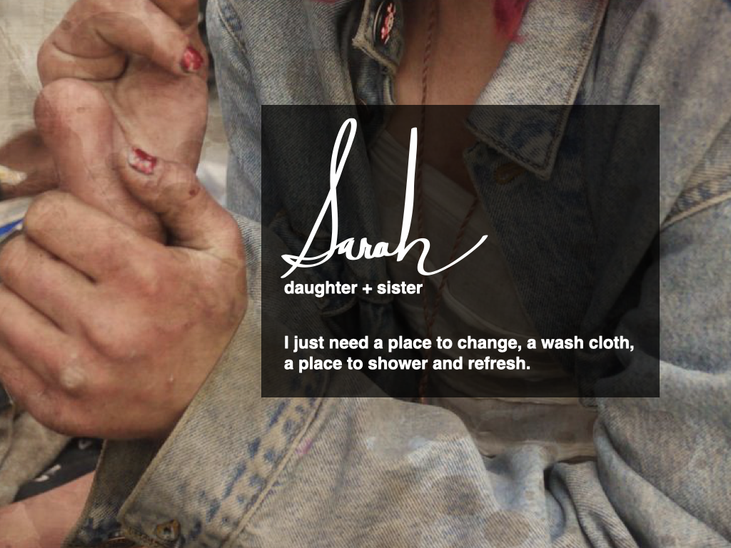
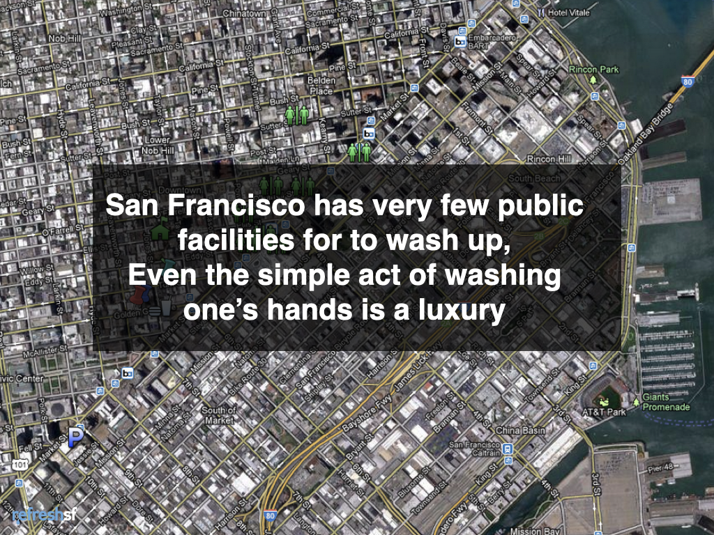
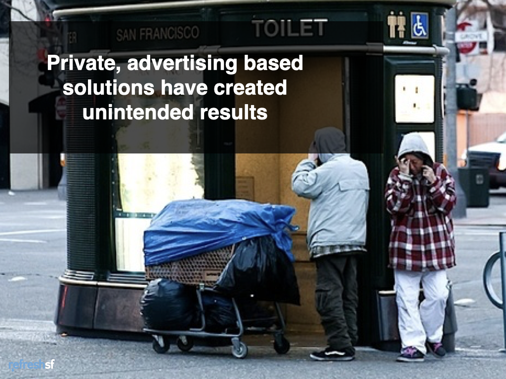
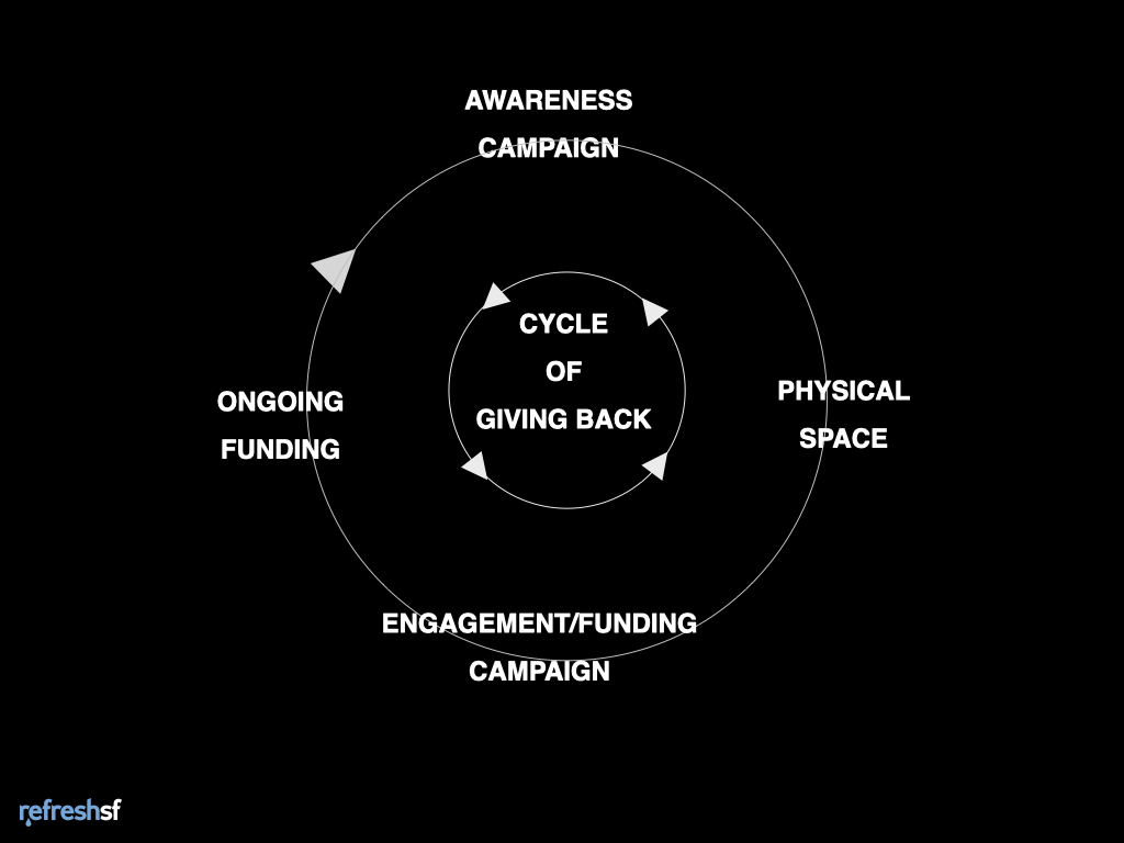
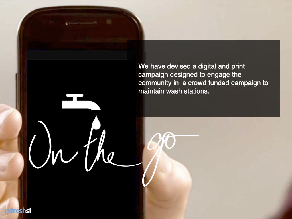
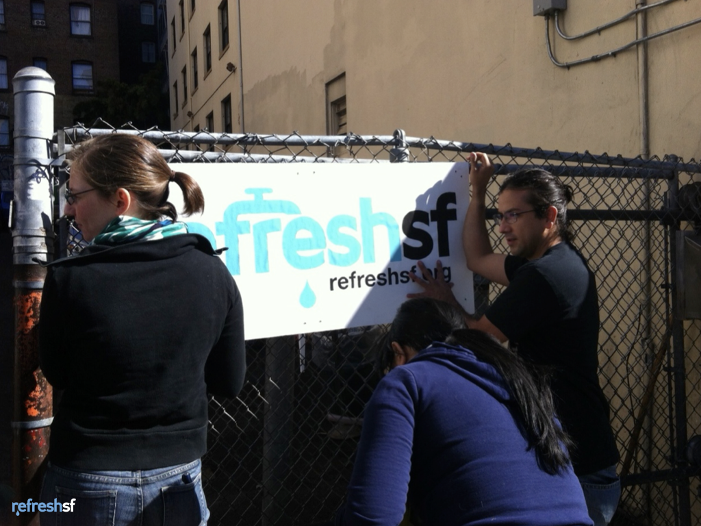
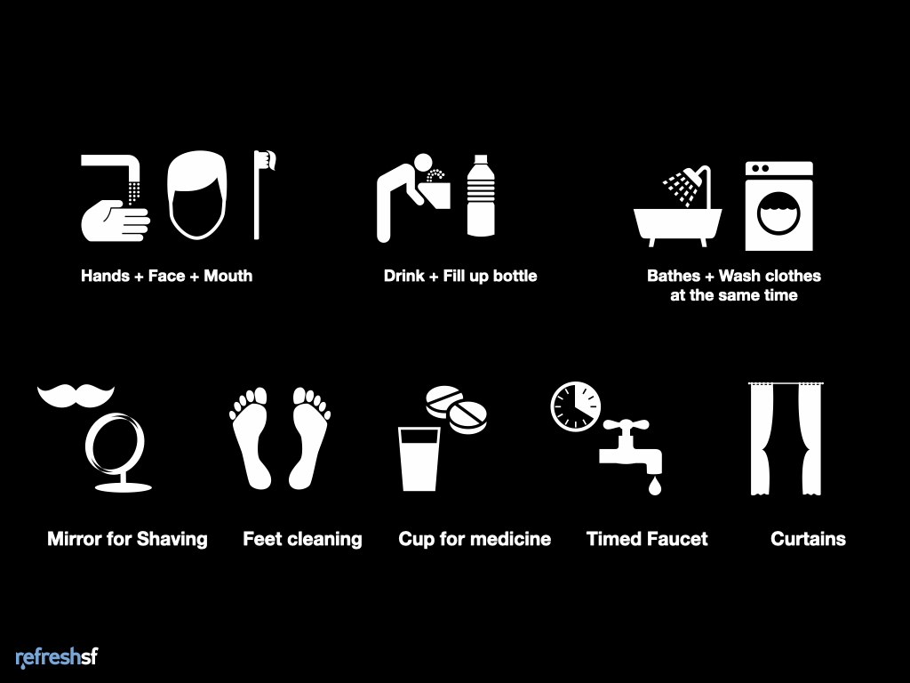
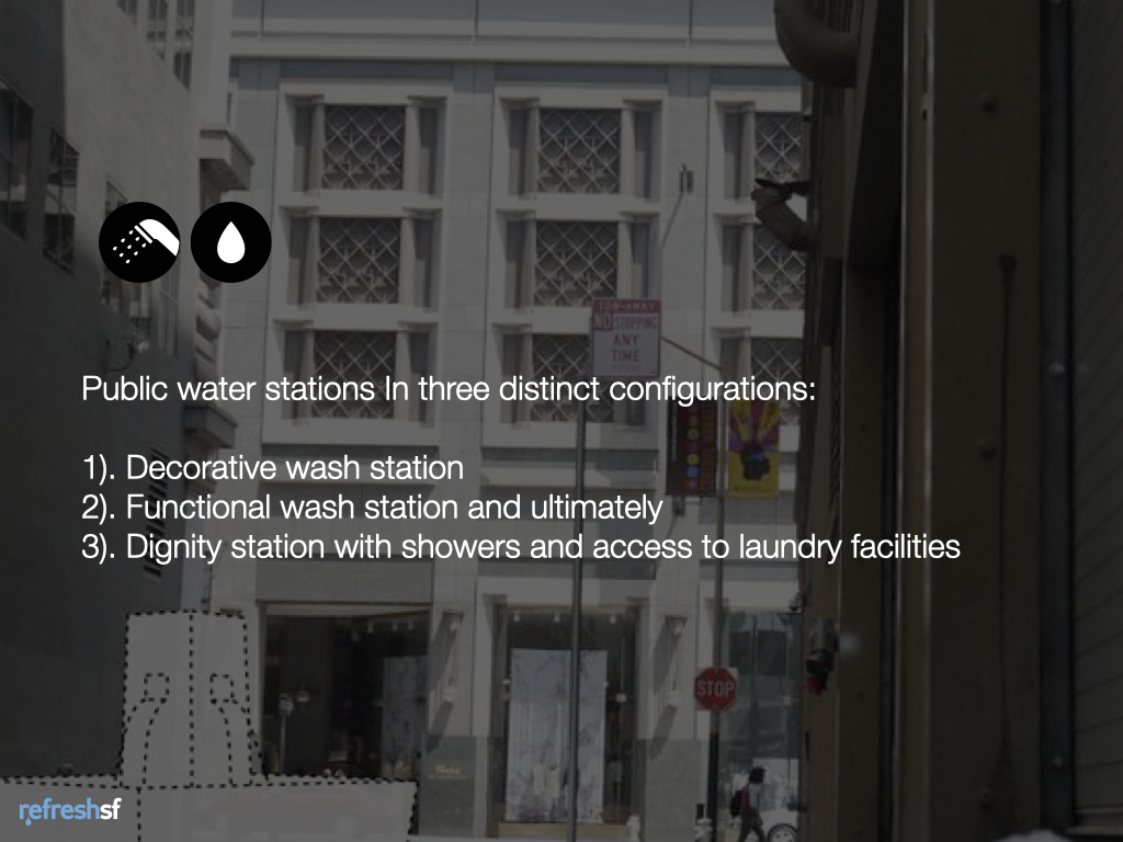
RefreshSF was a project aimed at helping people access fresh water, a critical need for homeless people. This project sought to reopen the City of San Francisco public restrooms and get funding to open public stations for bathing, washing clothes, laundry, etc. The idea is to use unused or underused urban spaces. This project used crowdsourcing with a public awareness campaign and a mobile system for citizens to donate small amounts of money to the project.
Our team did three pilots of our idea in San Francisco, setting up temporary wash basins with a water hose to attract attention and get feedback. .The feedback was positive, we discovered that many people who used the service were not homeless, and the general public would find the service proposed to be desirable, and they would use it as well. We also found department stores, the Ferry Building, hotels, and local churches willing to support the program.
This project won the Creative Currency hackathon and was presented at the Social Capital Markets Conference.
